


 Your new post is loading...

|
Rescooped by Thomas Faltin from Digital Strategy |
5 Ecommerce Checkout Tips - How To DESIGN For More Conversions Next Year


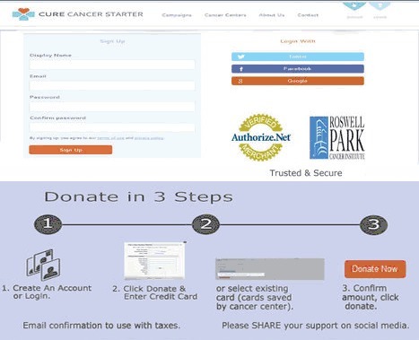
CureCancerStarter.org Lessons In Checkout Mechanics
We did a lot of things right with our initial design of http://www.curecancerstarter.org our crowdfunding cancer research website, but there are some "checkout mechanics" that need tuning including:
* 1,2,3 Graphic.
* Trust Marks.
* Ability To SEE what is happening.
* Too many Steps (superfluous information requested).
* Doesn't FEEL Secure.
Your ecommerce or charity donations page should be in lockdown until next year. While checkout process changes can often bring the biggest ROI, they are to be avoided this close to a major deadline like 12.25.
1,2,3 Graphic
Always MAP your checkout process and then use a different color to indicate YOU ARE HERE. This repeatable graphic is a great TRUST creator and costs NOTHING other than the design time to create it.
Trust Marks
When I use the Authorize.net Trust Mark I DON'T use their widget. Widgets allow visitors to click on the Authorize.net logo and hear all about how great they are. NO ONE clicks on that link and the overhead for carrying the JavaScript is too high. I take a picture of the logo and use that (no link). If you must link to something link to your privacy policy, but be sure to include the same graphic at the top and begin with an explanation of the Trust Mark in your copy.
SEEING What Is Happening
Our current CureCancerStarter.org checkout has a popup to save a credit card. PopUps are horrible as they destroy confidence. Confidence is lost when customers can't SEE what they've done and how it relates to the end goal. "Relates to the end goal" is why the graphical map of your checkout process is so crucial.
Too Many STEPS
We have a profile creation page in our current checkout and we aren't doing anything with that data so a BIG NO NO. Don't PROFILE your customers during checkout since you will lose half of them. Profiling should be done via incentives and email marketing WHEN you have a curators need for the data (and not before). Once I can actually USE a picture of a CureCancerStarter.org donor THEN and ONLY THEN should that information be requested.
Must FEEL Secure
Trust Marks are so common no one sees them, but boy you sure see their ABSCENCE. Why make me wonder if you are secure. Slap a logo on your checkout and write the words TRUSTED and SECURE under them. Research shows the presence of the words is valuable as it provides context to the logos AND increases trust.
When we redesign CureCancerStarter.org's checkout I will be sure to share it so we can do a BEFORE and AFTER comparison (and a real graphic designer will polish my rough drafts).
Great tips on good checkout design