

 Your new post is loading...


I'm not sure what to blame such a poor showing on basic holiday ecommerce design on, but this year's November crop is flat, uninspiring and junky.
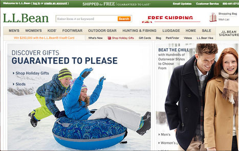
L. L. Bean usually sets the holiday standard. This year their November offering is marred by an obnoxious animated image that includes their great Free Shipping Offer. I HATE putting such a great free shipping offer on a roll because it is easy to miss in the 5 to 9 seconds most visitors give a webpage before moving on (granted this is BEAN so maybe 15 seconds).
Bean has the tough job of competing with themselves and, in past holiday selling seasons, they define how to create great holiday look and feel. Holiday look and feel can be tough. I like Patagonia's approach - put up snow scenes AND a surfer on a massive wave (hey its Christmas in Hawaii too).
The other faux pas that is unforgivable after all these years is Free Shipping obfuscation. Many leading retailers are going free shipping all orders and some are going the Zappos route and offering free returns too. Of the 37 websites reviewed only 6 earned A ratings on three criteria:
* Free Shipping.
* Holiday Look and Feel.
* Holiday merchandising via categories such as For Him, Her, Kids.
The other big miss is websites who think they are too cool for the holidays (AE.com, Restoration Hardware). Black on black at the holidays is expensively too cool and self absorbed.
If you know smaller websites who know how to do the holidays right please share in comments or email Martin.Smith(at)Atlanticbt.com.
Via Martin (Marty) Smith


interesting topic on #ecommerce UX design. any other websites that you know are doing innovative desktop or mobile ecommerce design work?