


Research and publish the best content.
Get Started for FREE
Sign up with Facebook Sign up with X
I don't have a Facebook or a X account
Already have an account: Login

Into the Driver's Seat
453.6K views |
+0 today
Building learners' independence through thoughtful technology use
Curated by
Jim Lerman
 Your new post is loading...
 Your new post is loading...
Your new post is loading...
"Colored printed sections showing the map of the world are cut to shape then pasted onto the surface of the globes and a protective coat of varnish is added. Narrator recounts the fact that lots of the workers have been there for over 30 years and quips: 'While the rest of the mankind does its best to blow the world up, they like building a new one.'" 
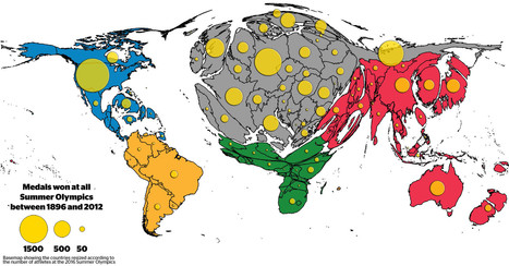
The distribution of medals shows the existing Olympic inequalities: The overall patterns are a reflection of wealth distribution in the world, raising the question whether money can buy sporting success. Besides investment in sports by those countries who can afford it, the medal tables also reflect a battle for global supremacy in political terms.
Tags: sport, popular culture, mapping, historical, cartography.

PIRatE Lab's curator insight,
August 15, 2016 8:32 PM
Another very interesting way to present geographic data.
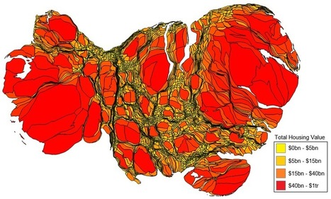
Cartograms are fun tools for swapping out land area for some other variable. For certain figures, especially data that swing wildly at one of the end of the spectrum or another, cartograms are ideal. This cartogram, which compares property values between counties across the continental United States, looks like bad news from a gastroenterologist. What this in fact shows is that just a handful of counties account for the vast majority of property values in the U.S. The distortion is so severe that it doesn’t look like a map of the U.S. at all... Via Lauren Moss
|
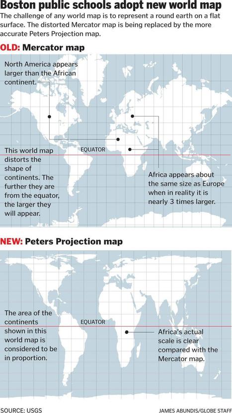
Social studies classrooms throughout the Boston public school system are getting an upgrade some 448 years in the making.
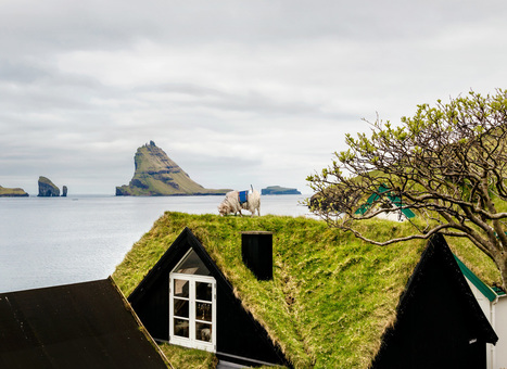
"How do you get Google to visit your small, remote island group with its Street View vehicles, and digitize your roads for the benefit of locals and tourists alike? If you are the Faroe Islands, then you exploit your local resources to roll your own Street View, in the hopes of attracting Google's attention. Behold: Sheep View 360, a solar-powered 360-degree camera, mounted on a sheep's back. Sheep View takes advantage of one great Street View feature: You can upload your own images to Google's service. So Durita Dahl Andreassen, working for the tourist site Visit Faroe Islands, decided to kick-start the Faroe Islands' entry by putting the camera on a sheep and letting it wander free, then uploading the photos."
Jim Lerman's insight:
This is such a rich story; using technology in a pre-industrial way to exploit the attractions of an isolated set of islands. This could make a marvelous multi-disciplinary inquiry and I can just imagine students mounting cameras on their pets to tell the stories of their neighborhoods.
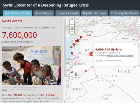
Thousands of refugees, many of them fleeing the brutal conflict in Syria, are streaming across Europe in search of safety and security.

Tanya Townsend's curator insight,
November 23, 2015 11:42 AM
This story map is a great visual of the current refugee crisis. This would be a helpful aid in describing the geographical barriers refugees face and how it affects them. For example the map shows where highest concentrations of deaths occur, naturally it is in the ocean. The ocean is a barrier for fleeing refugees. Think about how different landscapes and land forms can affect refugees available paths to flee
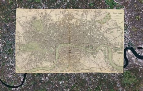
With 150,000 or so old print maps to his name, David Rumsey has earned his reputed place among the world's "finest private collectors." He continues to expand his personal trove as well as the digitized sub-collection he makes open to the public online — some 38,000 strong, and growing. He's created a series of interactive maps that layer old prints onto the Google Earth and Google Maps platforms, and this summer he plans to launch a geo-referencing tool (similar to one recently introduced by the British Library) that lets users get involved in the digital mapping process themselves. While preparing for this next expansion of his online map empire, Rumsey remains fascinated by "the power of putting these images up and letting them go," he says. "Maps have a way of speaking to people very straightforward," he says. "You don't have to have a lot of knowledge of map history or history in general. To me they're perfect tools for teaching history to the public." Via Lauren Moss
|


