

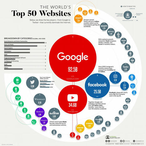
"Visual Capitalist is an excellent source of infographics, and I’ve shared many in previous posts. However, it wasn’t until today that I learned they give everybody permission to reprint…"
Via Leona Ungerer, Bruno De Lièvre
Get Started for FREE
Sign up with Facebook Sign up with X
I don't have a Facebook or a X account


 Your new post is loading...
 Your new post is loading...
Your new post is loading...
"Visual Capitalist is an excellent source of infographics, and I’ve shared many in previous posts. However, it wasn’t until today that I learned they give everybody permission to reprint…" Via Leona Ungerer, Bruno De Lièvre 
No comment yet.
Sign up to comment

The How to Get More Out of Google Search Infographic shows you how students can efficiently find exactly what they want on the web. Via Tom D'Amico (@TDOttawa)
![What happens after a data breach? [Infographic] | information analyst | Scoop.it](https://img.scoop.it/mhk80ig_OIgh0szG8FDh-jl72eJkfbmt4t8yenImKBVvK0kTmF0xjctABnaLJIm9)
High profile data breaches that expose customer information are in the news. This graphic shows how the thieves sell the info and make their money. Via Gust MEES
![[Infographie] Internet et vie privée dans le monde | information analyst | Scoop.it](https://img.scoop.it/u4ZafwQCLEucnGOgybgjOzl72eJkfbmt4t8yenImKBVvK0kTmF0xjctABnaLJIm9)
Après le palmarès des pays selon la liberté d'Internet, voici maintenant celui des pays qui respectent le plus la confidentialité et la vie privée. Petit tour Via Tiphanie Routier, claudine pierron, Terheck

Ugo - James Grillis's curator insight,
October 24, 2013 5:24 AM
Cela alimentera le débat de façon beaucoup plus colorée #NSA #Roll
From
infogr

Create infographics and interactive online charts. It's free and super-easy! Follow other users and discover amazing data stories! Via Baiba Svenca

Victor GraphicSave's comment,
August 3, 2013 9:08 AM
Nice Post Visit My Logo Designs http://graphicsave.com/logo-designs
http://graphicsave.com/restaurant-logo
From
www
Here you will find all of the articles on this scoop.it site tagged with the infographic keyword.
You can assemble an array of articles on any of th curated topics on this site by clicking the Filter Tab in the upper left corner of the page and selecting an interesting tag.
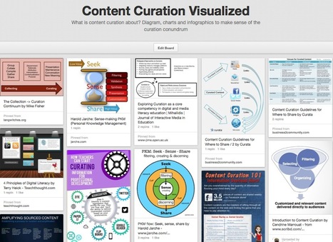
What is content curation about? Diagram, charts and infographics to make sense of the curation conundrum Via Robin Good, Manuel Pinto

Monica S Mcfeeters's curator insight,
March 30, 2014 9:18 AM
This will be helpful to share to those wondering about content curation. 
Jeff Domansky's curator insight,
September 1, 2014 11:53 PM
Valuable collection of the art of curation from Robin Good.
![5 Reasons We Use Social Media [Infographic] | information analyst | Scoop.it](https://img.scoop.it/0dX8Ctv2ZvgMgSGXFog8zzl72eJkfbmt4t8yenImKBVvK0kTmF0xjctABnaLJIm9)
There are many reasons we use social media. From the basic to the more advanced, the tool is simply ubiquitous and addictive. This infographic sheds some light for us all. Via Gust MEES, roberto toppi

Latisha Poulard's curator insight,
March 21, 2013 10:46 PM
You see why if you don't have an online presence then you are part of a dying breed...
![Why Brands Must Embrace Visual Social Media in 2013 [infographics] | information analyst | Scoop.it](https://img.scoop.it/04wqBzr0Q4EBepYMCOCgHTl72eJkfbmt4t8yenImKBVvK0kTmF0xjctABnaLJIm9)
Two infographics provide data and tips to explain why brands must leverage visual social media in 2013 to stay relevant and grow.
Today, the marketing world is still hot on the social media marketing trail, but the trail has diverged. There are different paths with cheerleaders along the way no matter which path a marketer follows.
Ideally, marketers should find the path down the middle that marries all of the elements of social media marketing, but most are not there yet. Many of today’s marketers are still choosing a single path to focus on or jumping back and forth. For example, those paths include the data and metrics focus, the storytelling focus, the visual focus, and more. This article hones in on the visual focus with the help of two great infographics that visually share the data and tell the story of visual storytelling... Via Lauren Moss

Bart van Maanen's curator insight,
January 8, 2013 5:34 AM
Leerzame infografiek over het gedrag van consumenten online en hoe (klein - middelgroot - groot) bedrijven daar mee omgaan. Het managen van social media is kennelijk nog steeds een kwestie. Meest opvallende stijger is Instagram, dat door het mobiel delen van foto's deel uitmaakt van de grote visualisering van het web. Hoewel het moeilijk te geloven is met een upload volume van, naar verluidt, 72 uur video per minuut, las ik ook voorspellingen dat video dit jaar nog 'groter' gaat worden. Onderaan staan trouwens de links naar een aantal goede bronnen voor dit soort info 
Janet Louise Stephenson's curator insight,
May 3, 2013 10:28 PM
They say a picture is worth a thousand words....
Infographics have become very famous the past years, and there have been have been numerous examples and posts showcasing inspiring and creative infographics related to certain topics across the internet.
This particular collection of designs includes 10 infographics that are not all focused on a specific niche subject, though they can all serve as examples of creative visualizations and innovative ways to convey information. Hopefully they will help inform or provide inspiration for any potential new and developing data visualization projects you may be working on... Via Lauren Moss, Dave Wood

Beth Kanter
Another way to articulate the importance of sense-making.
Think about it this way: Tools are not always actual objects designed to help us with physical activities. A notebook, whether it is a Moleskine or an Evernote digital document, is a tool that expands our memory. A digital calculator, whether it is an inexpensive machine bought in the nearest Dollar Tree or an app downloaded to your iPhone, frees you from the burden of having to retain and execute many complex mathematical algorithms. Non-physical tools (or sets of tools and practices), such as statistics and the scientific method, evolved to let us gaze beyond what we would normally see, and to overcome our deepest biases and lazy habits of mind. The same is true for great visual displays of information... Via Lauren Moss

Infographics on Social media Monitoring Tools for popularity and branding for business with social media booster proving effective results for profitable income...
Read more: http://allinfographics.org/social-media-monitoring-tools-facts-and-how-to-use/
Via Gust MEES
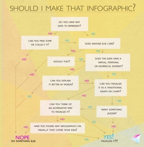
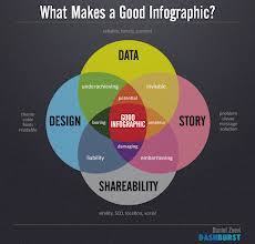
Infographics and data visualization are more popular than ever these days, and on the flip side of this trend is the fact that for each amazing piece that gets published, there is at least one that… well, should never have seen the light of day. Bad data visualizations can be misleading, confusing — or simply wrong. Good ones, on the other hand, can be helpful, informative, or both — and fun, to boot. So, we decided to create a little bit of that joy—and be a little meta—with a simple infographic about whether or not to make an infographic... Via Lauren Moss
|
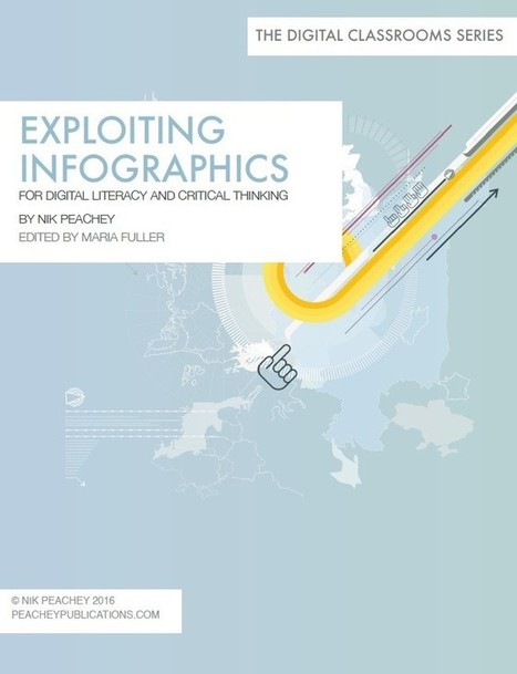
This ebook was designed with English language teachers in mind but should have some value for any teacher who is interested in developing their students’ digital literacy and critical thinking skills.
Via Nik Peachey

Nik Peachey's curator insight,
September 30, 2016 5:38 AM
My latest ebook in the Digital Classrooms Series. 
Ttoo2's curator insight,
October 5, 2016 11:39 AM
Infographics are such a great differentiated way for kids to show what they know.

Susan Kelly's comment,
October 14, 2016 8:37 AM
Thanks. I'm eager to read this and wonder if you've included the BIg 6 Information Literacy Skills.
We’ve been through hell and high water to bring you the best and brightest of the data viz world in 2013 for the Kantar Information is Beautiful Awards. Many hours of cogitation, digestion and deliberation have been spent and now here they are, all of our glorious winners on one uber-long scrolling page. Congratulations to all our winners. Now sit back and marvel! Via Goulu, Terheck
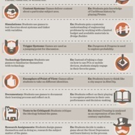
The purpose of this board is to explore the hottest trends in education--from mobile and blended learning to game-based learning and tablets in the classroom-through the fad that is the infographic. Via Tom D'Amico (@TDOttawa)
michel verstrepen's insight:
hottest trends in education
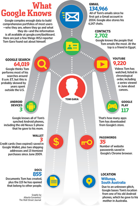
'Le Wall Street Journal s’est amusé à recenser toutes les applications Google (du moins les plus usitées) qu’un utilisateur peut installer sur ses terminaux. A partir de cet état des lieux, il s’est efforcé de comprendre ce que Google parvenait à savoir de chacun d’entre nous, nos goûts, nos habitudes, nos préférences. Une infographie qui fait réfléchir !' Via Pascale_Masson, Terheck

Morgan BANCEL's curator insight,
September 17, 2013 3:01 AM
Allez, un petit mindmapping dont vous être le sujet...

From
vizalizer
Vizalizer simplifies the creation, analysis and generation of data visualization through a Social Network that brings together publishers with colleagues and readers, to create content for its analysis and discussion, use in presentations, publications... Via Baiba Svenca

Baiba Svenca's curator insight,
July 9, 2013 3:01 PM
Vizalizer is an interesting tool that lets you create infographics and data visualizations. In my opinion, it is more suitable for business but ingenious people may find how to use it in education as well. The basic version is free but it has limitations.
![Social Media Wars Told in 'Game of Thrones' Style [INFOGRAPHIC] | information analyst | Scoop.it](https://img.scoop.it/4nnFvfHQeM2s2AiQ_XM45Dl72eJkfbmt4t8yenImKBVvK0kTmF0xjctABnaLJIm9)
From
mashable
Brian Anthony Hernandez: "Social networks often put up their defenses against opposing social platforms. The social media wars are detailed in this Game of Thrones-themed infographic." Via The Digital Rocking Chair

Claudio Gentile's curator insight,
June 3, 2013 4:59 AM
#socialmedia e #transmedia in una #infografica dedicata a #gameofthrones via @D_RockingChair
While not everyone can make infographics from scratch, there are tools available on the Web that will help you create your very own infographics. In this article, we’re listing more than 20 such options to help you get your messages across to your readers, visually. Via Let's Learn IT, Robin Good, Lauren Moss

Two Pens's curator insight,
May 13, 2013 1:14 PM
Piktochart is easy to work with and creates a fair Infographic. I still prefer to hire an art director. It's worth the money to have an intelligent designer with you :-) 
Eddie Thornton's curator insight,
May 13, 2013 3:29 PM
Don't forget to add your perspecitve, your insight as to why this infographic add up to more than just numbers and figures on a chart. 
Ness Crouch's curator insight,
May 14, 2013 4:09 PM
Another great link to help create infographics. I'd like to get more time to create these for class...
![Infographics ROCK Twitter and LinkedIn, Leave Facebook Cold: Measuring ROI [Infographic] | information analyst | Scoop.it](https://img.scoop.it/8ONIJFh_uLfxrIaXTBQTzzl72eJkfbmt4t8yenImKBVvK0kTmF0xjctABnaLJIm9)
Infographics on Return On Infographics ROI on business for sales and conversion of product with search engine ranking, social interaction, page views Via Martin (Marty) Smith, Ken Morrison

Lynn O'Connell for O'Connell Meier's curator insight,
February 8, 2013 4:05 PM
Facebook doesn't show enough of a infographic to allow it to have impact. To share there, make a photo of the top and link to another site. 
Ken Morrison's curator insight,
February 18, 2013 6:22 PM
Ken's Key Takeaway: I am sharing this link for two reasons. I like that it shares a list of the most popular infographic. I also like that it shows how to attempt to evaluate the ROI of an infographic. 
255's comment,
February 20, 2013 12:21 AM
Could be that infographics tells something in an easy way about relevant point ?
![How to protect your privacy better than CIA director David Petraeus! [Infographic] | information analyst | Scoop.it](https://img.scoop.it/R4a0X05nEZvpjd3GvWBKvDl72eJkfbmt4t8yenImKBVvK0kTmF0xjctABnaLJIm9)
The scandal involving the Director of the U.S. Central Intelligence Agency (CIA), David Petraeus, shocked the nation. Via Gust MEES

Gust MEES's curator insight,
December 25, 2012 6:43 PM
Check out also my curation about "Privacy" here:
- http://www.scoop.it/t/securite-pc-et-internet?tag=Privacy
Data visualizations and infographics can make complex datasets easier to understand and comprehend. By creating a graphical represenatation of data and statistics, complicated concepts and information can make more sense in less time. Many visualizations focus on representing a specific set of data or statistical information. Others focus on less-concrete topics, providing a visual representation of abstract concepts. Generally speaking, the first type appear more like graphs or charts and the latter are often more creative and imaginative. Via Lauren Moss
![Innovative ICT in Education: Twitter [Infographic] | information analyst | Scoop.it](https://img.scoop.it/rhcnyvTxCB2M1irpdb--TDl72eJkfbmt4t8yenImKBVvK0kTmF0xjctABnaLJIm9)
The latest ‘Training Tuesday’ for staff CPD was on the use of Twitter for professional development. Aims: What is Twitter? Sharing the benefits of developing your own PLN (Personal Lear...
Read more: http://mrwickenspe.wordpress.com/2012/05/22/innovative-ict-in-education-twitter/
Via Gust MEES
Information graphics or “infographics” are graphic visual representations of information, data, or knowledge. Infographics help us absorb facts and figures in the most effective way possible. They come in extremely handy when you need to explain complex information, numbers or data rather quickly and effectively. One cool way to get inspired is to look at some of the best infographics out there. Infographics are an excellent way to add humor or irreverence to tell a great story in short possible way. However, infographics can be pretty hard to design since you have to gather together a lot of information and make it look good. Today we're to sharing the top places to see some great visual graphics and also find inspiration to create your own... Via Lauren Moss
|


