


Témoins d'une époque glorieuse oubliée, sinistrés par une catastrophe ou simplement jamais achevés, tous ces sites abandonnés fascinent par leur beauté mélancolique. A visionner sans modération.
Via René Z.
Get Started for FREE
Sign up with Facebook Sign up with X
I don't have a Facebook or a X account


 Your new post is loading...
 Your new post is loading...
Your new post is loading...
Témoins d'une époque glorieuse oubliée, sinistrés par une catastrophe ou simplement jamais achevés, tous ces sites abandonnés fascinent par leur beauté mélancolique. A visionner sans modération. Via René Z. 
No comment yet.
Sign up to comment

Data Center Knowledge Via Martin (Marty) Smith

Martin (Marty) Smith's curator insight,
October 1, 2013 5:17 PM
Loved this post because the tone is teaching, "cloud engineers" and so we interloping Internet marketers can learn too. Don't think understanding the cloud is important? Here are just a few Internet marketing CSF (Critical Success Factors) impacted by "cloud formation": * SEO acceptability of your website. * Web 3.0 dynamic contingent logic firing in real time.
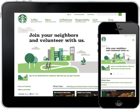
User centered web design tries to structure websites to match the expectations, needs, and abilities of visitors. Here are 4 pillars that make it possible. Via Martin (Marty) Smith
Martin (Marty) Smith's curator insight,
May 27, 2013 4:23 PM
Four Pillars * The Content. * The Design Framework. * The Visual Design.
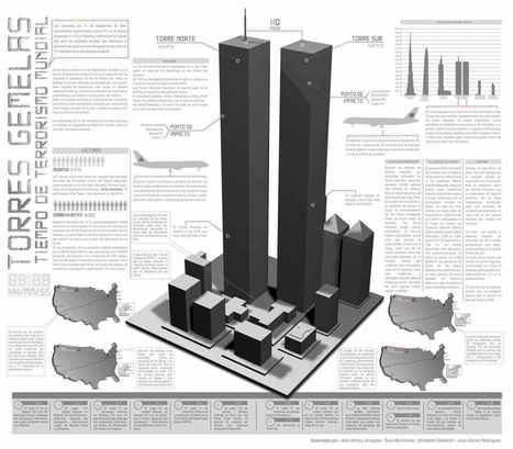
Infographics have become very famous the past years, and there have been have been numerous examples and posts showcasing inspiring and creative infographics related to certain topics across the internet.
This particular collection of designs includes 10 infographics that are not all focused on a specific niche subject, though they can all serve as examples of creative visualizations and innovative ways to convey information. Hopefully they will help inform or provide inspiration for any potential new and developing data visualization projects you may be working on... Via Lauren Moss, Dave Wood
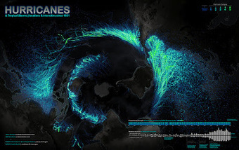
A few days ago, I tweeted about the beautiful map shown- Hurricanes and Tropical Storms since 1851. I added a note about the projection, which may be unusual for someone who was born in Europe, the US, or Continental Asia, as it is centered on the South Pole. Rob Simmon, a data visualizer at NASA Earth Observatory, replied: "I disagree with the map projection choice, far too much distortion of the data, especially in the Northern Hemisphere." That's a legitimate concern. Distorsion is a major challenge when designing maps. I gave Rob's comment some thought, as it is somehow related to the core idea in The Functional Art: Information graphics are tools; before choosing visual shapes to encode data we should define the tasks our graphics should help readers with. Additionally, in interactive visualizations we may want to explore information from different angles. In the video lectures that you get with the book, I point out that designers usually forget that sometimes it may be necessary to represent data more than once, with different kinds of charts, maps, and diagrams, each adapted to a particular function... Via Lauren Moss
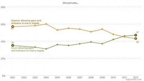
Regardless of your politics, this chart is a great example of how data can tell a story. It's a very simple graph by the Pew Forum on Religious and Public Life showing the changing attitudes about same-sex marriage. It shows that in the past couple of years, people have begun to be in favor of same-sex marriage. I'm showing this chart because it so clearly represents the story of the data. The eye is immediately drawn to where the "oppose" and "favor" lines cross. Other obvious choices for this data would have been a stacked bar chart or a side by side bar chart as shown here (which I created with the source data just as examples)... Via Lauren Moss

'It's about having a holistic, functional system.' To frame this series, I'd like to share with you the Two Things about web measurement. Since first thinking about this, I've revised them a few times, but I think I've settled here: I believe that if you stick to these two things as non-negotiable truths, you'll get the most out of the measurement you do...
Via Lauren Moss

Belle Chua's curator insight,
January 1, 2014 11:19 PM
Crafting your way to understand and making sense of web measurement
The demand for public data has been accompanied by a desire to present it in more visually appealing and easy to understand ways... Via Lauren Moss
|

Le logiciel de mindmapping Mindmeister 9 est sorti ce 9 janvier. J'ai testé pour vous cette nouvelle version qui mise l'essentiel sur l'ergonomie et le flat design. La nouvelle version de MindMeis... Via Marco Bertolini

Marco Bertolini's curator insight,
January 10, 2014 4:22 AM
Le nouveau MindMeister 9 vient de sortir. Mots-clés : design, élégance, et ergonomie ! 
pbernardon's curator insight,
January 10, 2014 4:38 AM
Merci à Marco pour pour ce retour d'expérience
This is my first slide deck designed to share. It reflects a summary and applied practice of some basic lessons learned about data visualization and information Via Baiba Svenca, Rui Guimarães Lima

Prof. Hankell's curator insight,
August 26, 2013 10:18 AM
Baiba Svenca's insight:
The author Sheila B. Robinson has put together her ideas about planning and designing a PowerPoint presentation with the focus on education. This slideshow is like another lesson in mastering PowerPoint presentation skills. 
Linda Allen's comment,
August 26, 2013 1:42 PM
Excellent advice and steps to follow for enticing presentations.
Linda Allen's comment,
August 26, 2013 1:42 PM
Excellent advice and steps to follow for enticing presentations.

Brainstorming, whether you believe in it or shun it, is a fantastic neologism. But as Frog Principal Designer David Sherwin has found, it’s also a very American word--one that doesn’t exist in every language. Today, Frog will release the Collective Action Toolkit, a free, 72-page booklet that seeks to develop a universal framework for people of all ages and cultural backgrounds to tackle big problems in their communities. Developed over the past year, the CAT contains nary a mention of design (or brainstorming). Instead, it relies on a simple vocabulary to describe skills like building a team, carrying out research, and developing solutions. Want to figure out a way to help people in your community eat healthier? Have an idea for a small business? The CAT offers templates for activities to help get the idea off the ground. Via ddrrnt
Interactive data visualizations are an exciting way to engage and inform large audiences. They enable users to focus on interesting parts and details, to customize the content and even the graphical form, and to explore large amounts of data. At their best, they facilitate a playful experience that is way more engaging than static infographics or videos. Several ideas and concepts of interaction design for data visualizations are presented in this post, using 11 examples from the web. The overall concepts featured include: The Basics: Highlighting and Details on Demand Making More Data Accessible: User-driven Content Selection Showing Data in Different Ways: Multiple Coordinated Visualizations Showing Data in Different Ways: User-driven Visual Mapping Changes Integrating Users’ Viewpoints and OpinionsVisit the complete article for numerous links, useful visuals and specific details on how to understand, implement and evaluate interactive design elements used in data visualization design. Via Lauren Moss

Hans's comment,
October 2, 2012 5:09 AM
Great article, I really like the idea of interactive information with details on demand. As an interaction designer I always try to balance content management and usability. Here are some interesting examples that made me consider a complete information surface vs a deep level on demand architecture.
Information graphics or “infographics” are graphic visual representations of information, data, or knowledge. Infographics help us absorb facts and figures in the most effective way possible. They come in extremely handy when you need to explain complex information, numbers or data rather quickly and effectively. One cool way to get inspired is to look at some of the best infographics out there. Infographics are an excellent way to add humor or irreverence to tell a great story in short possible way. However, infographics can be pretty hard to design since you have to gather together a lot of information and make it look good. Today we're to sharing the top places to see some great visual graphics and also find inspiration to create your own... Via Lauren Moss

Information graphics or infographics are graphic visual representations of information, data or knowledge. These graphics present complex information quickly and clearly, and are easy to understand. Infographics are sources of interesting information, when you are in need of some. Reading boring, long, colorless articles isn’t so attractive and interesting than reading and viewing facts and numbers in an illustrated way. Not only an illustrated way, but a very creative, attractive and super-appealing way. All of them have been designed not only to look good, but also to expose the maximum information and data possible. These infographics were made by some very talented designers, with creative minds and superb skills. While there are lots of really interesting and cool infographics on various topics, in this post we have only gathered awesome infographics which are of interest to web designers and developers... Via Lauren Moss
From Dr. Tom O'Connor's 'Methods of Research Course' http://www.drtomoconnor.com/3760/default.htm Via Lee Ballantyne
|


