


Le smartphone et l'IA convergent inévitablement ! L’occasion pour moi de faire le point/bridge à l’issue de nombreuses observations
Via Thierry Pires
Get Started for FREE
Sign up with Facebook Sign up with X
I don't have a Facebook or a X account


 Your new post is loading...
 Your new post is loading...
Your new post is loading...
Le smartphone et l'IA convergent inévitablement ! L’occasion pour moi de faire le point/bridge à l’issue de nombreuses observations Via Thierry Pires 
No comment yet.
Sign up to comment

Découvrez le portrait-robot du manager hybride, ses rôles et ses impacts pour les collaborateurs, le bien-être et le succès collectif Via Thierry Pires
Comment rendre les données publiques accessibles à tous les citoyens ? Comment les utiliser ? On en parle beaucoup depuis quelque temps déjà. Les données, Via Fidel NAVAMUEL

DocBiodiv's curator insight,
February 16, 2022 5:08 AM
Via FIDEL NAVAMUEL 16/02/2022 Présentation "Work With Data is an independent company primarily based in London, United Kingdom. We are data people who thrive to help everyone have a positive impact on the world we live in." @workwithdata Sur https://www.workwithdata.com/ testez la requête "biodiversity"

Découvrez comment l'intelligence artificielle développée par Knock Knock protège les systèmes d'informations en entreprise Via Thierry Pires
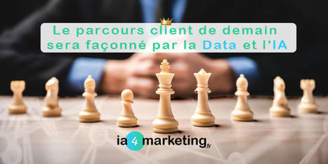
Découvrez comment envisager le nouveau parcours client en s’appuyant sur le cœur de l’approche Customer-Centric : la DATA et l’IA Via Thierry Pires

A recent study shows that if someone drops a USB drive, it will almost certainly be picked up, and there’s a nearly 50 percent chance it will be plugged in. Via Tom D'Amico (@TDOttawa)

Education leaders are calling for teachers to collect more and more data, but Justin Minkel argues that what really matters is what schools use their data for. Via Tom D'Amico (@TDOttawa)

The I Quant NY blog mines NYC's massive data clearinghouse to visualize issues facing city dwellers, from education to eating. Ben Wellington is the man behind I Quant NY, a blog dedicated to telling the stories hidden in New York City’s Open Data Portal, a clearinghouse of more than 1,300 data sets from city agencies. Started by the city government in 2011, the open data initiative’s goal is to facilitate government transparency and increase civic engagement. The blog itself comes out of a stats course Wellington teaches at Pratt Institute’s graduate program for city and regional planning, where he uses these data sets in coursework. Covering everything from gender divides in Citi Bike usage to finding the farthest point away from a Starbucks in Manhattan, Wellington’s larger mission is to get people thinking critically about the numbers that, if analyzed right, can be the key to understanding New York City. He spoke to CityLab about his blog, his hope for the open data movement, and some of his favorite data sets. Via Lauren Moss
During the past few years the demand regarding Data Info-graphics has increased in volume and demand as well as in clarity. The range of technologies available by which to collect and examine data is constantly on the rise- both in web and desktop applications, which provide several great interfaces. Within this scope, such new tools are continually emerging whose main purpose is to- simplify the process within being able to harness data in lending impact and insight generation... Via ghbrett, Lauren Moss
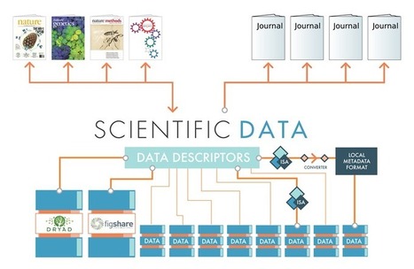
"Scientific Data to complement and promote public data repositories
Scientific Data will be a forum for publications about datasets, but will not be a repository for primary datasets. Primary data associated with Data Descriptors will be stored in one or more external data repositories. Why this distinction?
This strategy helps us draw some clear lines around the goals of Scientific Data. By ensuring that the primary datasets are stored in external systems, we make it crystal clear that our goal is to help authors publish content that promotes the scientific value and reusability of their datasets, not to control access to data. We feel that this is a progressive strategy that will help promote collaboration and data consolidation, rather than fragmentation" from source: http://blogs.nature.com/
#Scientific-Data #data #Open-Data #OpenData #Science #research #authors #scientists #collaboration #curation #metadata #publishing Via ghbrett

ghbrett's curator insight,
July 31, 2013 12:03 PM
This is an example of providing access to data & content. It presents a forum for authors to develop collaboration and data sharing rather than fragmenting research or keeping it embargoed. One result of such activities will be more rapid and wider dissemination of research to improve the knowledge base available to the scientific communities.

Andy Hobsbawm's (one of the founders of the business EVRYTHNG) business gives me a headache quite quickly as I struggle to imagine the implications of the humungous data generated by everything we touch. And then there's the data generated by mixing up the data with other data in order to create more data that predicts the future and reshapes our existence. Got that? Just a little scary, yes?
I don't mind my bike or my fridge talking about my habits but the implications of underwear or individual deodorants having their own Facebook page, or the web-of-things equivalent, is mind-boggling. What if - oh dear, how embarrassing - you don't appear to have a deodorant life? Too much information or not enough, either way as we become even more defined by our consumption this could get vicious. I can sense a lobby forming to say our rights are being eroded in ways that go way beyond what Google's done to us so far. Via ddrrnt

Data miningor “Knowledge Discovery in Databases” is the process of discovering patterns in large data sets with artificial intelligence, machine learning, statistics, and database systems.
Here is a simple but fascinating example of how data mining helped dissipate wrong assumptions and conclusions about girls, and take action with tremendous social impact. Via The Learning Factor
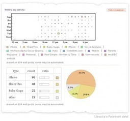
"Une analyse complète sou forme d'infographie de votre présence et de votre activité sur le réseau social Facebook. Un résultat impressionant fourni par le moteur Wolfram." Via Geemik Maria Açucena Da Silva
|
IA➃You la newsletter mensuelle by ia4marketing - ⚡✉ ☕ Votre RDV mensuel sur l'IA 🤖 et L'IA Marketing 🦾😉, bienvenue 🙏 et bonne lecture ! Via Thierry Pires

Découvrez des pistes d'utilisation du machine learning pour comprendre comment vos concurrents sont actifs sur le web et les réseaux sociaux Via Thierry Pires

Découvrez dans cet entretien d’Yuval Noah Harari, les profonds changements de l'évolution de l'homme liés aux progrès technologiques Via Thierry Pires
Et si votre ville était gérée par Google, qu'est-ce que ça changerait concrètement? Si les transports, les parkings et toutes les données publiques de mobilité étaient confiées à Google ? Ce n'est plus un épouvantail brandi par des opposants aux GAFAs : c'est une offre commerciale. Celle reçue par la ville de Colombus (Ohio, USA), récente vainqueur du Smart City Challenge, et que le journal Guardian a pu se procurer. Via PhCourcier
L’information des institutions est souvent dispersées dans différents systèmes et bases de données utilisant différents vocabulaires et termes spécifiques. ce qui est un frein à la mise à disposition des données. Via Lockall
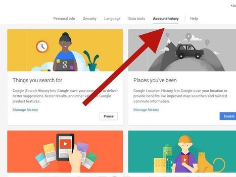
Here's what Google's sharing with advertisers about you, and how to get Google to stop. Via Tom D'Amico (@TDOttawa)
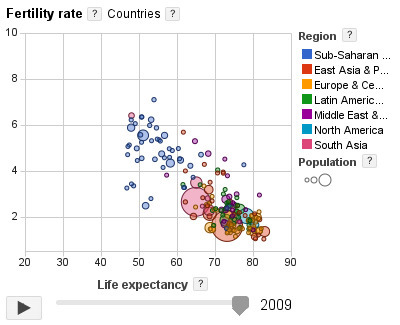
The Google Public Data Explorer makes large datasets easy to explore, visualize and communicate. As the charts and maps animate over time, the changes in the world become easier to understand. Via Patty Ball

Pete Warden is spot on about being sceptical of data, but it is data visualisation, not data science, where caution is most crucial Via NESS, Philippe Vallat

Even for the most direction-savvy New Yorker, emerging from the dark pit of the subway can be a disorienting experience. New York City streets are bright, they’re loud, oftentimes they’re smelly, and worst of all, maps are virtually non-existent. Or at least that used to be the case.
Just this week, the Department of Transportation unveiled its WalkNYC initiative, a program that will bring comprehensive pedestrian maps to all five boroughs. In a city where an estimated 30 percent of all trips are made by foot and one out of every three locals can’t tell north from south, they’re probably going to come in handy.
Though NYC’s public transportation is top-notch and we are technically on a grid, it’s easy to get lost or overwhelmed when traveling by foot. That’s why the DOT enlisted the help of PentaCityGroup, a consortium of urban planners, engineers, designers, cartographers and geographical information specialists, to solve the problem. Their goal? To create an information-packed map that would orient pedestrians and help them find the gems each NYC neighborhood has to offer. The first of these new information kiosks was installed earlier this week in Chinatown (they’re already located at every Citi Bike station), and it’s expected that others will be popping up in midtown Manhattan, Long Island City in Queens and Prospect Heights in Brooklyn this summer Via Lauren Moss

luiy's curator insight,
July 3, 2013 8:49 AM
If the style of these maps looks familiar, that’s because it is. The design team wanted to marry the current design to the graphic language that was was established for the subway system in the late 1960s. The typeface is still Helvetica (albeit with a slight twist–the type’s square dots are now round) and it uses the same organizational conventions (white type on a dark background). “All of this was deliberately echoing the way the subways look,” Bierut explains. “We wanted people to be able to ride the subway, come out and orient themselves.” Bierut says the design of the maps is meant to be accurate, trustworthy and friendly. But not too friendly—this is New York City, after all. “We wanted these things to be beautiful in a way, but also characteristic of the best of New York.”

Graphics, charts, diagrams and visual data representations have been published on books, newspapers and magazines since they've existed, not to mention old maps and scientific illustrations...
Despite the lack of tools such as the ones we have at our disposal nowadays, they are as inspiring and important as the best contemporary visualizations. Visit the article link for a gallery of vintage visualizations... Via Lauren Moss, Bucky Dodd

Charlley Luz's curator insight,
July 20, 2013 10:26 AM
muito legal, os Infográficos antes de existir a internet. 35 exemplos de infográficos no papel :) Achei falta do Marcha para Moscou do Minard http://www.datavis.ca/gallery/re-minard.php ; 
Leoncio Lopez-Ocon's curator insight,
July 20, 2013 2:57 PM
El brasileño Tiago Veloso, fundador de Visual Loop, nos ofrece 35 interesantísimas representaciones visuales de distintos fenómenos y eventos que permiten hacer un paseo por la historia de la ilustración científica.
For many data visualization projects, information comes from a source that has already done some aggregation. This is both a blessing and a curse. Aggregation definitely simplifies the analysis and visualization process, but it can also greatly reduce the visualization and analysis options. This is because aggregation often destroys connections in data. For this reason, it's critical to have an in-depth and thorough knowledge and understanding of the information from aggregated information. There are several different visualization techniques that open up once we have the original data, such as Euler diagrams and parallel sets.
The extra information that can be obtained from visualizations is important to gaining a full understanding of the data, and it can lead to a much more interesting story, as well as far better visualizations and more accurate connections and links within those visualizations. So, when gathering data about something, remember to dig deeper into it, as there are many important connections that happen within data that can provide knowledge beyond just a simple average or total.
To learn more about the value of these connections, sourcing accurate data, and how it is transformed into useful graphics, read the complete article and check out the case study used to convey the main points outlined above... Via Lauren Moss

kurakura's comment,
November 15, 2012 5:17 AM
the last graph on that page is really useful for understanding the data?
|


