Interesting links and articles related to IELTS, ESP, EAP and E-learning. Available to teach ESP, EAP, Research Skills, IELTS, TOEFL and General English.
TED Talks Map designer Aris Venetikidis is fascinated by the maps we draw in our minds as we move around a city -- less like street maps, more like schematics or wiring diagrams, abstract images of relationships between places.
This video touches on numerous themes that are crucial to geographers including: 1) how our minds arrange spatial information, 2) how to best graphically represent spatial information in a useful manner for your audience and 3) how mapping a place can be the impetus for changing outdated systems. This is the story of how a cartographer working to improve a local transportation system map, which in turn, started city projects to improve the infrastructure and public utilities in Dublin, Ireland. This cartographer argues that the best map design for a transport system needs to conform to how on cognitive mental mapping works more so than geographic accuracy (like so many subway maps do).
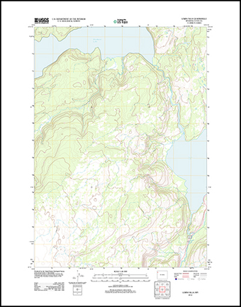
The last paper editions of USGS topographic masp came out in 1973 and 1992. If you are waiting for the next print edition, you'll be waiting a long time. Like so many other agencies with information distribution, the USGS topo maps have gone digital. In 2001 the USGS announced the production of a current, seamless digital National Map. You can still quadrangle chunks of the National map and download them for free as PDFs (with geospatial extensions for measuring).
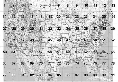
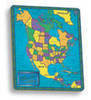
MapMaker Kit. Download, print, and assemble maps of the United States in a variety of sizes. The mega map occupies a large wall, or can be used on the floor.
Have you every wanted to create a giant map but aren't sure if you can logistically pull it off? The National Geographic's MapMaker kit is just that, a kit for you to create wall maps from a standard printer and tile them together. The assembly itself is a great spatial thinking and fun exercise for students (and there are large world maps as well).
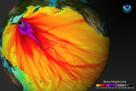
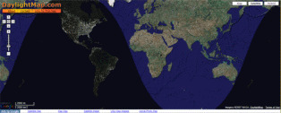
A time-lapse taken from the front of the International Space Station as it orbits our planet at night. This movie begins over the Pacific Ocean and continues...
This is an extraordinary view of the Earth that captivates students and often gives them a sense of awe and wonder for the planet we call home.
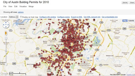
"Google Fusion Tables is an excellent way to create and share visualizations of data in map, chart, and tabular formats. Today we’re starting a new series of blog posts designed to get you up to speed with using this fantastic platform. We’ll also be releasing a free e-learning course called Bringing Data to Life with Google Fusion Tables to all our newsletter subscribers."
This is a video introduction to www.historypin.com which might just prove to be a very useful and important project. It's historical geography powered by collaborative mapping that is infused with social media dynamics. Backed by Google, they are geo-tagging old photos to recreate the historical geographies of all places and comparing them with current street view images. You can search by topic, place or date...this has the potential to be very big.
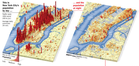
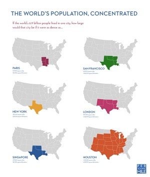
A great image for showing the pulsating rythmns of a dynamic urban system. We treat population density as a static metric, but how many people are in a given place would truly be difficult to fully quantify. What logisitic difficulties would this shift present for cities?
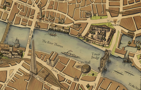
After featuring many very modern maps on Mapping London thus far, it was a pleasure to hear about the Grand Map of London, produced by a small bespoke mapping company...
The above image is a small extract of a Wellington's Travel Map of Central London. This gorgeous map accurately represents modern London, but has been beautifully rendered in the cartographic styles of the 1800's with some 3D graphic elements as well. Should you be interested in purchasing this 46 x 104 cm piece of art, visit:
Digital tools have faciliated an easier way to visually represent complex data and information in ways at are logical and intuitive. This blog post outlines tools that students can use (read: free!) along with basic tutorials to demonstrate their functionalities.
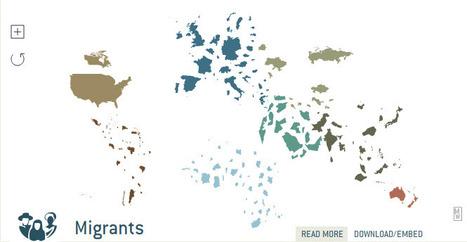
Not every state is equally impacted by migration, and the demographic profile of migrants is different for every state. This is an online mapping tool to search a large database that can give the user state specific information about the impact of economics and politics based on migration from Latin America and Asia on any given state.
Tags: Immigration, unit 2 population, migration, economic, statistics, mapping, political.
This map shows the population of migrants in certain states and compares them to other states. This demographic specifically highlights Texas and shows its migrant information. Texas has the highest immigrant income out of all of the states. Also Texas has very few naturalized citizens who used to be an immigrant.
This map relates to unit 2 because it shows the illegal immigration. And immigration theories. This proves ravensteins laws correct because it shows how people move a short distance to migrate, knowing that most migrants to America come from Latin America. This map is a great example of ravensteins theories and unit 2
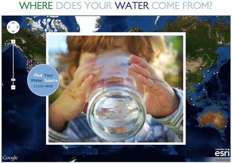
This interactive map documents where 443 million people around the world get there water (although the United States data is by far the most extensive). Most people can't answer this question. A recent poll by The Nature Conservancy discoverd that 77% of Americans (not on private well water) don't know where their water comes from, they just drink it. This link has videos, infographics and suggestions to promote cleaner water. This is also a fabulous example of an embedded map using ArcGIS Online to share geospatial data with a wider audience.
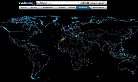
The Brazilian government's geographic department (Instituto Brasileiro de Geografia e Estatística-roughly equivalent to the U.S. Census Bureau) has compiled an fantastic interactive world factbook (available in English and Spanish as well as Portuguese). The ease of navigation allows the user to conduct a specific search of simply explore demographic, economic, environmental and development data on any country in the world.
"Mapping is a huge and growing sector, from social maps for sharing with friends, to mashing up Google Maps in every possible way."
You know that the technology exists for you to link your online information with maps...but not sure how to go about it? This link from mashable.com lists over 50 sites that specialize is visually representing your data, information or projects. Online mapping is not just for the experts, but being democratized ...online mapping for the masses!
This is an very intriguing map that shows different urban layouts and applies the concept of population density at the city scale and compares it to the global population. What is everyone lived in the city of New York (at New York's population density)? How big would that city be?
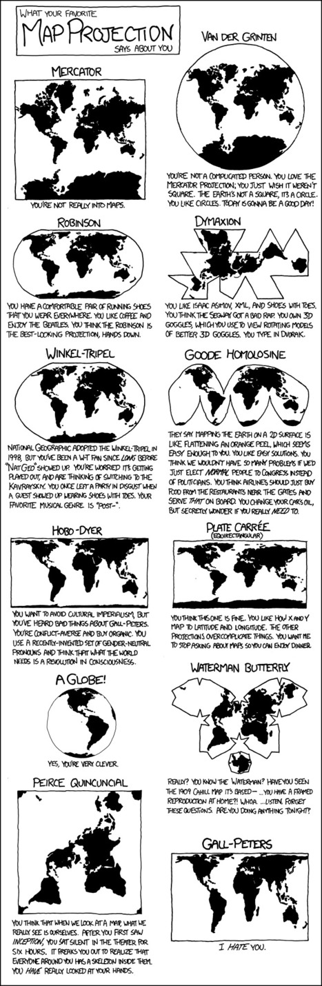
This cartoon strip shows the different types of map projections, and has a caption of what your personality is like if you like the map projection.
I thought this was really funny, especially the caption for the Peters Projection. I'm a Robinson for sure, because I just like the way it looks. I think all the different types of maps are good and useful in their own way, even the Peters... I guess...
We also learned all the different types of map projections in class, which helped me recognize these maps. This is also a humorous way for people who don't know the different map projections to learn it while still having a fun and good time. Maps are an important element in APHUG, because everyone should know how to read maps. It's part of Unit 1, because it shows the landmasses, and some maps can show different perspectives on things.
This quirky and humorous map will help the students in next year's APHUG class the different map projections, while having fun and finding out their personality that goes along with the different maps.
This is a good overview of some different types of map projections and it has some humor too! I like how all the different types of map are all in one place. Also, each picture is fairly detailed so that I can really see how one map is different from the next. I'm hoping this will be a good study tool in studying for the AP exam if there are any questions about different types of map projections.
Encyclopedic entry. A geographic information system (GIS) is a computer system for capturing, storing, checking, and displaying data related to positions on Earth’s surface. GIS can show many different kinds of data on one map.
This informative webpage (and accompanying features) simply answer the question, "What is GIS and how is it a useful way to work with spatial data?"
Learn about the world by changing the familiar map. Select a subject from the top menu and watch the map resize. A countrys total area no longer represents land mass, but items relevant to the subject (i.e.
The geovisualization in this interactive map is outstanding (translation: I could play with this all day). This displayed map shows the destination countries for migrants, with links to the data and information to read up on the topic. Truly impressive. For the live link, see: http://show.mappingworlds.com//world/?lang=EN
"Ever since London mapmaker and engraver John Spilsbury pasted one of his maps on a sheet of hardwood and cut it into small pieces with a marquetry saw (circa 1760), jigsaw puzzles have been used as a tool to teach children geography. Today, they are still a fun way for kids to learn more about their own country as well as the nations of the world."
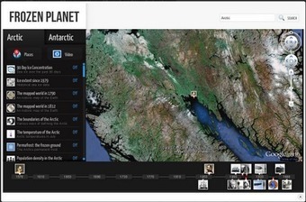
Very cool way to explore the colder realms of our planet. This web-based "Google Earth-like" resource comes preloaded with layers (ice extent, temperature, permafrost, biogeography, etc.) that would make for a great interactive lesson for many grade levels.
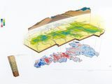
The Spatial History Project at Stanford puts together some fantastic geovisualization that is an awesome site that allows you or your kids to spatial and temporally the diffusion of Nazi concentration camps. It has some clickable 'GIS-like' layers to help students contextualize the data and to make some important interdisciplinary connections. Originally spotted on http://ushistoryeducatorblog.blogspot.com/
To get content containing either thought or leadership enter:
To get content containing both thought and leadership enter:
To get content containing the expression thought leadership enter:
You can enter several keywords and you can refine them whenever you want. Our suggestion engine uses more signals but entering a few keywords here will rapidly give you great content to curate.


 Your new post is loading...