

"As regular readers know, for the past fourteen years I’ve been publishing about twenty-five different annual lists highlighting the best educational resources around (along with tons of…"
Via Leona Ungerer
Get Started for FREE
Sign up with Facebook Sign up with X
I don't have a Facebook or a X account


 Your new post is loading...
 Your new post is loading...
Your new post is loading...
"As regular readers know, for the past fourteen years I’ve been publishing about twenty-five different annual lists highlighting the best educational resources around (along with tons of…" Via Leona Ungerer 
No comment yet.
Sign up to comment
![How to Create an Infographic in Under an Hour [+10 Free Templates] | Help and Support everybody around the world | Scoop.it](https://img.scoop.it/jKldflV4zNqvqJirZoFfwTl72eJkfbmt4t8yenImKBVvK0kTmF0xjctABnaLJIm9)
Wouldn't it be great if creating infographics was just as simple as writing regular ole text-based blog posts? Unfortunately, the reality is that making visual content like this usually takes a lot more time, effort, and let's face it -- skill -- than the written word.
Usually.But considering the popularity and effectiveness of visual content in marketing today, you can't just afford to throw in the towel. That's why we decided to take all the pain and suffering out of infographic creation.
Seriously -- don't throw in the towel just yet. You, too, can create professional-looking, high-quality infographics ... quickly! And I'm going to prove it. First things first ... Via Jeff Domansky

Carmen Ramos's curator insight,
April 12, 2015 12:36 PM
Infographiken erstellen einfach gemacht, mit Power Point 
Lori Wilk's curator insight,
April 14, 2015 10:04 AM
It's great to have tools to make your more #effective and #efficient that allows you to improve your #productivity. Execellent to help us to learn about creating #infographics

Mery Elvis Mt's curator insight,
October 7, 2015 8:34 PM
Crear infografías genera un alto engagement, aprende como hacerlas en menos de 1 hora

Content is the king, everyone knows that. But what makes content looks better? Content is no longer just text. It is important to make visual content because human brain process visual information much faster than text. With infographics, you can make complex and boring data interesting. However, illustrative infographics come at a price: Creating good infographics is extremely time-consuming. So we collected some great tools to easily create interesting infographics. Here are my favorites to create your own, great infographics and visual contents (without Photoshop!). Via The Learning Factor

The Learning Factor's curator insight,
February 3, 2015 4:23 PM
Here is a list of some great tools to easily create interesting infographics. 
Dean Ryan G. Martin's curator insight,
February 4, 2015 12:17 AM
These are very useful tools. Thanks for sharing! 
Robyn Haydon's curator insight,
February 4, 2015 10:35 PM
Infographics aren't just for websites! Here are some easy to use tools to integrate infographics into your reports, presentations and proposals.

Vizalizer simplifies the creation, analysis and generation of data visualization through a Social Network that brings together publishers with colleagues and readers, to create content for its analysis and discussion, use in presentations, publications... Via Baiba Svenca

Baiba Svenca's curator insight,
July 9, 2013 3:01 PM
Vizalizer is an interesting tool that lets you create infographics and data visualizations. In my opinion, it is more suitable for business but ingenious people may find how to use it in education as well. The basic version is free but it has limitations.
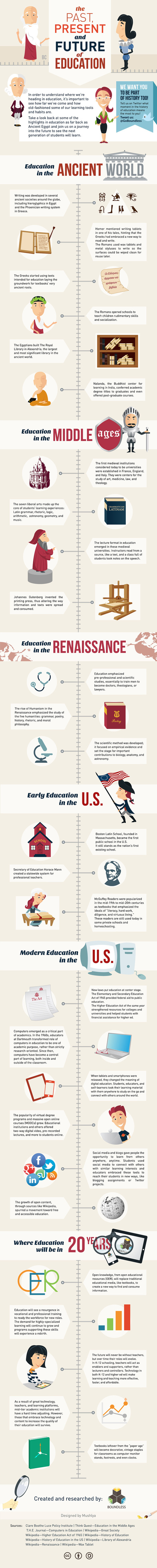
The folks at Boundless who last brought us the EdTech Buzzwords Infographic are back with The History of Education. The graphic takes a look at how formal education began, changes along the way, current day and predictions for the next twenty years. Via Gust MEES, Karen B Wehner, Maribel Bañares, juandoming, Paulo Faria, Sandra V. Barbosa

Michael Stapleton's curator insight,
March 19, 2013 10:30 PM
The folks at Boundless who last brought us the EdTech Buzzwords Infographic are back with The History of Education. The graphic takes a look at how formal education began, changes along the way, current day and predictions for the next twenty years. 
Shelli Herseth's curator insight,
December 4, 2015 12:41 PM
A cool infographic on the history of education! #edlt561

Data visualization is not a new phenomenon. For centuries, artists and historians, educators and scientists have been creating illustrations to better communicate complex information.
From Emma Willard’s “Picture of Nations” to Dimitri Mendeleev’s Periodic Table, historical infographics continue to inspire and educate today. Here is a look at some of the most influential and beautiful infographics from the 19th century... Via Lauren Moss
Robin Good: Here is a handy short guide to nine free infographic creation tools that can be utilized to create enticing visuals, word charts and data-based infographics without having special technical skills.
Useful. 8/10
Check them all out: http://www.infographicsarchive.com/create-infographics-and-data-visualization/ ;
(Unearted by Andres Taborga) Via Robin Good

Sahana Chattopadhyay's curator insight,
May 4, 2015 11:59 PM
Infographics are great tools to present curated and focused content from a specific perspective. |

A list of visual content types you probably haven't tried yet, from cinemagraphs and progress GIFs to interactive sliders and mixed-media infographics. Via Baiba Svenca
Baiba Svenca's curator insight,
October 27, 2016 3:43 PM
Fantastic visuals + tips how to create them.
Data is crucial. However, displaying a chunk of plain data can be monotonous. Infographics visualize plain data and make it visually more appealing. Data turned into infographic has a higher potential to go viral and be effective. While many of us are designers who can design amazing infographs, Infographic Generators can come in handy to Designers and non-designers alike. They can be a time saving resource. Via The Learning Factor
The Learning Factor's curator insight,
March 1, 2015 3:51 PM
Here is a list of 17 fantastic Infographic Generators. 
Renee Kar-Johnson's curator insight,
May 12, 2015 11:27 AM
Positive: works well with a lot of content, will work well for social media, colorful and very eye appealing Negative: doesn't have a title, a little confusing information

Professional infographic designers rely primarily on a core vector graphics software program to create their infographics designs. The main advantage is that all the icons, charts, images, illustrations, and data visualizations are treated as separate objects that can be easily moved, resized, overlapped, and rotated. Via Baiba Svenca

Melissa Marshall's curator insight,
October 15, 2014 12:56 AM
These tools are mostly web-based and provide ways in which students can visually represent their ideas. 
Stephan Hughes's curator insight,
October 21, 2014 9:27 AM
Getting students to create infographics and using them ourselves to present information are more than justifiable reasons for these kind of tools

Ken Dickens's curator insight,
April 19, 2013 1:54 PM
Company's are creating infographics to tell their story. Individuals are doing the same to get hired. Shouldn't non-profits be doing this too? Yes, you should. Find a Photoshop Volunteer and make this happen! -Ken

Sonya Nikolova's curator insight,
June 30, 2013 3:01 AM
Because in the current stagnated job market, you have to stand out!

Ness Crouch's curator insight,
February 6, 2013 1:39 AM
Very interesting summary of social media in schools. What sort of tools does your school utilise? 
Robert Blair's curator insight,
February 14, 2013 2:02 AM
I think that this is such a great visual for my generation. It is so representative of how we rely, and use technology to demonstrate common core values in the classroom. This is great but it also could be our achilles heel, we need to apeal to all types of learners and visual is just one, there are so many more type that must be catered to so that we can be affective.
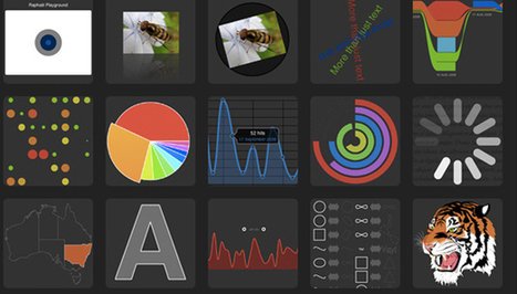
From simple charts to complex maps and infographics, Brian Suda's round-up of the best – and mostly free – tools has everything you need to bring your data to life... A common question is how to get started with data visualisations. Beyond following blogs, you need to practice – and to practice, you need to understand the tools available. In this article, get introduced to 20 different tools for creating visualisations... Via Lauren Moss, Baiba Svenca, Timo Ilomäki, AvatarGeneration

Randy Rebman's curator insight,
January 28, 2013 12:33 PM
This looks like it might be a good source for integrating infographics into the classroom. |


![Social media for teachers [Infographic] | Help and Support everybody around the world | Scoop.it](https://img.scoop.it/8bn7TFef-UB428kxYiTitTl72eJkfbmt4t8yenImKBVvK0kTmF0xjctABnaLJIm9)


