Design, Science and Technology
45.7K views | +4 today
Follow
Design, Science and Technology
#ideas #design #science #technology #inspiration #media #information
Your new post is loading...
Rescooped by Antonios Bouris from Curation, Social Business and Beyond
Scoop.it!

Editing Tips That Will Improve The Quality Of Your Writing

Editing Tips That Will Improve The Quality Of Your Writing | Design, Science and Technology | Scoop.it
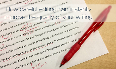
Careful editing can make such a difference to your writing, as there is so much more to think about than just spelling, grammar and sentence construction.

Via janlgordon
janlgordon's curator insight, April 18, 2017 8:45 PM

I selected this article from Curatti written by Alice Elliott because she explains the importance of carefully editing your blog posts.


Improve your writing with quality content.


How to Effectively Edit Your Articles


It's tempting to hit the publish button right away after writing a blog post. I agree that in order to make the best of it you need to carefully look your copy over first.


Elliott explains the process of how to edit your articles and improve your writing at the same time.


Here's what caught my attention:


  • It's important to first do planning and research before the writing begins. Use an outline of the structure with a beginning, middle, and end.


  • After writing a post give yourself some time to process it. Save the editing process after you have completed your article.


  • Read your completed work out loud to yourself. Notice the flow of the piece, and whether there were any mistakes you may have missed.


Selected by Jan Gordon for Curatti covering Curation, Social Business and Beyond


Image: Courtesy of Alice Elliott.

.

Read full article here: http://ow.ly/qtpb30aY16P


Stay informed on trends, insights, what's happening in the digital world become a Curatti Insider today

Ante Lauc's curator insight, April 20, 2017 3:03 AM
With curatti.com GAU will be better project.
Charlie Dare's curator insight, April 21, 2017 9:48 AM
From curator~ " Elliott explains the process of how to edit your articles and improve your writing at the same time. Here's what caught my attention: It's important to first do planning and research before the writing begins. Use an outline of the structure with a beginning, middle, and end. After writing a post give yourself some time to process it. Save the editing process after you have completed your article. Read your completed work out loud to yourself. Notice the flow of the piece, and whether there were any mistakes you may have missed.
Rescooped by Antonios Bouris from Must Design
Scoop.it!

Presenting SEO For Web Designers @HaikuDeck Today @AmerUnderground in Durham 10 - 11

Presenting SEO For Web Designers @HaikuDeck Today @AmerUnderground in Durham 10 - 11 | Design, Science and Technology | Scoop.it

SEO For Web Designers
Web designers are where rubber meets road for Search Engine Optimization, but it is unrealistic to expect designers to become SEO experts. This Haiku Deck sets reasonable expectations and outlines a handful of technical SEO best practices sure to help any web designer understand the most Darwinian of practices - today's SEO.  


Via Martin (Marty) Smith
No comment yet.
Rescooped by Antonios Bouris from Must Design
Scoop.it!

Picasso At The Beach and The NEW Art of Web Design

Picasso At The Beach and The NEW Art of Web Design | Design, Science and Technology | Scoop.it

PicassoHead App
Sharing this cool "draw a "Picasso Head" app (my PicassoHead http://www.picassohead.com/?id=5290a28#.VBCfth1bqjo.twitter ) to illustrate a few of our favorite web design concepts such as:

* DO LESS and let them DO MORE (them = customers, visitors, advocates_.
* GALLERIES ROCK - especially when your gallery is chock a block full of User Generated Content (UGC).
* Engagement Rocks - do you have a tool that is fun to use AND promotes positive site heuristics such as time on site, pages viewed, lower bounce?
* Every product, idea or website starts about the creators and must become about those who visit and love it.
* People love what THEY create and contribute more than what you do.
* This means all web design is or will be about collaboration.

We love the simplicity of this little app, but the even COOLER riff came from our confirming email. This is the email that shares the link where my Picasso At The Beach drawing lives (linked from this post http://www.picassohead.com/?id=5290a28#.VBCSuy4Lksk.twitter ) and where this little pitch lived:

"This summer check out Picasso Looks at Degas at the Clark in Williamstown, MA. You won’t want to miss this groundbreaking, Clark-exclusive exhibition that is the first to look at Pablo Picasso’s deep fascination with Edgar Degas.

http://www.clarkart.edu/exhibitions/picasso-degas/ "

Wow, cool idea. Create a little art based app and sell related links in the confirmation email. That's brilliant marketing, subtle marketing and the art of web design. Kudos to Picassohead creators RFI Studios, http://www.rfistudios.com.

#toogood


Via Martin (Marty) Smith
Rescooped by Antonios Bouris from Must Design
Scoop.it!

Top 10 Mistakes in Web Design

Top 10 Mistakes in Web Design | Design, Science and Technology | Scoop.it

The 10 most egregious UX offenses against users. Web design disasters and HTML horrors are legion, though many usability atrocities are less common than they used to be.

Marty Note
If you took a day and fixed any of these Top 10 Web Design Mistakes That Apply you would make 50% more this holiday season. These are "cost of poker" fixes that can easily remain for years and years. Every year one of these mistakes exists your website is 10% less effective.

When you make 2 or more of these mistakes you pay with an order of magnitude more pain for each added mistake so 2 mistakes doesn't cost you 20%. No 2 mistakes cost you 200% of what your website could be doing for you.

Fix all 10 of these basic problems and your site is on its way to its "mission critical" place in your company.


Via Martin (Marty) Smith
Rescooped by Antonios Bouris from Must Design
Scoop.it!

7 Basics of Great Website Design Are NOT What You Think

7 Basics of Great Website Design Are NOT What You Think | Design, Science and Technology | Scoop.it

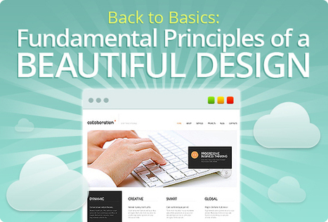
The purpose of this post is not just to present the state of today's web design - it’s more pragmatic. Seven basic principles of a good web design are presented here.

Marty Note
This is a great post about what web design IS and IS NOT. I'm going to include my notes here so they follow the post since the writing, though brilliant, is not as direct as I like. Here are my much more direct interpretations of the 7 Basics of Great Website Design:


1. Website Design Can’t Win, But You Can Sure LOSE Due to It.
We've past the period when shinny websites work. Every website has seconds before a visitor clicks off to find what they are looking for on some other website.

2. Create Website Surfaces For Scanners and Skimmers since Readers will work for what they want.
Key to know not all information is great for "scanning" and "skimming". Tease the click don't drown it is another way to think of this idea. Also, content such as news, Q&A and testimonials have more attention hooks than sharing complex or highly detailed material. If your website depends on sharing complex and highly detailed content tease it with snippets and with graphics firs.


Stay with simple, clean and useable as your guide.

3. Avoid NEW until it is UNDERSTOOD.
You don't have to wait until some new thing is old hat, but avoid using The New simply because it is new. New hurts conversion because it requires explanation and is hard to tease since visitors don't have "made to stick" context. If you must present "new" present with an "old" analogy.

Read Made To Stick by Heath brothers for more.


4. Confused customers do many things, BUYING and CONVERTING and never among them.

5. Hierarchy of information and navigation is LIFE online.
People know there is a YOU or a team behind your design. They want to know what YOU want them to DO and why they should do it with YOU. Sites that make the curator's hand visible via navigation, images and copy win. Those who challenge visitors to figure everything out for them selves lose.

This is NOT to say some mystery can't work in a web designer's favor, but make sure the mystery is immediately solved before posing another one. Daisy chain one mystery on another and visitors get frustrated and leave since benefit doesn't equal the work to realize it.

6. Colors can ruin a website.
Colors have so many overt and covert signals they should be used sparingly and consistently with the brand. If you use RED for a Zen website do so in accents and carefully since red is an ALERT color and so may be inconsistent with the brand.


7. Devil is in the web design details.
In my almost 15 years of experience NOTHING on this list is more true. Once you make a website simple and clean any small dissonance becomes LARGE because it sticks out like the proverbial "sore thumb". Make sure your site is a smooth surface with a clear message.


Via Martin (Marty) Smith
Martin (Marty) Smith's curator insight, November 29, 2013 1:38 PM

One of the best posts about website design I've read in a long time. So much of what WE think is "website design" either "was website design" or is more an expression of someone's ego than what is happening NOW. This post is one of the best "what is happening now" in website design articles I've read. M

Rescooped by Antonios Bouris from Must Design
Scoop.it!

Gamification - Designing for Engagement

Gamification is fundamentally rewriting the rules of engagement and design. We can leverage its techniques to create unprecedented connections with our customer

Via Martin (Marty) Smith
Martin (Marty) Smith's curator insight, June 1, 2013 8:12 AM

Building Engagement In

There are ways to BUILD engagement into a website's design. Here are three secrets to promote engagement not included in this excellent Slideshare:

* Place Email Subscription High Up and Prominent. 
* Include curated User Generated Content on every page.

* Create CTAs with CONTRAST.


Email Subscriptions
When your "Subscribe To Our Email List" Call to Action is high on the page in a Can't Miss It spot you communicate a clear "we want YOU" signal. 

UGC Everywhere
When you curate User Generated Content to your site you communicate how well you listen and care for community members. The website isn't all about YOU and what you think the inclusion of UGC says.


CTAs
I see to very common mistakes in websites I'm asked to review as Director of Marketing for Atlantic BT in Raleigh (http://www.atlanticbt.com ): NO CTAs or poorly contrasted CTAs. I PREFER CTAs to be buttons and usually test red, orange or green (depending on the background color). I'm convinced there is no ONE magic CTA color but the contrast is what makes a Call To Action helpful or not, clicked on or not, converting or not.  

Michael Allenberg's curator insight, June 2, 2013 7:17 AM

Engaging and experience should always go hand-in-hand, regardless of the implementation.

Rescooped by Antonios Bouris from Curation, Social Business and Beyond
Scoop.it!

Boost Your Website SEO in 4 Ways

Boost Your Website SEO in 4 Ways | Design, Science and Technology | Scoop.it
There are so many things you could do on your website to get more visitors and traffic. Here are 4 tips to improve your website SEO

Via janlgordon
janlgordon's curator insight, February 22, 2017 6:18 PM

I selected this article from Curatti written by Ashley Faulkes
 because it shows you how to boost your website traffic.


Unusual methods that will attract visitors to your landing page.


4 Ways to Increase Website Traffic


In order to get more visitors online you need to have the right strategies in place. I agree that by paying attention to what Google is telling you and discovering any issues with your website can be very helpful.


Faulkes provides unique strategies you can use to improve your traffic.


Here's what caught my attention:


  • Google will let you know what kinds of keywords you are ranking for as well as your page rank. This can help you discover what is working and what is not.


  • Use your main keywords on your homepage. These will show up in Google's search results.


  • Add amazing free images that Google will pick up on. This attracts more readers and visitors, and are very easy to find on places like Unsplash and Pixabay.


Selected by Jan Gordon for Curatti covering Curation, Social Business and Beyond


Image: Courtesy of Pixabay.


Read full article here: http://ow.ly/kALa309gFUL


Stay informed on trends, insights, what's happening in the digital world become a Curatti Insider today

Rescooped by Antonios Bouris from Must Design
Scoop.it!

30 Black And Blue Web Designs Inspire [examples]

30 Black And Blue Web Designs Inspire [examples] | Design, Science and Technology | Scoop.it

Details of the website as featured within CoolHomepages web design inspiration gallery.

Marty Note
Blue is a great color. There is a reason blue is many of your visitor's favorite color. Online blue is soothing, easy on the eyes and beautiful against black. My favorite is the UK design "un.titled.co.uk" (used as the image above).

Love using opacity to "hide" things in plain view as that kicks in the curiosity of visitors and gets the click. Current Un.titled site isn't as interesting or special as the design noted here. . Love blue online and these examples show why.


Via Martin (Marty) Smith
Rescooped by Antonios Bouris from Must Design
Scoop.it!

7 Web Design Disasters Drive People Crazy

7 Web Design Disasters Drive People Crazy | Design, Science and Technology | Scoop.it

A poorly designed website has real impacts, whether page views or sales. We won't hesitate to bounce away to another with a better user experience.

1. Requiring users to signup before browsing your site
2. Forgetting about multiple screens
3. Having ridiculous forms to fill out
4. Using hard to read or cutesy fonts
5. Implementing a Search bar that sucks
6. Bombarding the reader with a wall of text
7. Displaying your products with low-res images

MS - 8 Non stop animated gifs (you will discover what I'm talking about)

Marty Note
Agree with all 7 of these annoying disasters and would add an 8th - too many animated gifs all running at the same time with NO STOP.


Via Martin (Marty) Smith
Rescooped by Antonios Bouris from Must Design
Scoop.it!

10 Visual Web Design Mistakes To Avoid

10 Visual Web Design Mistakes To Avoid | Design, Science and Technology | Scoop.it

Don't Make These 10 Web Design Mistakes

1. Don't Use Flash.
2. Careful with fonts easy to do bad.
3. Text over images - Not So Much.
4. Too Many Ads.
5. No Clear Call To Action.

6. Too much text (break up with graphics or multiple pages).

7. Bad link colors.

8. Popups suck (don't do it).

9. Tiny font size.

10. Long paragraphs especially problem longer the post.  


Via Martin (Marty) Smith
Monica S Mcfeeters's curator insight, April 6, 2014 6:08 PM

Quick list to refer to and avoid some Web Design mistakes.

Rescooped by Antonios Bouris from visualizing social media
Scoop.it!

Design With Impact: A Guide to Webpage Anatomy

Design With Impact: A Guide to Webpage Anatomy | Design, Science and Technology | Scoop.it

Find out all the tips on how to design an impactful webpage with the Graphitas’ infogaphic, Design With Impact: A Guide to Webpage Anatomy.  See what you can and can’t live without on your webpage with the Impact-O-Meter.


Via Lauren Moss
Ellyn Winters's curator insight, June 19, 2013 8:30 AM

Very cool infographic showing the high impact marketing rationale behind today's modern web design methods. 

Laurence Segbo's curator insight, June 19, 2013 9:10 AM

Pour faire de belles infographies... une alternative à infogr.am

Louise Robinson-Lay's curator insight, June 20, 2013 5:07 AM

How to use design to help make a website more appealing.