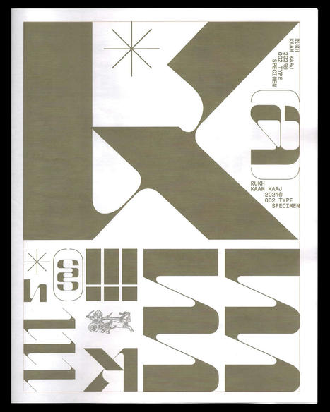

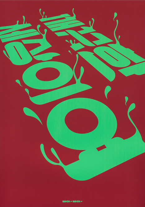
We speak to Mohammed Samad and Bouk Ra of Kaam Kaaj about the process of designing its typeface inspired by a plethora of cultural design references.
Read the full article at: www.itsnicethat.com
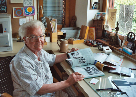
Via ECAL Library
Get Started for FREE
Sign up with Facebook Sign up with X
I don't have a Facebook or a X account


 Your new post is loading... Your new post is loading...
Read the full article at: www.itsnicethat.com Via ECAL Library 
No comment yet.
Sign up to comment
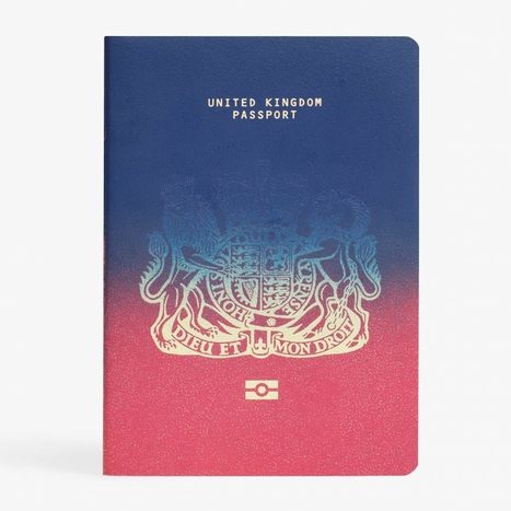
Last week saw the judging for our unofficial Brexit passport design competition... here is a look at the nine proposals shortlisted by our judges.
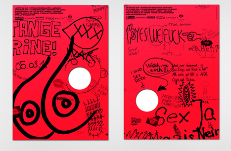
"La Fête du Slip":http://www.lafeteduslip.ch/2016/en/home/ is an annual event in Switzerland that aims to convey a “positive and celebratory approach to sexualities,” and through a series of creative events it addresses ideas surrounding gender, body image and sex. While the festival is an important event, which covers many issues, there’s a tongue-in-cheek flavour to the whole programme. As such, Berlin-based studio Dual Room has adopted a similar mischievous approach for the identity that's been inspired by the glory hole – a universal cavern, devoid of judgement.
Swiss typographer Adrian Frutiger, designer of typefaces including Univers, Avenir and the eponymous Frutiger, has died.
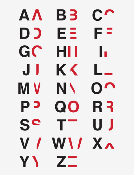
by breaking down and reassembling the alphabet into layers, daniel britton attempts to show how impairing the condition can be.
It’s tricky to implement the intricate tricks of an optical illusion in a book cover design without the finished product appearing slightly heavy-handed, but designer Hansje van Halem does it with poise and perfectionism. She’s worked as a freelance graphic designer since graduating from Amsterdam’s Gerrit Rietvield Academie in 2003 (as her About section explains) and her enjoyment of what others might find to be repetitive shines through in the illusory patterns in her portfolio.
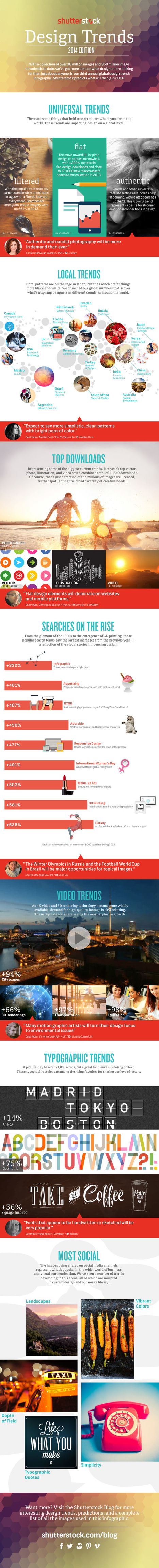
'One of our favorite annual traditions at Shutterstock is sharing our hard-earned design-trend data with the world. For this, our third annual infographic, we used data from our 350 million all-time downloads to explore recent and emerging trends from around the globe. Check out the infographic at the link, and scroll on to view a lightbox featuring images showcased in the design. Via Lauren Moss
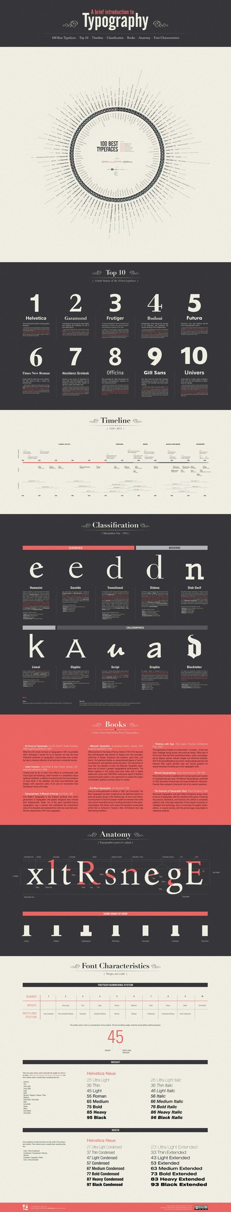
Typography is a key element of any graphic design. Any computer contains hundreds of pre-installed fonts to choose from and there are dozens of websites with thousands of free fonts, just some minimal knowledge and aesthetic taste.
This infographic intend to explain the basics of typography and disseminate the “best” ones that always work without too much complications. Take short walk through this fascinating world... Via Lauren Moss

Georgia Gibbs Design's curator insight,
April 19, 2013 8:05 PM
The lines in any face tell an interesting story and choosing the right type will help you to tell your own. 
Greg Andrade's curator insight,
October 11, 2013 10:09 PM
This is typography 101. These are some of the typography basics I teach my students. There are many other good articles pertaining to all types of design from architecture, furniture and of course graphic design.

Adam Atodl's curator insight,
January 18, 2013 4:51 PM
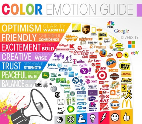
Color is very important to brand recognition. Scientists and researchers believe certain colors make us feel a certain way about something like this infographic by The Logo Company suggests. Red : Excitement, Youthful and Bold. |
Curated by a team of US-based Eastern European designers, The New Exhibition connects artists caught in the crossfire of war directly with art directors and agencies in the West.When a team of designers at design company Collins began researching portfolios for an online directory of Ukrainian creatives, they noticed something striking. “The style of many illustrators has completely shifted since Russian tanks rolled across the border into Ukraine,” says the team behind The New Exhibition, launched by Collins. It is but one of many creative revelations that have come out of the research process behind the new project, The New Exhibition – an ongoing online resource that features artists from across the creative world. Read the full article at: www.itsnicethat.com Via ECAL Library
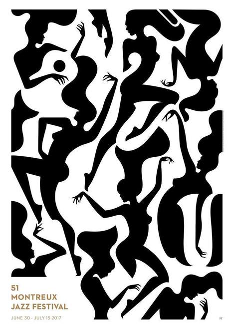
The Montreux Jazz Festival gave carte blanche to French illustrator Malika Favre to create the poster for the 51st edition.
Milton Glaser is ready to talk ethics. It’s not the first time, either. Ours is one of a few recent interviews with the graphic designer and creator of the _I ❤ NY_ logo, in which he addresses some of the moral demands of his trade – questions of whether graphic design ought to compromise its integrity for the sake of meeting a client’s demands. On the subject of advertisers and the designers who work for them, Glaser is clear. “Your obligation is to the client, and not necessarily the public. In some cases, you’re encouraging people to buy things that they don’t need, or encouraging them to move in a direction that does not serve them. Frequently in advertising – and PR and journalism as well - we have to persuade people to do things that we don’t really believe in and that they don’t really believe in. Should you participate in something that encourages people to do something that is not good for them? I consider that a core question for journalists and practitioners of graphic art, but it’s too frequently overlooked because it is too painful to answer."
The french public will discover the eclectic mix of styles, tastes and creations and the contemporary brilliance of this astounding artistic heritage still little known in europe. The intriguing and fascinating megalopolis that seoul is today is a cultural melting pot and above all a centre of creative effervescence whose trends are followed closely on the international design and fashion scenes.
From font pairing and scale, to alignment and white space, let this ultimate guide help you through the pits and peaks of the graphic design process. Via Jeff Domansky

Jeff Domansky's curator insight,
December 11, 2014 8:31 PM
Very useful design tips for bloggers and social marketers.

Pop Chart Lab's latest poster pays homage to the most important eras in graphic design. Start at the top, left-hand corner, of A Stylistic Survey of Graphic Design, and read from left to right. Each era (say, Arts & Crafts or Art Nouveau) is represented by a rectangular box that includes several squares that graphically represent the style described. The Modern movement, one of the largest movements depicted here, includes Bauhaus, Vorticism, De Stijl, New Typography and Istotope, Constructivism, Suprematicsm, and Futurism. Pop Chart creates, within each stamp-sized box, a visual representation of that particular style, with the design elements that prevailed at the time. So the Constructivism box echoes the intense Soviet Party posters from the 1920s, the Futurism box has a bold, attention-grabbing arrow on it, and so on. Via Lauren Moss
![Website Design Projects Timeline From Research To Testing [infographic] | Design, Science and Technology | Scoop.it](https://img.scoop.it/KmYc6GekuduKzrZ_joBL7zl72eJkfbmt4t8yenImKBVvK0kTmF0xjctABnaLJIm9)
This great infographic takes you through the initial engagement stages for new website design work, through research, landing page design, coding, validation onto final launch and search engine optimi Via Martin (Marty) Smith

Martin (Marty) Smith's curator insight,
February 7, 2014 12:06 AM
Cool way to visualize web design process and true to my experience of creating more than 100 websites. 
Katja Tschimmel's curator insight,
February 14, 2014 2:35 PM
Design Thinking applied to Web Sites. Very nice graphic!
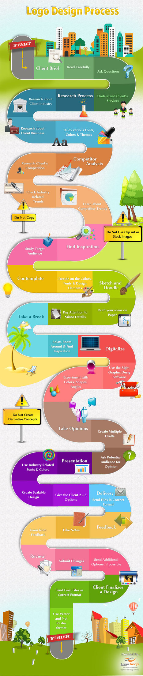
An infographic that defines the step by step logo design process along with dos and don’ts of the creative design process....

Julia McFarland's curator insight,
April 7, 2013 2:15 AM
There is a lot more to a logo design than people think... 
G3 CREATIVE's curator insight,
July 9, 2014 12:00 PM
An infographic that defines the step by step logo design process. |