

Big data's big promises are left in a big dust pile because we don't optimize the last mile: Data presentation. Learn from eight real-world how-to examples."
Via Bovee & Thill's Online Business Communication Magazines
Get Started for FREE
Sign up with Facebook Sign up with X
I don't have a Facebook or a X account


 Your new post is loading... Your new post is loading...
Big data's big promises are left in a big dust pile because we don't optimize the last mile: Data presentation. Learn from eight real-world how-to examples." Via Bovee & Thill's Online Business Communication Magazines 
No comment yet.
Sign up to comment
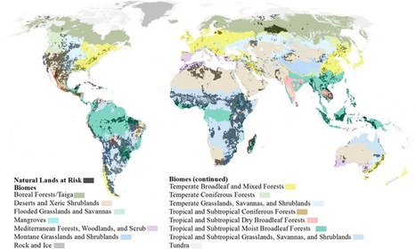
By 2050, the world’s population is projected to approach nine billion. With more people will come more developed land—a lot more. Urbanization, agriculture, energy, and mining put 20 percent of the world’s remaining forests, grasslands, and other natural ecosystems at risk of conversion by 2050. With that kind of expansion, there are sure to be harms—namely clean water, clean air, and biodiversity. To mitigate some of those risks, scientists and geographers at the Nature Conservancy have taken a crucial step by mapping the potential impact that human growth will have on natural lands. It’s the most comprehensive look to date at how major forms of development will take over fragile ecosystems, if left unchecked... Via Lauren Moss

CTy Thiet Ke Kien Truc Neohouse's comment,
October 3, 2017 10:46 PM
Bài viết rất hữu ít . Cùng tôi chia sẻ những điều hữu ít đi .
In the age of Big Data, folks are often overwhelmed by the volume of data sources, charts, and graphs thrown at them every day. Enter data visualization – the ability to condense, analyze, and share data that makes an impact. Throughout history, data visualization has been used to document everything from health crises to the effect of colors on mood. But what exactly does data visualization do and how can you leverage it to grow your business? Are data visualization and infographics the same thing? Read on to learn more, plus discover some fascinating examples. Via Lauren Moss

Chris Biddy's curator insight,
October 28, 2014 4:30 PM
Very insightful look at the what, how and so what of data visualization. Another example of how a good visualization makes data digestible!
Data is always useful but it is not easy to comprehend it when it is not presented understandably. This is where data visualization comes in; there are many Via yannick grenzinger
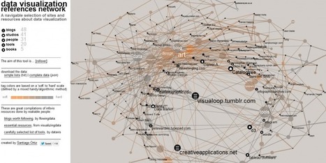
As data visualization expands its reach – through the rise of Massive Online Courses, the countless events and, most significantly, the interconnection between different disciplines and knowledge fields that produce inspiring works and innovative projects -, it’s only natural that the number of folks writing about it keeps rising. There are literally hundreds of interesting blogs out there, covering all the aspects surrounding the production of quality, effective data visualizations. Visit the link to find a collection of resources and interesting projects that give a pretty good idea of how vast and rich the data visualization community is...
Via Lauren Moss

Nathalie Prinet-Houairi's curator insight,
December 18, 2013 5:02 AM
Data visualization is now critical. My favorite of those blogs are Storytelling with data, and Ilovecharts (quite funny although not necessarily business related) 
Nobuyuki Kawagashira's curator insight,
January 8, 2014 8:15 PM
We can learn data visualization news from other bloggers.
Infographics have become extremely popular online tools to create a compelling visualization by conveying a message much more effectively than a stand alone written article or photo. They must be well-designed and appealing to the eye; these 10 online tools below will aid you in creating infographics to champion your cause and convey a visual message... Via Lauren Moss
Data is everywhere and well-designed data graphics can be both beautiful and meaningful. As visualizations take center stage in a data-centric world, researchers and developers spend much time understanding and creating better visualizations. But they spend just as much time understanding how tools can help programmers and designers create visualizations faster, more effectively, and more enjoyably.
As any visualization practitioner will tell you, turning a dataset from raw stuff in a file to a final result in a picture is far from a single-track, linear path. Rather, there is a constant iteration of competing designs, tweaking and evaluating at once their pros and cons. The visualization research community has recognized the importance of keeping track of this process.
Read the complete article to learn more about the future of the practice and the tools that enable designers to create thoughtful infographics and visualizations... Via Lauren Moss
|
From
www

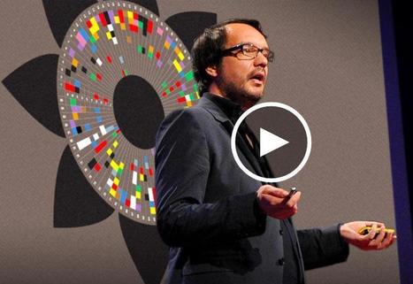
David McCandless turns complex data sets (like worldwide military spending, media buzz, Facebook status updates) into beautiful, simple diagrams that tease out unseen patterns and connections. Good design, he suggests, is the best way to navigate information glut -- and it may just change the way we see the world. Via Bovee & Thill's Online Business Communication Magazines
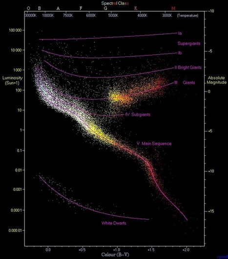
In our Data Visualization 101 series, we cover each chart type to help you sharpen your data visualization skills.Scatter plots have been called the “most versatile, polymorphic, and generally useful invention in the history of statistical graphics” (Journal of the History of the Behavioral Sciences, 2005). That’s a big claim, but just as their name implies, they can take a confusing and scattered set of data and make sense of it. As such, these plots are much more than a visualization tool; they are a discovery tool. Let’s look at what makes the scatter plot so good... Via Lauren Moss

Christopher Higgins's curator insight,
July 18, 2015 6:17 AM
A quick history of graphing information and how scatter plots are unique from other ways of graphing in more than one way. A great visual of the different types of relationships that are easily identified on a scatter plot, highlighting why scatter plots are so useful to understand relationships between two different variables.
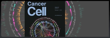
From
circos
How To Succeed Visually * Learning Curve Protects The Niche WHEN You Get In. Via Martin (Marty) Smith
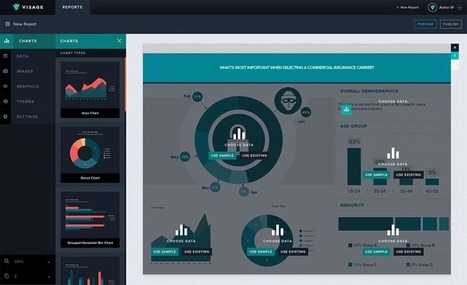
Visage makes infographics easy, and they customize palettes for free. If you’re an art director at a media outlet, odds are you have to assign and commission each data visualization you publish. That gets time-consuming, even when the graphic in question is nothing but a small pie chart running alongside a feature story. Visage, a newly launched platform, provides custom templates for graphics. There are myriad tools on the market that do this (for a gander at 30 of them, check out this list), but Visage is the latest, and it's gaining traction with designers at Mashable, MSNBC, and A&E... Via Lauren Moss
Often, complex stories are more easily communicated, understood and, ultimately, remembered, when they take visual form. Aside from data and words, infographics use images and graphical representations. Those key elements – images, words and numbers – operate as a system for simplifying information, revealing new patterns, and producing new knowledge in various fields. In fact, they might not have always been called “infographics,” but info/data-based visualizations have always been around. Via Lauren Moss
Infographics have become extremely popular online tools to create a compelling visualization by conveying a message much more effectively than a stand alone written article or photo. They must be well-designed and appealing to the eye; these 10 online tools below will aid you in creating infographics to champion your cause and convey a visual message... Via Lauren Moss
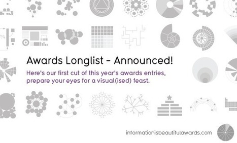
Robin Good: David McCandlees, the author of the book Information is Beautiful celebrates great data visualization and information design work through the Information is Beautiful Awards.
» Data visualization– A singular visualisation of data or information.» Infographic – Using multiple data visualisations in service to a theme or story
» Interactive visualization – Any viz where you can dynamically filter or explore the data.
» Data journalism – A combination of text and visualizations in a journalistic format.
» Motion infographic – Moving and animated visualizations along a theme or story.
» Tool or website – Online tools & apps to aid datavizzing.
The selection itself is worth a tour of the site and of this initiative.
Check: http://www.informationisbeautifulawards.com/
Longlist selection: http://www.informationisbeautifulawards.com/2012/07/our-longlist/
Shortlist selection: http://www.informationisbeautifulawards.com/2012/08/awardshortlist/
Via Robin Good
|


