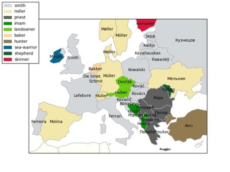
Here is the map of the most frequent occupational surnames in European countries and the corresponding trades.
Get Started for FREE
Sign up with Facebook Sign up with X
I don't have a Facebook or a X account


 Your new post is loading...
 Your new post is loading...
Your new post is loading...
Here is the map of the most frequent occupational surnames in European countries and the corresponding trades. 
No comment yet.
Sign up to comment
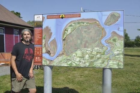
Grand Pré - A small Grand Pré company is being recognized in a big way for putting some Nova Scotia heritage sites on the map.
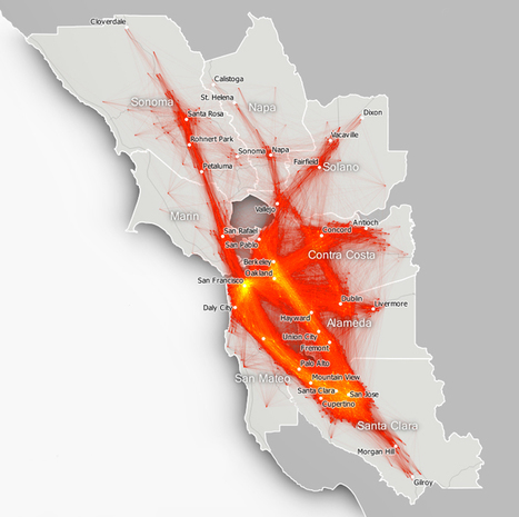
Your hellish commute has never looked so pretty. A new set of animated maps plots the commutes of 3.3 million Bay Area residents commuting to 110,000 destinations.

The Soviet military mapped the entire world, but few have seen the actual, physical maps—until now.
Google's Deep Dream images have been everywhere this week, but it's not just photographs and films that are been processed by the neural imaging network.
University of Washington law professor Anita Ramasastry discusses a new type of mobile app that maps illness in much the same way other apps map weather patterns and warns of the privacy ...
Mapping data is so much about subtleties. The little things add up to make a full map exponentially better than one that wasn't given the proper attention. But in case you don't have the time to ea...
Sure, it's not hard to learn when your bus is likely to show up, but have you wondered where everyone else's bus is at any given moment? You now have an
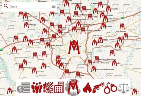
MafiaMaps is an app to crowdmap the mafia phenomenon all over Italy.
From
www

Maps can illuminate our world; they can enlighten us and make us see things differently; they can show how demographics, history, or countless other factors interact with human and physical geography. But, sometimes, maps can be utter disasters, either because they're wrong or simply very dumb. Here are a collection of maps so hilariously bad that you may never trust the form again. Tellingly, the bulk of the collection comes from cable TV news.

From
www
The League of American Bicyclists' rankings also show that no American state scored higher than 67 points out of 100.

Tori Denney's curator insight,
May 26, 2015 9:35 PM
Understanding and interpreting implications of associations among phenomena in places - When understanding or interpreting information from a map, you can conclude or infer on what may be happening in these places. This map displays "bicycle friendly" states in the U.S., but is not clear on what this means or represents. "Bicycle friendly" states could be determined by number of environmentally friendly pedestrian areas, number of parks, bicycle fatality rates, road safety, or by bicycle consumer rates and commuters. Among these many possibilities, you can focus on areas of phenomena that lead to simple explanations for clumped areas or patterns. For example, Alabama is ranked the least bicycle friendly, due to very high bicycle fatality rates. From this information, it is concluded that Alabama does not consist of many bike commuters because there are not enough safe roads.
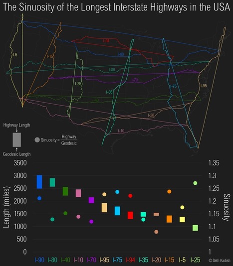
Seth Kadish of the blog Vizual Statistix used government data to create this fascinating map of the longest interstate highways in the continental U.S. The curvy line shows the interstate’s actual route, while the straight line shows its “geodesic” distance, basically the shortest distance between its two endpoints. The difference between those figures is graphed […]
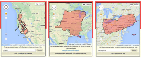
A website lets you compare countries around the world to your home state. You can check out other stats, too, from lifespan to income to free time.
|
"When I was a kid, my father brought home from I know not where an enormous collection of National Geographic magazines spanning the years 1917 to 1985. I found, tucked in almost every issue, one of the magazine’s gorgeous maps—of the Moon, St. Petersburg, the Himalayas, Eastern Europe’s ever-shifting boundaries. I became a cartography enthusiast and geographical sponge, poring over them for years just for the sheer enjoyment of it, a pleasure that remains with me today. Whether you’re like me and simply love the imaginative exercise of tracing a map’s lines and contours and absorbing information, or you love to do that and you get paid for it, you’ll find innumerable ways to spend your time on the new Open Access Maps project at the New York Public Library."
What's involved with creating a map for a fictional world? In the video above, Ottawa-based cartographer Mark Richardson explains how long it takes, where he gets the data, and how the real world can overlap with the fabricated realities. By day Richardson is a professional cartographer and graphic designer with the federal government, but by night he runs Green Hat Designs, a freelance cartography company that creates stunning maps for board games.
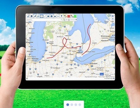
Scribble Maps is a company that allows everyone from hobbyists, students, governments and military officials to draw, create, embed, and share maps easily. The basic service is completely free and allows users to create custom maps, widgets, and images. They can then share their custom maps with friends or publish them to a website/blog.
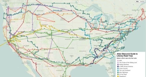
I am a freak for the American road trip. And I'm not alone, as some of this country's best writers have taken a shot at describing that quintessentially American experience.The above map is the result of a painstaking and admittedly quixotic effort to catalog the country as it has been described in the American road-tripping literature. It includes every place-name reference in 12 books about cross-country travel, from Mark Twain’s Roughing It (1872) to Cheryl Strayed’s Wild (2012), and maps the authors’ routes on top of one another. You can track an individual writer’s descriptions of the landscape as they traveled across it, or you can zoom in to see how different authors have written about the same place at different times.
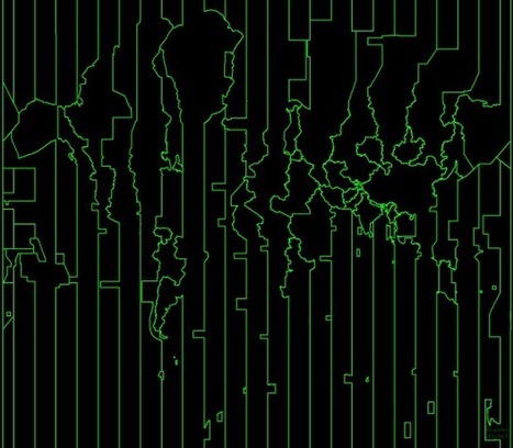
"Kind of fun. Branden Rishel mapped just the time zones. No borders or countries for context. In case you're confused and want to know where these lines come from, BBC News made an interactive that explains why time zones are the way they are."
From
www
Tellingly, the bulk of the collection comes from cable TV news.
Seth Dixon's insight:
Some of these are awfully, some are unintentionally awesome, but I think the one above might be even better than that. It's as if the cartographer in this one is purposefully making that gives us no knew information in the least informative way possible on purpose to make a snarky critique on the abundance of ill-conceived maps out there.

Jose Soto's curator insight,
August 5, 2015 9:50 PM
Some of these are awfully, some are unintentionally awesome, but I think the one above might be even better than that. It's as if the cartographer in this one is purposefully making that gives us no knew information in the least informative way possible on purpose to make a snarky critique on the abundance of ill-conceived maps out there. 
Flaviu Fesnic's curator insight,
August 6, 2015 2:51 AM
Some of these are awfully, some are unintentionally awesome, but I think the one above might be even better than that. It's as if the cartographer in this one is purposefully making that gives us no knew information in the least informative way possible on purpose to make a snarky critique on the abundance of ill-conceived maps out there. 
Deanna Wiist's curator insight,
September 12, 2017 9:07 PM
Some of these are awfully, some are unintentionally awesome, but I think the one above might be even better than that. It's as if the cartographer in this one is purposefully making that gives us no knew information in the least informative way possible on purpose to make a snarky critique on the abundance of ill-conceived maps out there.
From
www
What if we measured state boundaries based on economic and population growth, and not borders?
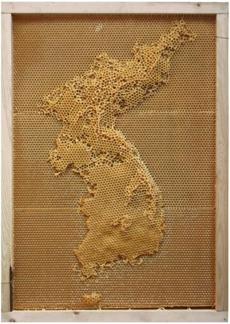
In an exploration of the connection between humans an nature, artist Ren Ri uses beeswax as his medium and the bee colony as the builder. Yeah. Because a colony will follow the queen bee and build ...
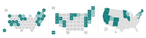
There's been a sudden bump in grid maps lately taking the place of state choropleths. For example, Haeyoun Park used them to show changes in state laws for gay marriage. The advantage over the choropleth is that each state gets equal visual space, and the placement still lets people find specific states and interpret geographic relationships.
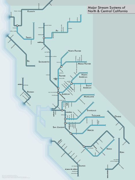
Rivers have been a key part of urban life for centuries. They have provided us with drinking water, protection, and a transit network that links us from one settlement to the next. I wanted to create a series of maps that gives people a new way to look at rivers: a much more modern, urban type of portrayal. So I turned to the style of urban transit maps pioneered by Harry Beck in the 1930s for the London Underground. Straight lines, 45º angles, simple geometry. The result is more of an abstract network representation than you would find on most maps, but it’s also a lot more fun. The geography is intentionally distorted to clarify relationships. I think it helps translate the sort of visual language of nature into a more engineered one, putting the organic in more constructed terms. Not every line depicted is navigable, but all are important to the hydrological systems shown.
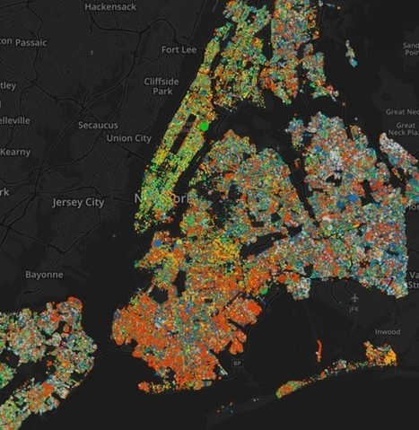
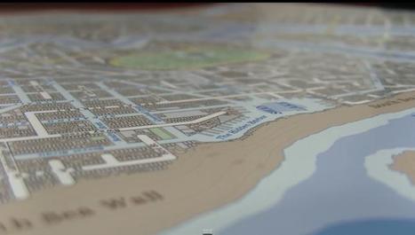
An atlas of 592,130 trees right down to trunk size. Though New York can sometimes seem like a drab warren of chain-link fence and oily pavement, the city actually has an impressive number of trees. On the streets alone—not counting private properties and parks—there were 592,130 at last reckoning, a leafy explosion you can now peruse in this great visualization of tree species.
|