Fantastic Maps
18.8K views | +0 today
Follow
Fantastic Maps
Great maps and beautiful places
Curated by Seth Dixon
Your new post is loading...
Scooped by Seth Dixon
Scoop.it!

19th-Century Atlases Included Hundreds of Fake Islands

19th-Century Atlases Included Hundreds of Fake Islands | Fantastic Maps | Scoop.it
Non-existent islands were a surprisingly common problem in the 19th century. Some of them may have once been actual islands, which later sunk beneath the waters. Some of them were genuine mistakes–icebergs misidentified as islands, islands whose longitudes were miscalculated, illusions that really did look like they might be land. Some were straight-up fabricated by sea captains looking to curry favor with funders.
No comment yet.
Scooped by Seth Dixon
Scoop.it!

Don‘t fly drones here

Don‘t fly drones here | Fantastic Maps | Scoop.it
This map represents areas where it is not recommended to fly drones due to regulations.
No comment yet.
Scooped by Seth Dixon
Scoop.it!

Dissected Maps: the First Jigsaw Puzzles

Dissected Maps: the First Jigsaw Puzzles | Fantastic Maps | Scoop.it
The earliest jigsaw puzzles were created as educational tools. Known as "dissected maps" these early puzzles were used to teach geography.
No comment yet.
Scooped by Seth Dixon
Scoop.it!

Using BuzzFeed's listicle format to tell stories with maps and charts

Using BuzzFeed's listicle format to tell stories with maps and charts | Fantastic Maps | Scoop.it

"Aldhous, who teaches data visualization at University of California, Berkeley’s School of Journalism and science communication at University of California, Santa Cruz, joined BuzzFeed’s science desk after working for Nature, Science and New Scientist magazines.

At BuzzFeed he has been honing his digital storytelling with a focus on pairing maps and charts with his stories. He’s using frameworks for storytelling that BuzzFeed is well known for, but leveraging them to experiment with visual science journalism. Recently, for instance, he effectively used BuzzFeed’s signature listicle format to explain the devastation caused by Hurricane Katrina."


No comment yet.
Scooped by Seth Dixon
Scoop.it!

Map of Every Country Code Top Level Domain Name Extension

Map of Every Country Code Top Level Domain Name Extension | Fantastic Maps | Scoop.it
The map above shows (just about) every country code top-level domain (ccTLD) extension and the country it corresponds to. Where are .io, .ly & .tv located?
No comment yet.
Scooped by Seth Dixon
Scoop.it!

Introducing Esri Vector Basemaps

Introducing Esri Vector Basemaps | Fantastic Maps | Scoop.it
The initial set of Esri vector basemaps includes eight different map styles built using a single vector tile service. This set of vector basemaps is available through the Esri Vector Basemaps (Beta) group in ArcGIS Online. The group includes vector basemaps in multiple styles, some that closely resemble existing Esri basemaps (e.g. Streets, Topographic, Light Gray Canvas), and others that are new (e.g. Streets at Night, Navigation, and Imagery Hybrid). The vector basemaps are available as both web maps, which can be used as a basemap for adding other layers, and as tile layers, which can be added to existing maps either as a basemap or overlay layer.
No comment yet.
Scooped by Seth Dixon
Scoop.it!

Maya Lin Used 168,000 Marbles to Model the Chesapeake Bay

Maya Lin Used 168,000 Marbles to Model the Chesapeake Bay | Fantastic Maps | Scoop.it
The artist’s highly imaginative waterway was created using satellite imagery from NASA


Nearly half a century later, the American artist, who became famous at 21 years old for winning the design competition to create the Vietnam Veterans Memorial in Washington, D.C., is using the same glimmering spheres to portray the Chesapeake Bay, the largest estuary in the United States.
No comment yet.
Scooped by Seth Dixon
Scoop.it!

MSNBC Opts To Apologize After Airing Map Of Disappearing Palestine

MSNBC Opts To Apologize After Airing Map Of Disappearing Palestine | Fantastic Maps | Scoop.it
Before MSNBC’s apology, pro-Palestinian activists praised the segment as a rare instance of mainstream media honesty about Israeli occupation.
Seth Dixon's insight:

Maps can be very controversial and must be contextualized.  Are these maps "right" or "wrong" is probably not the most helpful way to analyze them.  There were crafted to explain a perspective, and to use the data is the most convincing way possible to strengthen their case.  Maps are about including some data, and choosing not to include other relevant information.  Maps provide the user with a a perspective and we need to be critical enough of map readers to understand why the maps was created, who created it, and what the purpose of the map was before trying to evaluate it's accuracy, validity, or usefulness.     

No comment yet.
Scooped by Seth Dixon
Scoop.it!

Map of North America from the Tactile Atlas

Map of North America from the Tactile Atlas | Fantastic Maps | Scoop.it
Map of North America from the Tactile Atlas for the Blind by the Princeton Braillists.
No comment yet.
Suggested by Thomas Schmeling
Scoop.it!

Mapping Lake Michigan Like an Ocean

Mapping Lake Michigan Like an Ocean | Fantastic Maps | Scoop.it
Daniel Huffman unfurls the Great Lake’s massive shoreline to map how people relate to it.
No comment yet.
Scooped by Seth Dixon
Scoop.it!

Farmer creates map of China out of rice in his back yard

Farmer creates map of China out of rice in his back yard | Fantastic Maps | Scoop.it
A Chinese farmer has planted a map of his country in his back yard, using different varieties of rice to yield different colours.
No comment yet.
Scooped by Seth Dixon
Scoop.it!

Here’s Every Single Job in America, Mapped

Here’s Every Single Job in America, Mapped | Fantastic Maps | Scoop.it
Are you one of the millions of Americans opting into "job sprawl" over a short commute?
No comment yet.
Suggested by Thomas Schmeling
Scoop.it!

Live Ships Map

Live Ships Map | Fantastic Maps | Scoop.it
Vessel positions tracking based on AIS data. Real-time ship locations, port arrivals and departures.
No comment yet.
Scooped by Seth Dixon
Scoop.it!

Finally, a digital map for Alaska - Geographical

Finally, a digital map for Alaska - Geographical | Fantastic Maps | Scoop.it
A long-awaited, somewhat delayed, digital geologic map of Alaska has been released, made from a ‘treasure trove’ of geological information
No comment yet.
Scooped by Seth Dixon
Scoop.it!

Wearable Maps of 80 Cities Around the Globe

Wearable Maps of 80 Cities Around the Globe | Fantastic Maps | Scoop.it
A U.K. designer is using open data to produce dramatic t-shirts of cities from Phoenix to Beijing.
No comment yet.
Scooped by Seth Dixon
Scoop.it!

The World's 140 Subway Systems, All Crammed Into One Poster

The World's 140 Subway Systems, All Crammed Into One Poster | Fantastic Maps | Scoop.it
Celebrate your love for heavy-rail commuter systems by putting every single one of them on your wall.
No comment yet.
Scooped by Seth Dixon
Scoop.it!

Where Americans Are Killed By Guns: US Homicide & Suicide Death Rates

Where Americans Are Killed By Guns: US Homicide & Suicide Death Rates | Fantastic Maps | Scoop.it
33,169 people were killed by guns in the US in 2013. However, the rates at which people were killed by guns varied widely between states and regions.
No comment yet.
Scooped by Seth Dixon
Scoop.it!

Here's How Daylight Saving Time Affects Your Part of the Country

Here's How Daylight Saving Time Affects Your Part of the Country | Fantastic Maps | Scoop.it

"Daylight saving time was created to benefit Americans, but not every part of the country is affected equally. Within the Eastern time zone, for instance, the sun rises a whole 40 minutes earlier in New York City than it does in Detroit. To illustrate how daylight saving time impacts sunrise and sunset times around the county, cartographer Andy Woodruff published a series of helpful maps on his website."

No comment yet.
Suggested by Thomas Schmeling
Scoop.it!

Mapping Every Single U.S. Road Fatality From 2004 to 2013

Mapping Every Single U.S. Road Fatality From 2004 to 2013 | Fantastic Maps | Scoop.it
The death toll amounts to 373,377 lost lives.
No comment yet.
Suggested by Thomas Schmeling
Scoop.it!

MAP: A wonderful collection of the world's greatest maps

MAP: A wonderful collection of the world's greatest maps | Fantastic Maps | Scoop.it

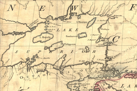
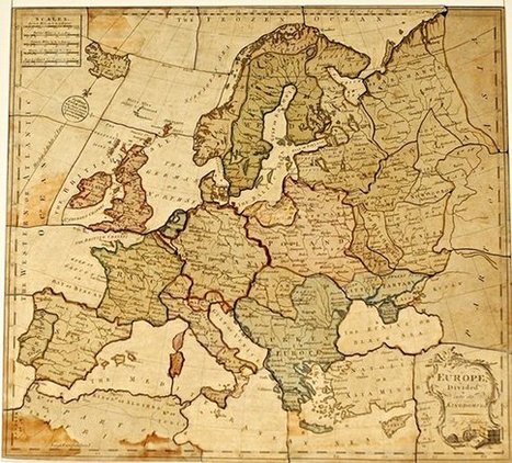
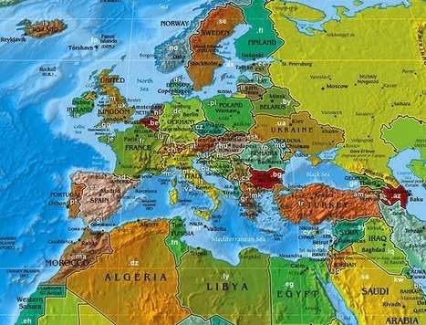
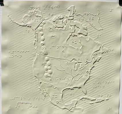
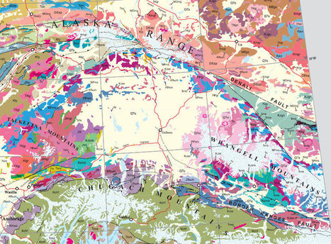
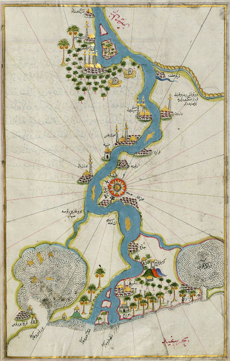
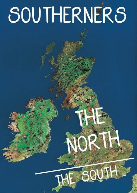
"A beautiful new book called MAP: Exploring the World is the perfect insight into the world of cartography, with the book featuring rare and ancient maps from pioneers, illustrators and cartographers.

And it’s not just geographical – the book shows the way in which design, politics, and how we see ourselves has changed as the world has evolved.

The maps tell their own stories in their own way across 5,000 years of cartographic innovation, from the first attempts by the Greeks and scrolls of Eastern Asia, to the complexity of modern life."

No comment yet.
Scooped by Seth Dixon
Scoop.it!

Tolkien's annotated map of Middle-earth discovered inside copy of Lord of the Rings

Tolkien's annotated map of Middle-earth discovered inside copy of Lord of the Rings | Fantastic Maps | Scoop.it
A recently discovered map of Middle-earth annotated by JRR Tolkien reveals The Lord of the Rings author’s observation that Hobbiton is on the same latitude as Oxford, and implies that the Italian city of Ravenna could be the inspiration behind the fictional city of Minas Tirith.
No comment yet.
Scooped by Seth Dixon
Scoop.it!

12 Maps Only British People Will Find Funny

12 Maps Only British People Will Find Funny | Fantastic Maps | Scoop.it
"It doesn't matter where you're from in the world, knob and bollocks are the same." – Karl Pilkington.
No comment yet.
Scooped by Seth Dixon
Scoop.it!

Love maps? This exhibit is for you

Love maps? This exhibit is for you | Fantastic Maps | Scoop.it
Map enthusiasts from around the world converged in Minneapolis this week to attend the North American Cartographic Information Society's annual conference downtown.

For the first time, the NACIS is inviting the public to view more than 100 maps the group has on display, ranging from posters with smartphone-friendly codes to intricate maps hand-drawn by children.
Seth Dixon's insight:

If only I were in the upper Midwest, I'd be all over this. 

No comment yet.
Scooped by Seth Dixon
Scoop.it!

How Modern Cartographers Marry Math and Art

How Modern Cartographers Marry Math and Art | Fantastic Maps | Scoop.it
Old maps get a lot of love, and with good reason—with their sea monsters and sheer craftsmanship, they can transport us through both space and time. But although they lack fold-mark furrows, there’s something to be said for new maps, too. Leafing through Mind the Map, a stunning new book from Gestalten, it’s hard not to think we’re living in the middle of a map renaissance, a time when cartographers and illustrators have good design on their minds and satellite data at their fingertips.
Vermont Social Studies's curator insight, October 7, 2015 8:44 AM

Let's teach our students that maps are beautiful!

Scooped by Seth Dixon
Scoop.it!

Making Connections Between the World's Newest and Oldest Maps

Making Connections Between the World's Newest and Oldest Maps | Fantastic Maps | Scoop.it
An interview with John Hessler, a cartography expert at the Library of Congress and one of the people behind the new book, Map: Exploring The World.
No comment yet.