The MarTech Digest
563.4K views | +2 today
Follow
Your new post is loading...
Scooped by Marteq
Scoop.it!

RWD Is A Natural Evolution Of The Web — And It's Here To Stay - Forrester | #TheMarketingAutomationAlert

RWD Is A Natural Evolution Of The Web — And It's Here To Stay - Forrester | #TheMarketingAutomationAlert | The MarTech Digest | Scoop.it
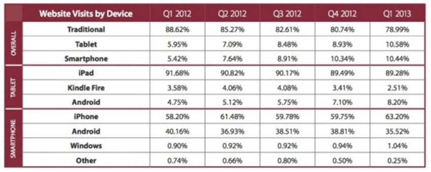
When I first looked at responsive web design (RWD) back in June 2012, only early adopters (mostly startups, agencies and media firms) had taken the plunge.


Key excerpt...


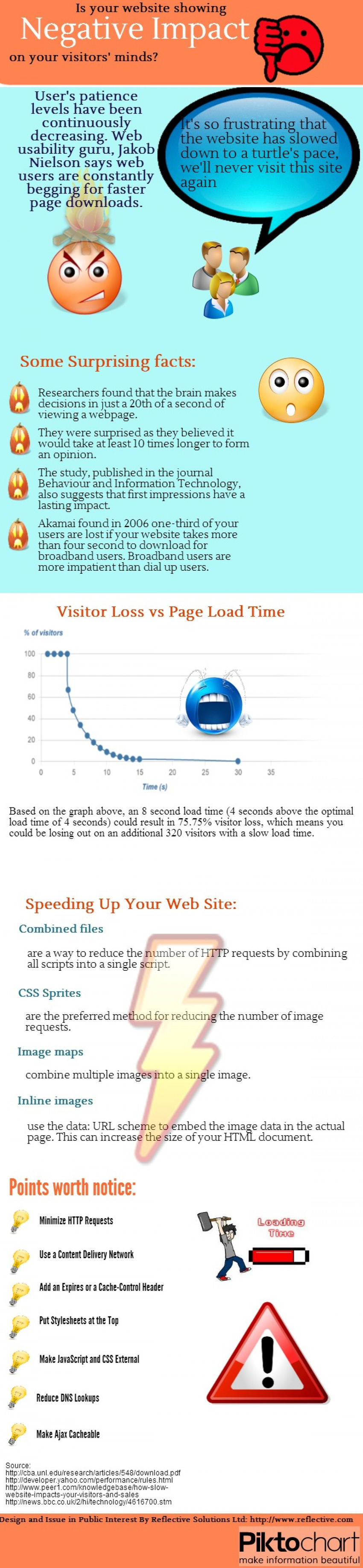
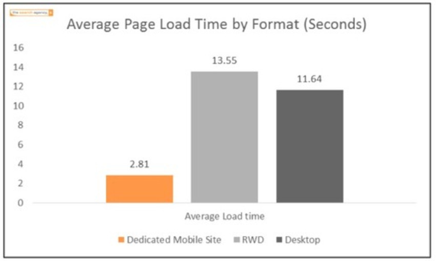
Unfortunately, many organizations may make RWD decisions based on advice from agency partners and/or mobile application development vendors (or some combination of both) that have a vested interest in the technology choice. eBusiness professionals should avoid drinking the RWD “Kool-Aid” or going responsive because “everyone else is doing it.” RWD was never framed as a silver bullet for your mobile needs, and you shouldn’t treat it as such. To help our clients determine if RWD is right for them, we devised a simple seven-step decision tool that we hope will help you determine if RWD is a fit for your organization's mobile web needs.


__________________________________

NEW: iNeoMarketing makes content marketing easy with the new Q8 Content. Q8 fills your content pipeline daily with relevant articles that your audience wants to read. Learn more and sign up for the beta program: http://www.Q8content.com.


Receive a FREE daily summary of The Marketing Technology Alert directly to your inbox. To subscribe, please go to http://ineomarketing.com/About_The_MAR_Sub.html  (your privacy is protected).

Marteq's insight:

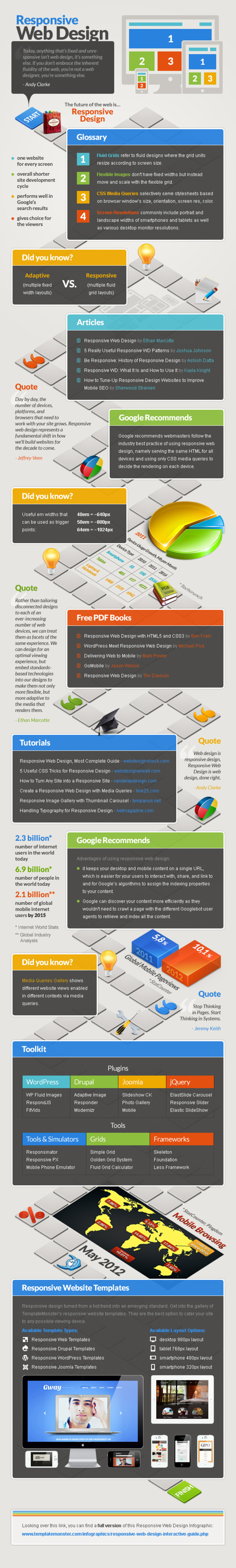
Evaluate Adaptive as the design of choice, as the Responsive load times may be prohibitive.


No comment yet.
Scooped by Marteq
Scoop.it!

Is your website showing negative impact on your visitors' minds | Reflective | #TheMarketingAutomationAlert

Is your website showing negative impact on your visitors' minds | Reflective | #TheMarketingAutomationAlert | The MarTech Digest | Scoop.it
Is your website showing negative impact on your visitors' minds.


__________________________________

NEW: iNeoMarketing makes content marketing easy with the new Q8 Content. Q8 fills your content pipeline daily with relevant articles that your audience wants to read. Learn more and sign up for the beta program: http://www.Q8content.com.


Receive a FREE daily summary of The Marketing Technology Alert directly to your inbox. To subscribe, please go to http://ineomarketing.com/About_The_MAR_Sub.html  (your privacy is protected).

Marteq's insight:

Slow kills.  IN ADDITION, be careful of your loads on mobile devices. As pointed out in earlier scoops, responsive may be hurting more than helping.

No comment yet.
Scooped by Marteq
Scoop.it!

Here's the Slide That Could Kill Responsive Design - Marketing Land | #TheMarketingAutomationAlert

Here's the Slide That Could Kill Responsive Design - Marketing Land | #TheMarketingAutomationAlert | The MarTech Digest | Scoop.it

Excerpt...


Not only will mobile site rankings suffer but so will brand perception. Google and others have produced survey data that reflect consumers have little tolerance for slow-loading mobile web sites. There are also well documented brand perception and purchase-intent consequences if sites perform too slowly.


__________________________________

NEW: iNeoMarketing makes content marketing easy with the new Q8 Content. Q8 fills your content pipeline daily with relevant articles that your audience wants to read. Learn more and sign up for the beta program: http://www.Q8content.com.


Receive a FREE daily summary of The Marketing Technology Alert directly to your inbox. To subscribe, please go to http://ineomarketing.com/About_The_MAR_Sub.html  (your privacy is protected).

Marteq's insight:

This is a shocking graphic, and is causing me to rethink the wisdom of responsive. I've gone back through research, and perhaps the javascript-based AWD may be the solution (http://www.scoop.it/t/the-marketing-automation-report/?tag=responsive+web+design).

No comment yet.
Scooped by Marteq
Scoop.it!

Adaptive Web Design vs. Responsive Web Design | Skyrkt | #TheMarketingAutomationAlert

Adaptive Web Design vs. Responsive Web Design | Skyrkt | #TheMarketingAutomationAlert | The MarTech Digest | Scoop.it


___________________________________

-Receive a FREE daily summary of The Marketing Technology Alert directly to your inbox. To subscribe, please go to http://ineomarketing.com/About_The_MAR_Sub.html  (your privacy is protected).

-If you like this scoop from The Marketing Technology Alert (brought to you by iNeoMarketing), PLEASE share by using the links below.


Marteq's insight:

Tough call. If you've got the time and resources, then AWD is the way to go. Otherwise RWD is your choice. If you have an agency working for you, you may want to quiz them on providing AWD.

Brice Gilbert's curator insight, November 4, 2013 3:10 AM

Well designed poster ! Be aware from your choice between AWD & RWD.

Scooped by Marteq
Scoop.it!

How to Do Responsive Web Design Right [Infographic] - Profs | #TheMarketingAutomationAlert

How to Do Responsive Web Design Right [Infographic] - Profs | #TheMarketingAutomationAlert | The MarTech Digest | Scoop.it
Web Sites - If your company hasn't yet considered using responsive Web design, you might well want to, especially if many of your website visitors are using mobile devices to access your site ...


___________________________________

-Receive a FREE daily summary of The Marketing Technology Alert directly to your inbox. To subscribe, please go to http://ineomarketing.com/About_The_MAR_Sub.html  (your privacy is protected).

-If you like this scoop from The Marketing Technology Alert (brought to you by iNeoMarketing), PLEASE share by using the links below.

Marteq's insight:

Reciting the stat: 50% of emails are opened on mobile devices. What do you think the % is for web sites? Take a look at your analytics: I'm betting that it's more than 20%.

ByPass Web Development's curator insight, January 28, 2014 9:59 AM

Great infographic. Enough said.

Scooped by Marteq
Scoop.it!

[INFOGRAPHIC] Why WordPress Responsive - WordPress Responsive Themes | #TheMarketingAutomationAlert

[INFOGRAPHIC] Why WordPress Responsive - WordPress Responsive Themes | #TheMarketingAutomationAlert | The MarTech Digest | Scoop.it
Marteq's insight:

h/t to Marketing Technology Blog


  • See the article at from www.wpresponsivethemes.com
  • Receive a daily summary of The Marketing Automation Alert directly to your inbox. Subscribe here (your privacy is protected).
  • If you like this scoop, PLEASE share by using the links below.
  • iNeoMarketing drives more revenue and opportunities for B2B companies using marketing technologies. Contact us
Mario Mendoza's curator insight, November 15, 2013 6:01 PM

Responsive themes are the way to go with all the different devices being used nowadays for viewing your site

Scooped by Marteq
Scoop.it!

B2Bs, Are You Using These Must-Have Mobile Marketing Tactics? - Profs | #TheMarketingAutomationAlert

B2Bs, Are You Using These Must-Have Mobile Marketing Tactics? - Profs | #TheMarketingAutomationAlert | The MarTech Digest | Scoop.it
Despite recent developments in mobile marketing, many B2B marketers are still avoiding its opportunities and getting left behind. Are you?


Excerpt...


Start by considering the following tactics for your mobile presence.

  1. Responsive website. Make your website responsive to the different devices and adapt content where necessary.
  2. Mobile-friendly campaigns. Ensure that your campaigns do not run aground on mobile devices, and instead optimize your landing pages. Tailor settings for each type of device for things such as forms.
  3. Mobile advertising. Mobile advertising can be highly tailored by location, time, and device, resulting in high relevance and therefore high-response rates.
  4. Mobile e-mail. Reading e-mails is still one of the most used functions on smartphones and tablets. It is therefore essential to ensure that your HTML can be read properly on these devices. For example, use only one column.
  5. Mobile apps. An app enables you to secure a prominent presence on your customer’s device. But for this you need to do more than simply follow the recommendations given above.
Marteq's insight:

Note the recent MarketingCharts scoop regarding the email open rate on mobile devices: 50%. If you do anything, make sure it is #4. Prioritized: 4, 1, 2, 5, 3.


  • See the article at from www.mpdailyfix.com
  • Receive a daily summary of The Marketing Automation Alert directly to your inbox. Subscribe here (your privacy is protected).
  • If you like this scoop, PLEASE share by using the links below.
  • iNeoMarketing drives more revenue and opportunities for B2B companies using marketing technologies. Contact us
No comment yet.
Scooped by Marteq
Scoop.it!

The How-To Guide to Responsive Email Design | Litmus | #TheMarketingAutomationAlert

The How-To Guide to Responsive Email Design | Litmus | #TheMarketingAutomationAlert | The MarTech Digest | Scoop.it
Marteq's insight:

And test your Responsive design using Litmus: we do, and it's a no brainer.


  • See the article at from litmus.com
  • Receive a daily summary of The Marketing Automation Alert directly to your inbox. Subscribe here (your privacy is protected).
  • If you like this scoop, PLEASE share by using the links below.
  • iNeoMarketing drives more revenue and opportunities for B2B companies using marketing technologies. Contact us
Nico Epstein's curator insight, September 12, 2013 5:24 AM

I'm excited to try this out :) 

Scooped by Marteq
Scoop.it!

1 in 2 Email Opens Said to Occur on a Mobile Device During Q2 - MarketingCharts | #TheMarketingAutomationAlert

1 in 2 Email Opens Said to Occur on a Mobile Device During Q2 - MarketingCharts | #TheMarketingAutomationAlert | The MarTech Digest | Scoop.it
  • Mobile-only (subscribers who only opened on a mobile device);
  • Desktop-only (subscribers who opened only on a desktop, typically through a client such as Outlook);
  • Webmail-only (subscribers who opened via a webmail service only, typically through a desktop with any free service, such as Gmail);
  • Mobile-combo (subscribers who opened 2 or more times, at least one of which was on a mobile device); and
  • Other (subscribers who opened 2 or more times, at least one of which was on webmail and at least one of which was on desktop).
Marteq's insight:

It's a mix of B2C and B2B, but the moral of the story: RESPONSIVE DESIGN. Build it with Responsive in mind, and this isn't an issue. Get rid of the issue.


  • See the article at from www.marketingcharts.com
  • Receive a daily summary of The Marketing Automation Alert directly to your inbox. Subscribe here (your privacy is protected).
  • If you like this scoop, PLEASE share by using the links below.
  • iNeoMarketing drives more revenue and opportunities for B2B companies using marketing technologies. Contact us
No comment yet.
Scooped by Marteq
Scoop.it!

[INFOGRAPHIC] Responsive Design: Getting it right | Who is Hosting This | #TheMarketingAutomationAlert

[INFOGRAPHIC] Responsive Design: Getting it right | Who is Hosting This | #TheMarketingAutomationAlert | The MarTech Digest | Scoop.it


Marteq's insight:
  • See the article at From visual.ly
  • Receive a daily summary of The Marketing Automation Alert directly to your inbox. Subscribe here (your privacy is protected).
  • If you like this scoop, PLEASE share by using the links below.
  • iNeoMarketing drives more revenue and opportunities for B2B companies using marketing technologies. Contact us
No comment yet.
Scooped by Marteq
Scoop.it!

Hope or Hype: Responsive Design [Infographic] - Monetate | #TheMarketingAutomationAlert

Hope or Hype: Responsive Design [Infographic] - Monetate | #TheMarketingAutomationAlert | The MarTech Digest | Scoop.it
Providing a mobile-friendly experience isn't only for the benefit of users these days.
Marteq's insight:
  • See the article at www.websitemagazine.com
  • Receive a daily summary of The Marketing Automation Alert directly to your inbox. Subscribe here (your privacy is protected).
  • If you like this scoop, PLEASE share by using the links below.
  • iNeoMarketing drives more revenue and opportunities for B2B companies using marketing technologies. Contact us
No comment yet.
Scooped by Marteq
Scoop.it!

14 brands that increased conversion rates via responsive design - Econsultancy | #TheMarketingAutomationAlert

14 brands that increased conversion rates via responsive design - Econsultancy | #TheMarketingAutomationAlert | The MarTech Digest | Scoop.it

Key excerpt...


It’s pretty straightforward to make a business case for mobile-friendly design if you have a transactional but non-responsive website: simply look at your conversion rates by device. They’ll probably be fairly woeful for tablets, and even worse for mobiles (certainly if ours are anything to go by). Add a dollop of simple maths and you’ll have some idea of the opportunity cost of not making the customer experience better for mobile and tablet users. 


Marteq's insight:

Please click through to see the 14 brands...actually, tweets from brand representatives. Then take a ballpark average, apply it to the number of mobile visitors, and determine the value of converting to a responsive design. A no brainer.


  • See the article at econsultancy.com
  • Receive a daily summary of The Marketing Automation Alert directly to your inbox. Subscribe here (your privacy is protected).
  • If you like this scoop, PLEASE share by using the links below.
  • iNeoMarketing drives more revenue and opportunities for B2B companies using marketing technologies. Contact us
No comment yet.
Scooped by Marteq
Scoop.it!

Scalable vs. Responsive Email Design [Infographic] | Yesmail

Scalable vs. Responsive Email Design [Infographic] | Yesmail | The MarTech Digest | Scoop.it
Marketers can adapt to mobile email usage by applying scalable and responsive design techniques.
Marteq's insight:

Either way, use Litmus to preview your design across all pertinent devices.


  • See the article www.yesmail.com
  • Receive a daily summary of The Marketing Automation Alert directly to your inbox. Subscribe here (your privacy is protected).
  • If you like this scoop, PLEASE share by using the links below.
  • iNeoMarketing drives more revenue and opportunities for B2B companies using marketing technologies. Contact us
No comment yet.
Scooped by Marteq
Scoop.it!

What Is Responsive Web Design and Why You Need It [Infographic] - QuantumCloud

What Is Responsive Web Design and Why You Need It [Infographic] - QuantumCloud | The MarTech Digest | Scoop.it
As of middle of 2013 the number of mobile device users accessing the internet has surpassed the number of desktop computer users. It is estimated that a whopping 119 billion USD will be spent via mobile eCommerce by year 2015.
Marteq's insight:
  • See the article at infographicjournal.com
  • Receive a daily summary of The Marketing Automation Alert directly to your inbox. Subscribe here (your privacy is protected).
  • If you like this scoop, PLEASE share by using the links below.
  • iNeoMarketing drives more revenue and opportunities for B2B companies using marketing technologies. Contact us
Laurence Segbo's curator insight, June 19, 2013 9:27 AM

Voir avec quel logiciel est faite l'infographie sur le site quantumcloud.com

Scooped by Marteq
Scoop.it!

Responsive Design in 60 Seconds [VIDEOGRAPHIC] - PRWeb

Responsive Design in 60 Seconds [VIDEOGRAPHIC] - PRWeb | The MarTech Digest | Scoop.it
Content marketing and digital flipbook platform, Uberflip, has released a videographic that highlights and benefits of responsive design for marketers.
Marteq's insight:
  • See the article at www.prweb.com
  • Receive a daily summary of The Marketing Automation Alert directly to your inbox. Subscribe here (your privacy is protected).
  • If you like this scoop, PLEASE share by using the links below.
  • iNeoMarketing drives more revenue and opportunities for B2B companies using marketing technologies. Contact us
No comment yet.
Scooped by Marteq
Scoop.it!

Infographic: The Challenge Of Email Success In A Fragmented Mobile World - Email Monks

Infographic: The Challenge Of Email Success In A Fragmented Mobile World - Email Monks | The MarTech Digest | Scoop.it
Soon, nearly half of all emails will be consumed on mobile devices, where the methods used to read them are widely varied.
Marteq's insight:
  • See the article at marketingland.com
  • Receive a daily summary of The Marketing Automation Alert directly to your inbox. Subscribe here (your privacy is protected).
  • If you like this scoop, PLEASE share by using the links below.
  • iNeoMarketing drives more revenue and opportunities for B2B companies using marketing technologies. Contact us
No comment yet.
Scooped by Marteq
Scoop.it!

18 practical responsive design tools and resources for wireframing - Econsultancy

18 practical responsive design tools and resources for wireframing - Econsultancy | The MarTech Digest | Scoop.it

Introduction...


You’re probably growing tired of the phrase ‘responsive design’, but it isn’t one of those overly-hyped buzz phrases that you can ignore, and it’s not going to go away anytime soon.


The reality is that many sites – ours included – still need to figure out how to deliver a consistent user experience that adapts to devices with different screen sizes.


So, I thought I’d compile a few resources, and some lovely tools, to help you (and me) to go down the responsive design route.


Marteq's insight:

We're not going to ask if you're implementing responsive design...you should be! But we are scooping this is an excellent collection of tools to assist with the task of responsive design.  Great stuff!


  • See the article at econsultancy.com
  • Receive a daily summary of The Marketing Automation Alert directly to your inbox. Subscribe here (your privacy is protected).
  • If you like this scoop, PLEASE share by using the links below.
  • iNeoMarketing merges marketing automation with content marketing for a powerful lead management solution, configured and managed by our knowledgeable, experienced staff.  Contact us.
James Johnston's curator insight, May 27, 2013 2:27 PM

A great list of tools, I have tried out a few of them before...

Scooped by Marteq
Scoop.it!

Writing Content For Responsive Design - ClickThrough Marketing

Writing Content For Responsive Design - ClickThrough Marketing | The MarTech Digest | Scoop.it

Key excerpt...


When designing content for a responsive site, it’s important to bear in mind the kinds of devices that your users will be browsing on. Make copy functional and to the point, yet engaging. Few people will be willing to read long essays on a mobile device.


In addition, it’s best to avoid writing content that requires the user to click through several pages. Photo-gallery style content, such as “The 10 Best Hats at Ascot”, with one photo per page, are OK for PC users, but someone on a mobile may not want to have to keep reloading pages to read the entire article.


Ideally, posts should be reasonably short, but informative. A few hundred words should do the job. If you cannot convey your message fully in such a short post, it’s a good idea to write a series of posts and upload a new one each day. This gives visitors a reason to return to a site each day, keeping its brand in their mind. So, in theory, it should be easier to sell to them.

Marteq's insight:

There's a bit of a trade-off when gearing content for responsive design: you're sacrificing depth for usage over multiple devices. By depth, we're referring to length of copy, design elements, CTA (copy and buttons), etc. Much modification is required, but realize that a substantial portion of your audience is reviewing your content over non-PC I/O devices.


  • See the article at www.clickthrough-marketing.com
  • Receive a daily summary of The Marketing Automation Alert directly to your inbox. Subscribe here (your privacy is protected).
  • If you like this scoop, PLEASE share by using the links below.
  • iNeoMarketing merges marketing automation with content marketing for a powerful lead management solution, configured and managed by our knowledgeable, experienced staff.  Contact us.
No comment yet.
Scooped by Marteq
Scoop.it!

Mobile Optimisation Must-Haves for B2B Marketers - G2M Solutions

Mobile Optimisation Must-Haves for B2B Marketers - G2M Solutions | The MarTech Digest | Scoop.it
There are two kinds of mobile devices being increasingly used by your buyers; smartphones and tablets. But are your websites optimised for mobile?


Summary...


Here are the basic requirements you need:

1. Make it quick

2. Have simple and clean user navigation

  • One column
  • Big buttons
  • Tracking cookies

3. Optimise emails

4. Encourage sharing

Marteq's insight:

You MUST build your digital properties and communications with responsive design in mind, especially with regards to mobile devices. You're familiar with the percentage of your B2B emails that are being opened using mobile devices, aren't you?


  • See the article at www.g2msolutions.com.au
  • Receive a daily summary of The Marketing Automation Alert directly to your inbox. Subscribe here (your privacy is protected).
  • If you like this scoop, PLEASE share by using the links below.
  • iNeoMarketing merges marketing automation with content marketing for a powerful lead management solution, configured and managed by our knowledgeable, experienced staff.  Contact us.
No comment yet.
Scooped by Marteq
Scoop.it!

Email Is Top Activity On Smartphones, Ahead Of Web Browsing & Facebook - Marketing Land

Email Is Top Activity On Smartphones, Ahead Of Web Browsing & Facebook - Marketing Land | The MarTech Digest | Scoop.it
Email is the most common activity that U.S. adults do on their smartphones, with Web browsing and using Facebook a close second and third, respectively.


Excerpted...


That’s according to “Always Connected,” a new study from IDC that was done earlier this month and includes responses from more than 7,400 iPhone and Android users between 18 and 44 years old. Facebook sponsored the study, and so much of the data surrounds how Facebook helps users connect with others via their smartphones.


According to the study, 78 percent of respondents say they check email on their smartphones, compared to 73 percent who browse websites and 70 percent who do something on Facebook. “While the exact percentages and order vary slightly by segment,” the study says, “the top 7 activities are consistent among 18-44 year olds, males and females, Android and iOS, etc.”

Marteq's insight:

So are you deploying responsive design yet?


  • See the article at marketingland.com
  • Receive a daily summary of The Marketing Automation Alert directly to your inbox. Subscribe here (your privacy is protected).
  • If you like this scoop, PLEASE share by using the links below.
  • iNeoMarketing merges marketing automation with content marketing for a powerful lead management solution, configured and managed by our knowledgeable, experienced staff.  Contact us.
No comment yet.
Scooped by Marteq
Scoop.it!

How to Optimize Responsive Design for Conversions - QuickSprout

How to Optimize Responsive Design for Conversions - QuickSprout | The MarTech Digest | Scoop.it

Important excerpt...

How to create your own responsive design

By this point you may be wondering, showcasing examples and results is all well and good, but how do you create your own mobile responsive design?  Fortunately, there are several tools you can use to help streamline and simplify the process:

  • Simple Grid – this system uses a series of “slots” that can be rearranged and combined according to a grid-based design.
  • Skeleton – skeleton is a boilerplate development kit that is based on the popular 960 grid style.  It also has a number of extensions for popular content management and sharing platforms including WordPress, Drupal and Github.
  • Gridpak – this is a “responsive design generator” that creates a grid with a slider that you can adjust to fit your needs.  You can also adjust features such as the column padding for greater control and flexibility.
  • The 1140 CSS Grid – this grid is available as both CSS and a Photoshop template.


Marteq's insight:

This is a must-read for responsive design. Strongly encourage clicking through for greater detail, and you'll want to bookmark for future reference.


  • See the article at www.quicksprout.com
  • Receive a daily summary of The Marketing Automation Alert directly to your inbox. Subscribe here (your privacy is protected).
  • If you like this scoop, PLEASE share by using the links below.
  • iNeoMarketing merges marketing automation with content marketing for a powerful lead management solution, configured and managed by our knowledgeable, experienced staff.  Contact us.
No comment yet.
Scooped by Marteq
Scoop.it!

Seven potential downsides from using responsive design

Seven potential downsides from using responsive design | The MarTech Digest | Scoop.it

We've scooped a fair number of articles on responsive web design, all pointing to the positives.  However, here's a word of caution...


Here are six potential problems that site owners should be aware of before they decide to embrace responsive design...

1. Slow loading time

Responsive design uses a single set of code so mobile users have to download the same amount of content as a desktop user. However, a lot of the content that would load on desktop is set to “display: none” through the mobile media query, so the user is downloading a lot of unnecessary content that they won’t even see.

2. Development time and resources

It’s a fairly obvious one, but will still be one of the key considerations for businesses toying with the idea of building a responsive site.

3. Catering for different user behaviours

Smartphones, tablets and desktops are different devices that encourage very different visitor behaviour. Catering to different expectations is difficult when using one set of code, and could possibly result in a compromised user experience on all devices.

4. Advertising

Rescaling desktop images for a mobile screen is a tricky challenge that is made more important when you consider the impact on third-party adverts.

5. Keep on scrolling

This may be an issue with poor design rather than responsive design, but rescaling desktop pages for mobile screens often results in very long pages that require a lot of scrolling.

6. More coding and testing

Though having a single set of code is supposed to make things simpler, it will have an impact on how quickly you can roll out updates and redesigns.

7. Images

This is one of the main problems that mobile developers are battling with at the moment. The basic issue is that an image that suits a 27” desktop screen probably isn’t what you’d choose for a 3.5" smartphone screen.


Marteq's insight:

See the article at econsultancy.com.


Receive a daily summary of The Marketing Automation Alert directly to your inbox. Subscribe here (your privacy is protected). If you like this scoop, please share by using the links below.


iNeoMarketing merges marketing automation with content marketing for a powerful lead management solution, configured and managed by our knowledgeable, experienced staff.  Contact us.

No comment yet.
Scooped by Marteq
Scoop.it!

Choose The Best Responsive Email Layout For Your Message

Choose The Best Responsive Email Layout For Your Message | The MarTech Digest | Scoop.it

Here's a topline summary of a very valuable article to save for future reference...


A) Responsive Email Layout Patterns

1) Shrink wrap: This is the pattern immediately adopted by letter format messages and many newsletters. Basically, the message container becomes skinnier (shrinks!), and the content within reflows (wraps!).


2) Column drop:  In multi-column layouts, one or more of the columns drop down to sit beneath other columns. Depending on the number of columns, a little additional manipulation may be required, as individual columns in an email design are often well suited for viewing on a mobile screen.


2.5) Grandfathered column drop: A small subset of the column drop, this pattern appears with senders who pursue a column drop layout in the interest of a quick win for mobile readability.


3) Layout shifter:  This pattern is the one least frequently seen in email. It features the most dramatic layout changes, so it’s to be expected that fewer senders would be making the largely aesthetic investment.


The Question Of Nav

I see two common and two uncommon nav options that most responsive email designers will end up employing to avoid the inefficient nav “net” of 5-10 categories.

Common:

  • Hide – hide the nav entirely in the mobile view
  • Reduce – hide all except the top 2 highest performing nav links; this approach achieves a balance of offering the highest proven click opportunities with minimal layout needs

Uncommon:

  • Move it – nav jumps below primary content or to the bottom of the message
  • Roll it up – use a rollout menu (that expands when tapped) to preserve real estate but offer immediate access

Senders are trending toward hiding the entirety of the preheader, and I have yet to see an email that wouldn’t benefit from following suit to give faster access to hero content.


Getting Started: Responsive Reference Material

There are 3 particular resources I reference when researching and planning responsive messages.

http://mediaqueri.es/ – The quintessential catalog of responsive sites.

http://pttrns.com/ – This site catalogs screens from iOS apps and it’s a great place for exploring UI and organizational patterns in apps.

http://onepagelove.com/ – My single favorite site for email inspiration also provides a great starting point for responsive messages.

Marteq's insight:

See the full article at marketingland.com.


Receive a daily summary of The Marketing Automation Alert directly to your inbox. Subscribe here (your privacy is protected). If you like this scoop, please share by using the links below.


iNeoMarketing has the talent and experience to help you with your marketing automation.  Contact us.

No comment yet.
Scooped by Marteq
Scoop.it!

Responsive Web Design Interactive Infographic

Responsive Web Design Interactive Infographic | The MarTech Digest | Scoop.it
No comment yet.