


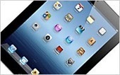

Focus on medium-sized smartphones and full-sized tablets and forget about “phablets."
That’s the conclusion of a new study by app advertising and analytics firm Flurry, which looked at how a device’s form factor and screen size relates to app usage on its network.
The study focused on the top 200 models, as measured by active users in Flurry’s systems, representing more than 80% of all usage. From that group, five basic device categories emerged: small phones, (3.5-inch or smaller screens), medium phones, (3.5 to 4.9-inch) Phablets (5 to 6.9-inch), small tablets (7 to 8.4-inch), full-size tablets (8.5 inches and up).
While small phones account for 16% of devices overall, they make up only 7% of active users and 4% of app sessions. Full-size tablets, by contrast, are overrepresented on Flurry’s network, reaching 1 billion smartphones and tablets monthly. They account for only 7% of the top 200 device models, but 15% of all active users, and 13% of app sessions.

 Your new post is loading...




