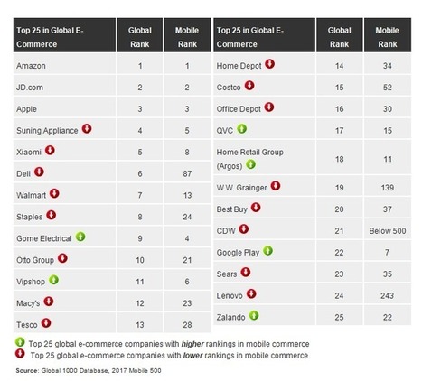
The web design field has gone through immense advancements and in some cases overhauls over the last decade. These advancements have undoubtedly introduced new technologies and innovations in order to make online consumer experience more pleasurable. However, they have also brought about new challenges as well, especially when it comes to mobile sites.
Ever since e-commerce websites went mobile, the playing field changed beyond recognition. New rules were made. Older ones were rewritten. And in some cases, traditional design approaches were abandoned altogether in favor of new versatile web design practices. These practices had one thing in common, to make mobile sites more responsive.
Today we’ll look at best practices for mobile e-commerce sites that new start-ups and even SMBs involved in e-commerce should pay attention to. These field-tested strategies essential for any designer working in this field.

 Your new post is loading...