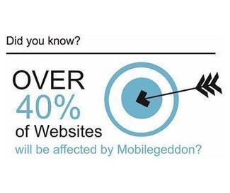
It s no secret that the rise of mobile devices has created one of the largest shifts in consumer behavior in the last 40 years.
ABI research reports that 1.2 billion smartphones will enter the market over the next five years. And Morgan Stanley has predicted that web browsing on mobile devices is likely to overtake desktops within the next couple years.
The question is: Is your website keeping pace with this shift?
If your website isn't easily accessible to mobile users you are missing out on a substantial group of sophisticated consumers, and your website is basically broken. These users will go somewhere else for products and services. Mobile ready websites are no longer a luxury; they are a necessity.
So, let's start with what you should avoid in your website.
Flash, Frames, and Funkiness
Flash is an Adobe multimedia platform for websites that has recently been discontinued. It was popular for video streaming, but it is not supported on more than 100 million iPhones and iPads. If your website has Flash as part of its framework, it's time for a change.
Frames came on the scene in 1996 and should have left soon after, but they hang on in many websites and cause problems.
You may not recognize a site that uses frames - they are invisible to the user - but you might have noticed these issues:
I can't bookmark the specific page - I keep bookmarking the homepage.
When I print it doesn't look right
When I resize my browser the site looks horrible and isn't usable.
It's amazing how many sites still use this non-standard technology and you should be sure your site isn't one of them. Using frames will ruin the mobile experience.
Funkiness is the the junk drawer of website features that includes animated "GIFs," popups, and various plugins that clutter a website and cause problems when it is displayed on smaller devices. Every element on a website should translate easily to mobile devices, and these elements can be troublemakers.

 Your new post is loading...