

 Your new post is loading...

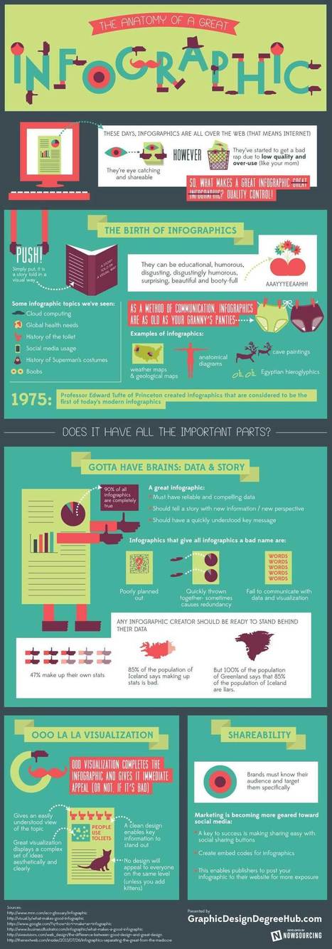

Created by the team behind Graphic Design Degree Hub, this self-referential infographic shows us how to create a great one.
According to this chart, it’s all about having reliable and compelling information, giving an issue a new perspective, and a main purpose—a task which is pretty challenging in itself.
Informative in nature, this infographic also pokes fun at charts with unreliable statistics—such as how 85% of Iceland’s population which agrees that making up figures is bad.
See the rest of the infographic at the article or view it in its entirety here.
Via Lauren Moss


![The 10 Commandments Of Using Pinterest For Business [Infographic] - Bit Rebels | MarketingHits | Scoop.it](https://img.scoop.it/TG_xWZhuKVsrDL_qwVS_HTl72eJkfbmt4t8yenImKBVvK0kTmF0xjctABnaLJIm9)

![An 8-Step Social Media Marketing Strategy For Brands [INFOGRAPHIC] | MarketingHits | Scoop.it](https://img.scoop.it/Fgp_rpJnPdYN5YXCrCcaazl72eJkfbmt4t8yenImKBVvK0kTmF0xjctABnaLJIm9)


![The eCommerce Guide to Social, Local & Mobile [Infographic] | MarketingHits | Scoop.it](https://img.scoop.it/TNgjIK-iioFlWPMXAbzbAzl72eJkfbmt4t8yenImKBVvK0kTmF0xjctABnaLJIm9)

![A Journalist’s Guide To Infographics [INFOGRAPHIC] | MarketingHits | Scoop.it](https://img.scoop.it/phHsX18IaPteO0FPRS96ajl72eJkfbmt4t8yenImKBVvK0kTmF0xjctABnaLJIm9)
![The Complete Guide to Successful Landing Pages [INFOGRAPHIC] | MarketingHits | Scoop.it](https://img.scoop.it/FRSBjxtSZfXQtimhmxEQoTl72eJkfbmt4t8yenImKBVvK0kTmF0xjctABnaLJIm9)


