Visualization Techniques and Practice
16.3K views | +0 today
Visualization Techniques and Practice
How to use visualization techniques for nonprofits in areas like data analysis, learning, facilitation, and innovation
Curated by Beth Kanter
Your new post is loading...
Rescooped by Beth Kanter from visual data
Scoop.it!

How Facebook's New Machine Brain Will Learn All About You From Your Photos

How Facebook's New Machine Brain Will Learn All About You From Your Photos | Visualization Techniques and Practice | Scoop.it
Facebook poaches an NYU machine learning star to start a new AI lab that may very well end up knowing more about your social life than you do.

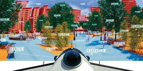
Facebook users upload 350 million photos onto the social network every day, far beyond the ability of human beings to comprehensively look at, much less analyze. And so that’s one big reason the company just hired NYU machine learning expert Yann LeCun as director of Facebook’s new AI laboratory, an eminent practitioner of an artificial intelligence (AI) technique known as “deep learning.”

“Yann LeCun's move will be an exciting step both for machine learning and for Facebook, which has a lot of unique social data,” says Andrew Ng, who directs the Stanford Artifical Intelligence Laboratory and who led a deep-learning project to analyze YouTube video for Google. “Machine learning is already used in hundreds of places throughout Facebook, ranging from photo tagging to ranking articles to your newsfeed. Better machine learning will be able to help improve all of these features, as well as help Facebook create new applications that none of us have dreamed of yet.”


Via Lauren Moss
Lewis Walker's curator insight, December 21, 2013 9:38 AM

Mega data collection is not just the government, it is the wave of the future. The question is how will we use it?

Rescooped by Beth Kanter from visual data
Scoop.it!

Artists use data to make political statements

Artists use data to make political statements | Visualization Techniques and Practice | Scoop.it

Big data can feel impersonal, overwhelming and cold. But stark statistics are now being used to make intimate statements through art and public advocacy.


The past few years have seen the widespread availability of a large amount of data, thanks largely to the internet.

Census reports are easily searchable, campaign polling is expertly parsed and analysed, and online dating behaviour provides a glimpse into human sexuality.


Now more artists are using these impersonal details to make an impassioned statement; visit the article link for examples.


Via Lauren Moss
Astrakhan's comment, February 9, 2013 3:44 AM
DataScientists = Data Artists
Rescooped by Beth Kanter from visual data
Scoop.it!

6 Illuminating Big Data Infographics

6 Illuminating Big Data Infographics | Visualization Techniques and Practice | Scoop.it

Is Big Data still a big mystery to you? 

In recent years, the volume of information coming into companies has exploded, so that many IT organizations are dealing with extremely large sets of data. 

IT leaders are rethinking many aspects of how they manage and deliver information, from investments in infrastructure and analytics tools to new policies for organizing and accessing data so they can deliver more of it, faster. They are concerned that if they don't have the right tools and architectures to deal with all that information, then big data can be a big problem. Check out these infographics on Big Data to see the impact...


Via Lauren Moss
Aurélia-Claire Jaeger's curator insight, January 21, 2013 2:28 AM

Et en plus, c'est beau !

Rescooped by Beth Kanter from visual data
Scoop.it!

An infographic explores the state of infographics

An infographic explores the state of infographics | Visualization Techniques and Practice | Scoop.it

It turns out 2012 was a huge year for the infographic—internet culture likes its data presented with charming representative imagery. 


Business, technology, and social media comprised the most popular topics for this exploding medium, according to data, Singapore searched the term “infographic” more than any other global city. 
The year’s most popular infographic was “What Are the Odds,” which explores how improbable it is that you (or this infographic, for that matter) came into existence in the first place...


Via Lauren Moss
No comment yet.
Rescooped by Beth Kanter from visual data
Scoop.it!

Create infographics that demand attention with these online tools

Create infographics that demand attention with these online tools | Visualization Techniques and Practice | Scoop.it

Want to create an attractive infographic but don’t have the budget to hire a professional designer?

Then you should try using an infographic-creation tool.

If your small business is looking for an eye-catching and easy to comprehend way to teach, inform, and inspire others about its products and services, infographics might be a good solution. Infographics can be more effective and memorable than other ways to present data, making them particularly effective for online audiences.

To create an infographic, you should make a list of possible ideas that you want to get across, create the initial draft or skeleton, color scheme it, and research your content from authoritative sites. Then it’s time to select your design platform.


Read about three online tools that can help you create stunning infographics...


Via Lauren Moss
No comment yet.
Rescooped by Beth Kanter from visual data
Scoop.it!

5 Free Tools for Creating Infographics

5 Free Tools for Creating Infographics | Visualization Techniques and Practice | Scoop.it

Generally, people don’t have the time or energy to sit and plow through pages or screens of text; they want to be able to ingest information as quickly and easily as possible. With the recent rise of infographics (information graphics), what used to require an avalanche of stats or analyses to dissect, can now be interpreted and relayed into an easy-to-read, fun, and visually appealing schematic – and an excellent content marketing concept. Infographics, when designed well, can be applied to different online sites and social networks.

Summarized at the article are 5 free tools (with links) that allow you to start creating simple infographics or explore the potential of data visualization...


Via Lauren Moss
Cb Bowman's curator insight, September 10, 2013 12:33 PM

The Tools Needed To Get You Started in Using Infographics

Rescooped by Beth Kanter from visual data
Scoop.it!

Which infographic is right for you?

Which infographic is right for you? | Visualization Techniques and Practice | Scoop.it

That’s right, there’s more to infographics than a scrolling image full of facts and figures. Different types of infographics are consumed differently.

The right kind of infographic should match your data to your narrative and ensure that people take away your message after reading it.

While infographics may not come in that many shapes or sizes (600 x 1,800 pixels is the norm), that doesn’t mean there’s a stock standard infographic for you.  

Use the flowchart to help you decide which infographic is right for you...


Via Lauren Moss
No comment yet.
Rescooped by Beth Kanter from visual data
Scoop.it!

Is Data Visualization Art?

Is Data Visualization Art? | Visualization Techniques and Practice | Scoop.it

Data Visualization is driven by data. Its form is often derived from optimizing the efficiency of inputting data (and information about that data) into a human brain. It is a very pragmatic practice, built around numbers and logic.


And yet it is beautiful. It evokes emotions. It can be aesthetically pleasing, or hideous. It communicates complex concepts and provokes thought. It is consumed for enjoyment. Some visualizations even share similarities with poetry.

There are several stages in the life cycle of data visualizations, and while the core of the practice is driven by rational thinking, any number of stages in the process have opportunities for subjective decisions or artistic interpretations...


Via Lauren Moss
Lauren Moss's curator insight, January 24, 2013 7:42 PM

An overview of the creative and artistic processes involved in data visualization...

Rescooped by Beth Kanter from visual data
Scoop.it!

Can you trust an infographic?

Can you trust an infographic? | Visualization Techniques and Practice | Scoop.it

A pictorial display of statistics, the infographic is a huge hit in the internet age.

But as one on rape figures has recently shown, they can be highly misleading.


A picture apocryphally speaks a thousand words, but its 21st-century counterpart – the infographic – often says much less. It's no surprise that the grabby and easily shared format has taken off in the internet era, and thlatest graphic to go viral is one on a tough and complex problem: rape and criminal justice...


Via Lauren Moss
No comment yet.
Rescooped by Beth Kanter from visual data
Scoop.it!

Infographic Design Vector Elements: Resources for creating visualizations

Infographic Design Vector Elements: Resources for creating visualizations | Visualization Techniques and Practice | Scoop.it

A collection of resoureces and links to free infographic design vector elements, including various graphics, charts, labels, pictograms, symbols, maps and more- for use in designing infographics and data visualizations.

Simply open the files in a vector based program and edit...


Via Lauren Moss
Dazhi Jiang's curator insight, December 12, 2012 5:35 AM

Infographic resources

Rescooped by Beth Kanter from visual data
Scoop.it!

All You Need to Know About Infographics: Tips, Tutorials, Guides

All You Need to Know About Infographics: Tips, Tutorials, Guides | Visualization Techniques and Practice | Scoop.it

Let’s be honest, we don’t like to read big pieces of text. Text-heavy graphs are rather difficult for understanding, especially when dealing with numbers and statistics. That is why illustrations and flowcharts are often used for such kind of information.

An infographic, or a visual representation of study or data, like anything else, can be done right or wrong. How to create a successful infographic? A good idea and a good design.


Stop by the link for more on what defines an infographic, what contributes to its popularity, as well as the various types of infographics and references for tutorials and best practices.


Additional topics covered include:

  • The major parts of an infographic
  • How to create an infographic
  • Developing ideas & organizing data
  • Research & sources
  • Typography, graphics & color
  • Facts & conclusions
  • Designing & Editing

Via Lauren Moss
HCL's curator insight, April 30, 2014 9:26 PM

Some good tips here...

Rescooped by Beth Kanter from visual data
Scoop.it!

Open Data Emerges as a Global Movement

Open Data Emerges as a Global Movement | Visualization Techniques and Practice | Scoop.it

“Open data” — the philosophy and practice of making the data collected by government agencies freely available to the public — is critical to increasing citizens’ engagement with their governments. Since 2010, hundreds of nations, regions, and cities across the world have launched their own open data initiatives.

For example, datacatalogs.org maintains centralized lists of local, regional, and national data catalogs. Europe is heavily represented: nearly every country publishes open data, geospatial files and maps and statistics. Within each nation, local councils, regional governments, and autonomous regions are publishing their own locally-relevant open data. Spain, Italy, and France each boast over a dozen internal data catalogs created by local agencies...

Whether or not open data portals eventually lead to open, transparent, and accountable democratic governments is still up for debate, but they remain indispensable to the citizens, researchers, and journalists using data from these sites.


Read the complete post for a better understanding of open data in a concise, yet informative article with numerous links and specific initiatives referenced for further research...


Via Lauren Moss
Johnson Watts's comment, October 2, 2012 1:35 PM
It's not the size of government that counts. It's the transparency, agility, and democracy of goverment that matters.