Visualization Techniques and Practice
16.3K views | +0 today
Follow
Visualization Techniques and Practice
How to use visualization techniques for nonprofits in areas like data analysis, learning, facilitation, and innovation
Curated by Beth Kanter
Your new post is loading...
Rescooped by Beth Kanter from visual data
Scoop.it!

Which infographic is right for you?

Which infographic is right for you? | Visualization Techniques and Practice | Scoop.it

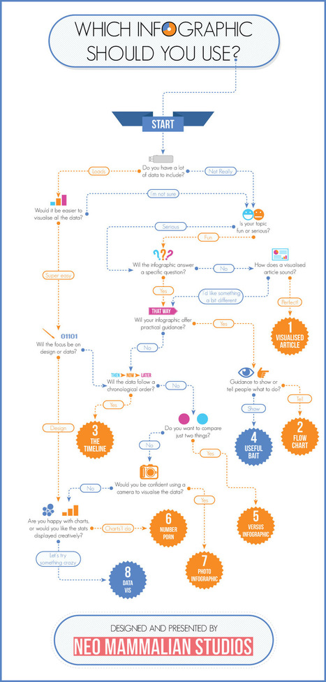
That’s right, there’s more to infographics than a scrolling image full of facts and figures. Different types of infographics are consumed differently.

The right kind of infographic should match your data to your narrative and ensure that people take away your message after reading it.

While infographics may not come in that many shapes or sizes (600 x 1,800 pixels is the norm), that doesn’t mean there’s a stock standard infographic for you.  

Use the flowchart to help you decide which infographic is right for you...


Via Lauren Moss
No comment yet.
Rescooped by Beth Kanter from visual data
Scoop.it!

Lessons from Visualized: Cutting Through Hyperbole With Data Visualization

Lessons from Visualized: Cutting Through Hyperbole With Data Visualization | Visualization Techniques and Practice | Scoop.it

At the Visualized conference on November 9th, Neil Halloran posed an interesting question: Can DataViz lead to a data savvy society in the same way that the printing press lead to a literate one? One that is prepared to make tough decisions on complex issues?

Neil Halloran thinks so. That’s why he created VisualBudget.org to cut through hyperbole surrounding the what may be the most frequently misunderstood and pressing issue facing Americans today, our massive $16 trillion dollar deficit.

But how is a modern citizen supposed to make an informed decision on issues of tremendous scope and complexity, such as the fiscal cliff or the growing budget deficit without falling back on sound bites and punditry? Neil Halloran’s solution is to tell a story. Rather than simply presenting a static infographic or a set of tabular data on federal receipts and expenditures, VisualBudget.org takes you on a interactive tour...


Via Lauren Moss
No comment yet.