

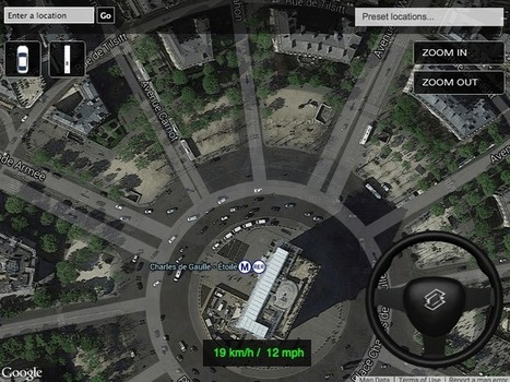
Explore the many trivia, hidden object, shooting and driving games created around Google Maps, from Streetview Zombie Apocalypse to Google Sheep View.
Via Tom D'Amico (@TDOttawa) , massimo facchinetti
Get Started for FREE
Sign up with Facebook Sign up with X
I don't have a Facebook or a X account


 Your new post is loading...
 Your new post is loading...
Your new post is loading...
Explore the many trivia, hidden object, shooting and driving games created around Google Maps, from Streetview Zombie Apocalypse to Google Sheep View. Via Tom D'Amico (@TDOttawa) , massimo facchinetti 
No comment yet.
Sign up to comment
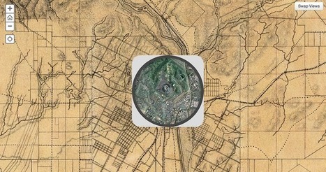
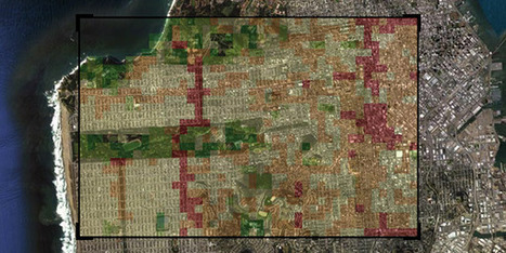
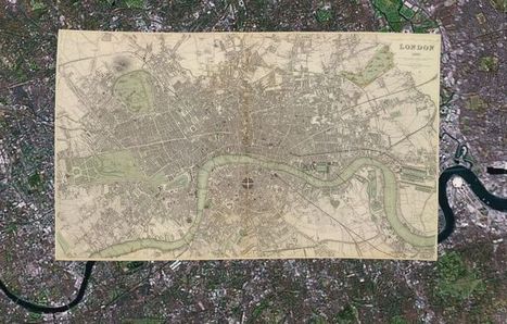
The Smithsonian magazine recently dipped into David Rumsey's collection of over 150,000 maps to find some of the best representations of American cities over the past couple hundred years. With some simple programming, they were able to overlay images of vintage maps of some major cities onto satellite images from today. The results are fascinating. Via Lauren Moss

Gordon Shupe's curator insight,
September 3, 2013 8:24 AM
I love interactive maps, and history is fascinating... let's take a look!

Take a look at a set of maps that tell encoded stories of politics, natural disasters and social movements.
There are many nice Flickr visualizations of global cities but never anything quite this comprehensive across space and time: Meet Luminous Cities, a creation of the London-based mapping and digital arts firm TraceMedia, built with support from the Centre for Spatial Analysis & Policy at the University of Leeds and the Centre for Advanced Spatial Analysis at University College London. The project is trying to "uncover the archeology of data traces left by social media" in cities across the globe... Via Lauren Moss
Thanks to the open data movement and Google Map Maker, anyone with a computer can create a map. These maps tell a story, but it's a subjective one. And while that can be a powerful tool, it can also skew perspectives and cloud a debate. "We should really teach people to read maps in that way," says Laura Kurgan, an associate professor of architecture at Columbia University. "Maps are arguments, just like a piece of written journalism is an argument." Via Lauren Moss
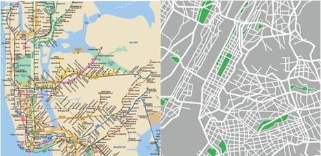
Subway maps distort the reality on the ground for all kinds of reasons. What happens when we make decisions based on them? London’s city center takes up about two percent of the city. On the Tube map, it looks four times as big. Over in New York City, Central Park—which is a skinny sliver, much longer than it is wide—was depicted in some 1960s and ‘70s IRT maps as a fat rectangle on its side. So public transit maps are distorted, quite on purpose. All of them enlarge city centers. Many use a fixed distance between stations out in the boonies, even if, in reality, they’re spaced wildly differently. Curvy lines are made straight. Transfers are coded with dots, lines, and everything in between. According to Zhan Guo, an assistant professor of urban planning and transportation policy at NYU Wagner, certain cities allow for more flight of fancy than others. San Francisco and New York have a lot of geographic markers, so passengers will only accept so much map distortion. New York’s grid system further discourages excessive futzing. In Chicago, the line is elevated, which leaves even less leeway. But in a place like London, with twisty streets, few geographical markers other than the Thames, and an underground system, you can pull a lot more over on people... Via Lauren Moss
The Neighborhood Visualizer , developed by MIT PhD candidate David Quinn and Lisbon research student Daniel Wiesmann, aims to bring about a better understanding about urban patterns that relate to material use and energy use.
Built on top of a selection of open-source tools, the web-based map reveals the currently available data on material (i.e. kg/person) and energy use (i.e. kWh/person) in about 42 different US cities. 'Materials' include parameters like asphalt or gravel roads, or the use of masonry, glass or timber in residential housing, all based on estimations of urban form. Users can select specific neighborhood areas and create heatmaps that are normalized by population or household size. Further analyses are automatically generated as PDF files. Via Jandira Feijó
|

From
spatial

Robin Edwards, a researcher at UCL CASA, has created these stunning topographic maps using the high resolution elevation data provided by the British Oceanographic Data Centre. The transitions from black (high areas) to blue (low areas) give the maps a slightly ethereal appearance to dramatic effect. Via Lauren Moss
Maps can direct us from here to there, show where one thing is in relation to another, or add layers information to our surroundings. Whatever its form, a map’s main purpose is to make the complex world we live in more comprehensible. But there are also maps that describe the world as it never came to be. Those are the maps that interest Andrew Lynch, who runs a Tumblr called Hyperreal Cartography & The Unrealized City that's full of city maps collected from libraries, municipal archives, and dark corners of the internet. Lynch recently shared a few of his favorite “dream cities” with WIRED’s MapLab... Via Lauren Moss
With 150,000 or so old print maps to his name, David Rumsey has earned his reputed place among the world's "finest private collectors." He continues to expand his personal trove as well as the digitized sub-collection he makes open to the public online — some 38,000 strong, and growing.
He's created a series of interactive maps that layer old prints onto the Google Earth and Google Maps platforms, and this summer he plans to launch a geo-referencing tool (similar to one recently introduced by the British Library) that lets users get involved in the digital mapping process themselves. While preparing for this next expansion of his online map empire, Rumsey remains fascinated by "the power of putting these images up and letting them go," he says. "Maps have a way of speaking to people very straightforward," he says. "You don't have to have a lot of knowledge of map history or history in general. To me they're perfect tools for teaching history to the public." Via Lauren Moss
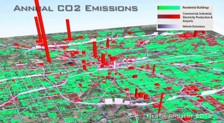
A team of researchers from Arizona State University have developed a new software system, called Hestia, that is capable of estimating greenhouse gas emissions across entire urban landscapes, all the way down to street level and individual buildings. The project, known as Hestia after the Greek goddess of home and hearth, allows the team to combine extensive public database “data-mining” with traffic simulation and building-by-building energy-consumption modeling. According to researchers, Hestia’s increased detail and accuracy will help cities, and possibly even other nations, identify where an investment in energy and greenhouse gas savings would have the greatest impact... Via Lauren Moss
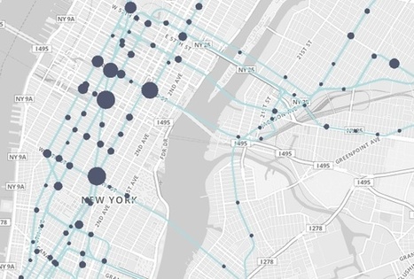
What do 1.6 billion mass transit trips through the city look like? In 2011, MetroCards were swiped through the turnstiles of the New York City subway system 1.6 billion times. Each swipe was, itself, a data point, and it came connected to myriad others about the day of the week, the subway stop, the identity of the rider. Did the commuter have a student MetroCard, or a senior citizen one? What about a seven-day pass, or a 30-day one? As a sheer byproduct of moving so many people around the city, the New York Metropolitan Transit Authority constantly churns out information like this. And, thanks to the rapidly expanding movement for open data, it’s now available to the public – if we can just begin to figure out what to do with it. "This is such a big sprawling thing," says John Geraci, who heads the New York office of faberNovel, a Paris-based company that consults with cities, non-profits and private companies on how to act more like startups. "This data was not created really with this in mind, with the idea of being seen by people. It’s like data exhaust." Geraci’s firm has just created a data visualization site playing with all of this information to at least begin to tempt our imaginations on what we could learn from it... Via Lauren Moss, Sylvia Fredriksson
|


