
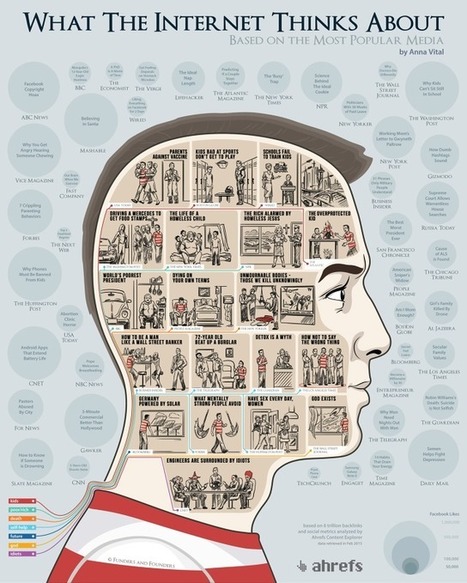
What does the Internet care about? What articles do we share the most? Using the data from the Ahrefs Content Explorer, the people at Funders and Founders
Via Lauren Moss
Get Started for FREE
Sign up with Facebook Sign up with X
I don't have a Facebook or a X account


 Your new post is loading...
 Your new post is loading...
Your new post is loading...
What does the Internet care about? What articles do we share the most? Using the data from the Ahrefs Content Explorer, the people at Funders and Founders Via Lauren Moss 

Are you still printing employee handbooks? Are you still hanging on to that filing cabinet? Are you still filling out employee paperwork by hand?
Aside from being a huge burden on the environment, it’s a drain on your time and your money. Via Lauren Moss, Wes Thomas
A visual history of human sensemaking, from cave paintings to the world wide web.
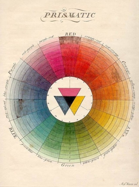
100 Diagrams That Changed the World by investigative journalist and documentarian Scott Christianson chronicles the history of our evolving understanding of the world through humanity’s most groundbreaking sketches, illustrations, and drawings, ranging from cave paintings to The Rosetta Stone to Moses Harris’s color wheel to Tim Berners-Lee’s flowchart for a “mesh” information management system, the original blueprint for the world wide web. But most noteworthy of all is the way in which these diagrams bespeak an essential part of culture — the awareness that everything builds on what came before, that creativity is combinational, and that the most radical innovations harness the cross-pollination of disciplines. Via Lauren Moss

Patrizia Bertini's curator insight,
December 30, 2012 5:59 AM
I see! - goes together with embodied cognition? It seems so... Infographics as a key? 
bancoideas's curator insight,
December 30, 2012 9:28 AM
Ideas acerca de las ideas que tenemos sobte nosotros/as mismos/as y el mundo que co-construimos 
Denise Eler's curator insight,
June 30, 2015 7:26 PM
Quando um gestor pede que uma apresentação de 80 slides seja condensada em 3 slides, ou uma página A3, não tenha dúvida: isto vai exigir de você mais que capacidade de síntese textual. Pensar visualmente, especialmente, criando diagramas é uma competência valiosa. Vejo isso durante meus cursos e vivência com profissionais das mais variadas indústrias. A boa notícia é que dá para aprender ;)

There’s so much we know that we’ll never see. We can extrapolate the concept of the Big Bang--the explosion of everything in the universe from a focused point.
So projects like Beginning, an animation by Grzegorz Nowiński from Novina Studio, are remarkably important. It tells a sort of good parts version of the history of the universe, from the Big Bang to the rise of humankind. Not only is the piece pure visual delight filled with stark textures and fine particle effects that look particularly stunning when projected on water, Beginning is a grounding piece of context--somewhat imagined, sure--but the sort of imagined thing that very much centers our perspective of reality. The average person sort of knows what the Big Bang looked like because of projects like this one, even if Beginning is far more stylized than photoreal. Via Lauren Moss

Lauren Moss's curator insight,
December 17, 2012 8:44 PM
This project is an intriguing visualization incorporating sound, photography, and projection- view the animation at the link (FastCompany) and read more on the process involved in creating this 4.5 minute history of the universe... 
Jean-Michel Bayle's curator insight,
December 29, 2012 11:57 AM
A voir absolument avant la fin de l'année 2012 ... Bonne Année 2013
From
ht

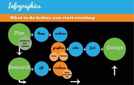
Let’s be honest, we don’t like to read big pieces of text. Text-heavy graphs are rather difficult for understanding, especially when dealing with numbers and statistics. That is why illustrations and flowcharts are often used for such kind of information. An infographic, or a visual representation of study or data, like anything else, can be done right or wrong. How to create a successful infographic? A good idea and a good design.
Stop by the link for more on what defines an infographic, what contributes to its popularity, as well as the various types of infographics and references for tutorials and best practices.
Additional topics covered include: The major parts of an infographic How to create an infographic Developing ideas & organizing data Research & sources Typography, graphics & color Facts & conclusions Designing & Editing Via Lauren Moss, Monique Walhof, THE OFFICIAL ANDREASCY
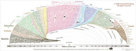
In this graphic by the Tree of Life web project and designer Leonard Eisenberg, we see all 3.5 billion years of life on earth evolving, not through limbs and timelines, but an elegant rainbow swirl. It’s as if our whole history is a colorful bunch of balloons, all tying back to bacteria. As you look at the graphic, realize that time radiates outward and each kingdom’s appearance is also in chronological order from left to right. What you’ll discern then is a story of origins and mass extinctions, the way life almost bided its time through the Ice Age then hit the gas through the Cambrian Explosion. It was here when the protostomes (everything from trilobites to squids) simply went nuts, and the separation of plants vs. animals as we know them arose...
Visit the article to learn more about the graphic that visualizes the history of the world... Via Lauren Moss
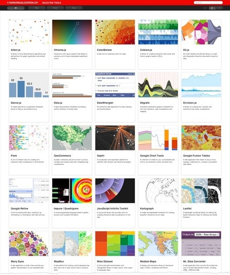
Robin Good: Here is a curated collection of "libraries for plotting data on maps, frameworks for creating charts, graphs and diagrams and tools to simplify the handling of data" to create interactive and dynamic data visualizations.
Useful. 8/10
Collection: http://datavisualization.ch/tools/selected-tools/
Via Robin Good, Maria Zappa Kasapidi

Dean Meyers's comment,
September 6, 2012 8:19 AM
I turn to this collection routinely for inspiration and to learn what's up and coming in the dataviz world. d3.js was probably my latest find through this site.

wildswans's curator insight,
May 5, 2013 12:08 AM
What an interesting selection of tools for data presentation, if only more of them were free.
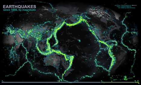
This map of all the world's recorded earthquakes between 1898 and 2003 is stunning. As you might expect, it also creates a brilliant outline of the plates of the Earth's crust—especially the infamous "Ring of Fire" around the Pacific Plate.
The plate boundaries are amazingly vivid in this geovisualization of the all the earthquakes over a 105 year span. How did scientist orginally come up with the theory of plate tectonics? How did spatial thinking and mapping play a role in that scientific endeavor? Via Martin Daumiller, Sakis Koukouvis
This visualization tours the ocean floor from the gentle continental slopes to the deepest trenches using data analyzed and archived by NOAA. Does it look familiar? It is actually the same data that Google has incorporated into Google Earth and Ocean. Via Sakis Koukouvis
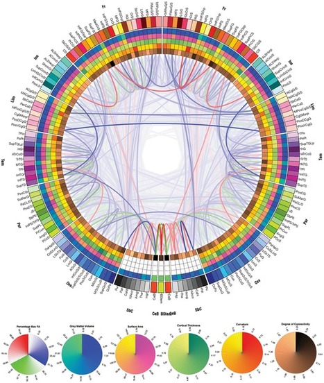
The point is to show how advances in imaging and data visualization technologies enable inter-disciplinary research which just a decade ago would have been impossible to conduct. There is also a somewhat artistic quality to these images, which reinforces the notion of data visualization being both art and science.
CONNECTOME: http://www.scoop.it/t/science-news?tag=connectome
Via Sakis Koukouvis
In this new RSA Animate, Manuel Lima, senior UX design lead at Microsoft Bing, explores the power of network visualisation to help navigate our complex modern world. Taken from a lecture given by Manuel Lima as part of the RSA's free public events programme.
Via Sakis Koukouvis
From
vimeo
This visualization reveals the freshwater stores that NASA’s GRACE (Gravity Recovery and Climate Experiment) satellite detects from space and shows how that data can be used to evaluate groundwater gains and losses, critical information in the effort to conserve the water that people depend upon Via Sakis Koukouvis
This seems like a straightforward question, but it’s proven to be a difficult one to answer. Even visualization researchers don’t have a clear definition.
Is it synonymous with information graphics? Does visualization have to be computer generated? Does data have to be involved, or can it be abstract? The answers vary depending on who you ask.
Visualization is a medium. It’s not just an analysis tool nor just a way to prove a point more clearly through data. Visualization is like books. There are different writing styles and categories, there are textbooks and there are novels, and they communicate ideas in different ways for varied purposes. And just like authors who use words to communicate, there are rules that you should always follow and others that are guidelines that you can bend and break... Via Lauren Moss

Fàtima Galan's curator insight,
September 12, 2013 6:50 AM
"Visualization is like books. There are different writing styles and categories, there are textbooks and there are novels, and they communicate ideas in different ways for varied purposes. " 
Patrice Mitrano's curator insight,
January 30, 2014 5:16 AM
De très nombreux exemples d'infographies, malheureusement pas toujours aboutis. A croiser avec d'autres infographies ou représentations sur des sujets identiques ou bien à rapprocher des données sources. |
Graphics, charts, diagrams and visual data representations have been published on books, newspapers and magazines since they've existed, not to mention old maps and scientific illustrations...
Despite the lack of tools such as the ones we have at our disposal nowadays, they are as inspiring and important as the best contemporary visualizations. Visit the article link for a gallery of vintage visualizations... Via Lauren Moss

Charlley Luz's curator insight,
July 20, 2013 10:26 AM
muito legal, os Infográficos antes de existir a internet. 35 exemplos de infográficos no papel :) Achei falta do Marcha para Moscou do Minard http://www.datavis.ca/gallery/re-minard.php ; 
Leoncio Lopez-Ocon's curator insight,
July 20, 2013 2:57 PM
El brasileño Tiago Veloso, fundador de Visual Loop, nos ofrece 35 interesantísimas representaciones visuales de distintos fenómenos y eventos que permiten hacer un paseo por la historia de la ilustración científica.
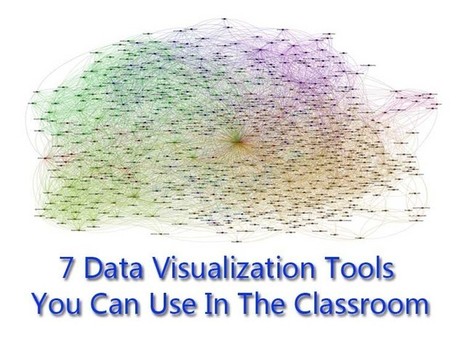
No matter what happens, there will always be a demand for data visualization tools. Data on its own can be pretty boring and brightening it up with images and other visual tools, it can make normally inaccessible information much easier to digest. (Editor’s Note: It’s also great for information reading literacy, and the new Common Core demand for multimedia “texts.”) There are a number of fantastic tools out there that will present your data in an accessible manner. All of the tools listed below are free and chances are you’ve used one or two of the tools mentioned before. Via Lauren Moss
There’s so much we know that we’ll never see. We can extrapolate the concept of the Big Bang--the explosion of everything in the universe from a focused point. Via Lauren Moss
Lauren Moss's curator insight,
December 17, 2012 8:44 PM
This project is an intriguing visualization incorporating sound, photography, and projection- view the animation at the link (FastCompany) and read more on the process involved in creating this 4.5 minute history of the universe...
Jean-Michel Bayle's curator insight,
December 29, 2012 11:57 AM
A voir absolument avant la fin de l'année 2012 ... Bonne Année 2013
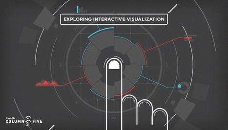
We often spend time talking to organizations that initially believe developing one or more static infographics is the best approach. Many times, we discover that their objectives, narrative, existing content, and the profile of their target audience suggest we should be considering developing an interactive work product instead.
As infographics become a more prevalent form of communication, we look ahead to other meaningful ways to impart information. This article serves as an introduction to interactive visualizations, with more detailed articles on the topic still to come. Via Lauren Moss
From
ht
Let’s be honest, we don’t like to read big pieces of text. Text-heavy graphs are rather difficult for understanding, especially when dealing with numbers and statistics. That is why illustrations and flowcharts are often used for such kind of information. An infographic, or a visual representation of study or data, like anything else, can be done right or wrong. How to create a successful infographic? A good idea and a good design.
Stop by the link for more on what defines an infographic, what contributes to its popularity, as well as the various types of infographics and references for tutorials and best practices.
Additional topics covered include: The major parts of an infographic How to create an infographic Developing ideas & organizing data Research & sources Typography, graphics & color Facts & conclusions Designing & EditingVia Lauren Moss
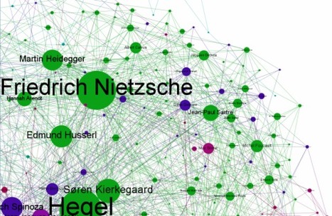
Simon Raper at Drunks & Lampposts has composed a data visualization of the relations of influence among philosophers.
Read more:
Via Gust MEES
This map of all the world's recorded earthquakes between 1898 and 2003 is stunning. As you might expect, it also creates a brilliant outline of the plates of the Earth's crust—especially the infamous "Ring of Fire" around the Pacific Plate.
The plate boundaries are amazingly vivid in this geovisualization of the all the earthquakes over a 105 year span. How did scientist orginally come up with the theory of plate tectonics? How did spatial thinking and mapping play a role in that scientific endeavor? Via Martin Daumiller, Sakis Koukouvis
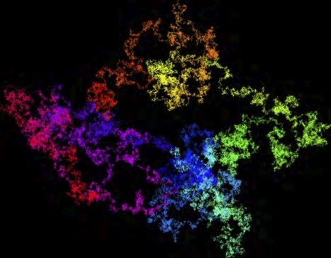
Of course, the number of digits in π is infinite, but over the years, as computers have become more powerful, we know many more of them than ever before. But it’s one thing to say that I can download trillions of digits of π and another to make some sort of sense out of all of these digits. Into this steps a team of researchers from Australia, Lawrence Berkeley National Laboratory, and Simon Fraser University with some elegant visualizations of π. In a recent paper, they used a classic method of visualizing large strings of numbers: the random walk.
More on "Pi": http://www.scoop.it/t/science-news?tag=pi
Via Sakis Koukouvis
When I meet with people and talk about our work, I get asked a lot what technology we use to create interactive and dynamic data visualizations. At Interactive Things, we have a set of preferred libraries, applications and services that we use regularly in our work. We will select the most fitting tool for the job depending on the requirements of the project. Sometimes a really simple tool is all you need to create something meaningful. On other occasions, a more multifaceted repertoire is needed. But how does one choose the right thing to use? An endless list of every tool available, does not answer that question and a recommendation from a friend is oftentimes more valuable. That’s why we have put together a selection of tools that we use the most and that we enjoy working with. We called it selection.datavisualization.ch. It includes libraries for plotting data on maps, frameworks for creating charts, graphs and diagrams and tools to simplify the handling of data. Even if you’re not into programming, you’ll find applications that can be used without writing one single line of code. We will keep this list as a living repository and add / remove things as technology develops... Via Lauren Moss, Pepe Crespo, Sonia C. Alonso
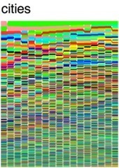
We are an increasingly urban species, with more than half of humanity living in urban hubs. Ranking the world's 590 most-populous cities, this psychedelic stack flow packs history, geography, and population into a single digital square. Via Ana Valdés, Sakis Koukouvis
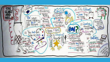
Visual thinking is an approach that uses art to develop critical thinking, communication and visual literacy skills. Incorporating sketching and visual note-taking skills for meeting facilitation in real time instead of using PowerPoint presentations is an effective way to solve problems, articulate ideas and communicate with clients and team members. Via Sakis Koukouvis

From
io9
The picture up top is adapted from a rather simple but effective piece of data visualization, created by the folks at design studio TWO-N, which represents the first four-million digits of Pi in a brilliant mess of interactive pointillism.
Other stories about PI: http://www.scoop.it/t/science-news?tag=pi
Via Sakis Koukouvis
|


Interesting insight into the internet
At least, the concern about equality, energy and social welfare is there. I like the last one about engineers tho. Hahaha.
I think this article is awesome because they use data visualization to show what people share the most, visit the most, and search the most. Data is everywhere and people are using it everyday and sometimes don't even think about it.