


 Your new post is loading...

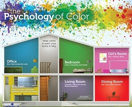

Infographic: What Colors Should You Use?
‘The Psychology of Color’ explores what colors should and should not be used in interiors, and why certain colors are used in advertising.
According to the infographic, offices should be painted blue, as it is the “most productive color”. Living rooms should be painted lavender, to calm the nerves and offer relaxation. Yellow increases metabolism, and gives you energy.
The infographic also states that the color red: “evokes strong emotion, encourages appetite, passion or intensity”.
Black, white, silver and gold colors are often used for luxury items (Chanel, Prada, Michael Kors)—to enhance the feeling of sophistication...
Via Lauren Moss


