omnia mea mecum fero
14.2K views | +0 today
Follow
omnia mea mecum fero
όλα τα δικά μου τα κουβαλάω πάνω μου
Curated by pa3geo
Your new post is loading...
Rescooped by pa3geo from visual data
Scoop.it!

Infographic: Hackers Create An Amazing, Illegal Portrait Of The Internet

Infographic: Hackers Create An Amazing, Illegal Portrait Of The Internet | omnia mea mecum fero | Scoop.it

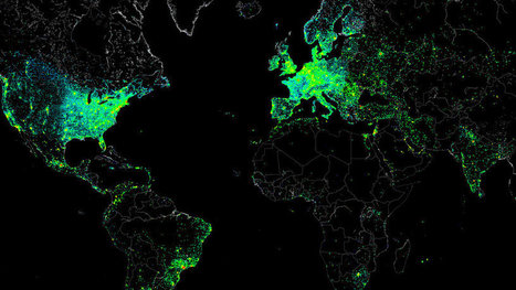
It wasn’t malicious. The file itself was the size of a small JPEG. It was given the absolute lowest priority. And it was set to self-destruct if anything went wrong. But this small file allowed one single hacker to measure the Internet activity of nearly half a million connected devices around the world, then share the results with everyone.

How was this even possible? The "hacker" barely hacked anything. In reality, they gained access to all these systems because each had the default "root" set as a password. With this access in hand, they ran several tests focusing on Internet structure and activity. And what they created from all this data is a spectacular map that captures a day in the life of the Internet (and all of its users).


Via Lauren Moss
Annenkov's comment, May 10, 2013 11:24 PM
США и Европа как очаги информатизации
Sakis Koukouvis's comment, May 11, 2013 3:17 AM
Wonderful
Nacho Vega's curator insight, May 11, 2013 12:18 PM

Creative power: hacking at the end of the world!


Using "root" as universal key :))

Rescooped by pa3geo from visual data
Scoop.it!

The Big Data Explosion [infographic]

The Big Data Explosion [infographic] | omnia mea mecum fero | Scoop.it

Data is everywhere!

Take a look at the data that is being produced throughout the world every day and the sources of the explosion of big data...


Via Lauren Moss
Andres Zurita's curator insight, February 5, 2013 6:27 AM

amazing flow of info...

Scooped by pa3geo
Scoop.it!

Udacity | Free Online Courses, Advance your College Education & Career

Udacity | Free Online Courses, Advance your College Education & Career | omnia mea mecum fero | Scoop.it
Learn. Think. Do. Free Online Classes in Programming, Computer Science, Math, Sciences and Entrepreneurship from Top University and Industry Instructors.
No comment yet.
Rescooped by pa3geo from visual data
Scoop.it!

The top 20 data visualisation tools

The top 20 data visualisation tools | omnia mea mecum fero | Scoop.it

From simple charts to complex maps and infographics, Brian Suda's round-up of the best – and mostly free – tools has everything you need to bring your data to life...

A common question is how to get started with data visualisations. Beyond following blogs, you need to practice – and to practice, you need to understand the tools available. In this article, get introduced to 20 different tools for creating visualisations: from simple charts to complex graphs, maps and infographics. Almost everything here is available for free, and \you may have installed already...


Via Lauren Moss
Randy Rebman's curator insight, January 28, 2013 12:33 PM

This looks like it might be a good source for integrating infographics into the classroom.

Rescooped by pa3geo from #TRIC para los de LETRAS
Scoop.it!

A Carefully Selected List of Recommended Tools

A Carefully Selected List of Recommended Tools | omnia mea mecum fero | Scoop.it
When I meet with people and talk about our work, I get asked a lot what technology we use to create interactive and dynamic data visualizations.

At Interactive Things, we have a set of preferred libraries, applications and services that we use regularly in our work. We will select the most fitting tool for the job depending on the requirements of the project. Sometimes a really simple tool is all you need to create something meaningful. On other occasions, a more multifaceted repertoire is needed. But how does one choose the right thing to use? An endless list of every tool available, does not answer that question and a recommendation from a friend is oftentimes more valuable.

That’s why we have put together a selection of tools that we use the most and that we enjoy working with. We called it selection.datavisualization.ch. It includes libraries for plotting data on maps, frameworks for creating charts, graphs and diagrams and tools to simplify the handling of data. Even if you’re not into programming, you’ll find applications that can be used without writing one single line of code. We will keep this list as a living repository and add / remove things as technology develops...


Via Lauren Moss, Pepe Crespo, Sonia C. Alonso
No comment yet.
Rescooped by pa3geo from visual data
Scoop.it!

The Internet Of Things: Every Device That Connects Us [Infographic]

The Internet Of Things: Every Device That Connects Us [Infographic] | omnia mea mecum fero | Scoop.it

When trying to piece together the devices that we use to connect to each other, it’s easy to see that it’s going to take a piece of paper the size of Texas to feature them all. Even if we manage to do so, we will be far from connecting them all in whatever way they use the Internet. So what do we do? Well, we do it anyway, and on a computer of course. Intel put together a really interesting infographic that lines up all the devices that we use to connect to each other.

For the first time, we can get a clear view of how the technological infrastructure was built and to what extent it reaches out. As you can see, the numbers represented get multiplied with each major technological milestone, and it’s easy to see that we’re heading for something really interesting in the future. Whatever it will be that will beat the Internet will be major, and even though I can’t imagine what that will be right now, it’s still exciting to know that we always come up with something to beat the previous technology. What do you think will be the next big thing in technology that will top the Internet?


Via Lauren Moss
No comment yet.
Scooped by pa3geo
Scoop.it!

18 Ways Teachers Can Use Google+ Hangouts - Online Colleges

18 Ways Teachers Can Use Google+ Hangouts - Online Colleges | omnia mea mecum fero | Scoop.it
Add Google+ Hangouts to your curriculum to make class time more fun and rewarding.
No comment yet.
Rescooped by pa3geo from visual data
Scoop.it!

Infographic: An Amazing, Invisible Truth About Wikipedia

Infographic: An Amazing, Invisible Truth About Wikipedia | omnia mea mecum fero | Scoop.it

Every Wikipedia entry has an optional feature we take for granted--geotagging. An entry on the Lincoln Memorial will be linked to its specific latitude and longitude in Washington D.C. On any individual post, this may or may not be a useful thing. But what about looking at these locations en masse?

That was a question asked by data viz specialist and programmer Olivier Beauchesne. To find out, he downloaded all of Wikipedia (it’s open-source, after all) then used an algorithm that would assemble 300 topical clusters from popular, related keywords. Then he placed the location of each article in these topical clusters on a map. What he found was astounding...


Via Lauren Moss
No comment yet.
Scooped by pa3geo
Scoop.it!

Coursera

Coursera | omnia mea mecum fero | Scoop.it
We are a social entrepreneurship company that partners with the top universities in the world to offer courses online for anyone to take, for free.
No comment yet.
Rescooped by pa3geo from visual data
Scoop.it!

Create infographics that demand attention with these online tools

Create infographics that demand attention with these online tools | omnia mea mecum fero | Scoop.it

Want to create an attractive infographic but don’t have the budget to hire a professional designer?

Then you should try using an infographic-creation tool.

If your small business is looking for an eye-catching and easy to comprehend way to teach, inform, and inspire others about its products and services, infographics might be a good solution. Infographics can be more effective and memorable than other ways to present data, making them particularly effective for online audiences.

To create an infographic, you should make a list of possible ideas that you want to get across, create the initial draft or skeleton, color scheme it, and research your content from authoritative sites. Then it’s time to select your design platform.


Read about three online tools that can help you create stunning infographics...


Via Lauren Moss
No comment yet.
Rescooped by pa3geo from visual data
Scoop.it!

10 Best Tools for Creating Infographics

10 Best Tools for Creating Infographics | omnia mea mecum fero | Scoop.it
We have a list of 10 Best Tools for Creating Infographics. Making infographics from scratch can be a tough as and not all the people can do it.

This is where some tools can help — numerous resources are available to help you while designing and creating infographics. Graphics and visualization samples from each website are included in this list, so you can visit each link and see the infographics directly from the source.

Check out this list of 10 Best Tools for Creating Infographics, and find the ones that suit your needs the best...


Via Lauren Moss
No comment yet.
Rescooped by pa3geo from Informatics Technology in Education
Scoop.it!

Wunderlist – Fantastic Productivity Apps | Mark Brumley

Wunderlist – Fantastic Productivity Apps | Mark Brumley | omnia mea mecum fero | Scoop.it

Try Wunderlist for a powerful, easy to use productivity tool with a wonderful user interface. Easily create to-do lists and arrange in categories (list names). You can share lists with others so collaborating on projects is a snap. ...


Via Informatics
No comment yet.
Rescooped by pa3geo from visual data
Scoop.it!

Data Visualization: 20+ Useful Tools and Resources

Data Visualization: 20+ Useful Tools and Resources | omnia mea mecum fero | Scoop.it
There are plenty of cool technologies available to collect and examine data.

Both web and desktop applications have provided some really great interfaces to fall in love with data mining, and with the rise in popularity we have noticed an increased number of infographics created over the past few years.


Via Lauren Moss
No comment yet.
Rescooped by pa3geo from Edu4Kids
Scoop.it!

Geocube - The world of Geography at your fingertips

Geocube - The world of Geography at your fingertips | omnia mea mecum fero | Scoop.it

Geocube is an attractive online resource about Geography. Geocube is based on the principle of the Rubik Cube with six faces and 54 topics. It is a virtual and easily accessible website which is available online for free. Move the Geocube around with your mouse and explore the faces and topics.Geocube provides an accessible way to read, see and watch what Geography is and geographers do. This is a European initiative developed by HERODOT, the European Network for Geography in Higher Education and is available to anyone who is interested in Geography.


Via Smaragda Papadopoulou, Informatics
No comment yet.