omnia mea mecum fero
14.2K views | +0 today
Follow
omnia mea mecum fero
όλα τα δικά μου τα κουβαλάω πάνω μου
Curated by pa3geo
Your new post is loading...
Rescooped by pa3geo from Daily Magazine
Scoop.it!

All You Need to Know About Infographics: Tips, Tutorials, Guides

All You Need to Know About Infographics: Tips, Tutorials, Guides | omnia mea mecum fero | Scoop.it

Let’s be honest, we don’t like to read big pieces of text. Text-heavy graphs are rather difficult for understanding, especially when dealing with numbers and statistics. That is why illustrations and flowcharts are often used for such kind of information.

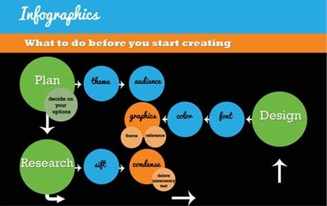
An infographic, or a visual representation of study or data, like anything else, can be done right or wrong. How to create a successful infographic? A good idea and a good design.


Stop by the link for more on what defines an infographic, what contributes to its popularity, as well as the various types of infographics and references for tutorials and best practices.


Additional topics covered include:

The major parts of an infographic How to create an infographic Developing ideas & organizing data Research & sources Typography, graphics & color Facts & conclusions Designing & Editing


Via Lauren Moss, Monique Walhof, THE OFFICIAL ANDREASCY
HCL's curator insight, April 30, 2014 9:26 PM

Some good tips here...

Rescooped by pa3geo from Informatics Technology in Education
Scoop.it!

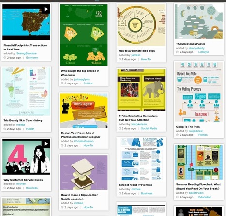
Πως να δημιουργήσετε ένα Infographic

Πως να δημιουργήσετε ένα Infographic | omnia mea mecum fero | Scoop.it
Πως μπορείτε να δημιουργήσετε εύκολα τα δικά σας infographics!

Via sofilab, Informatics
No comment yet.
Rescooped by pa3geo from visual data
Scoop.it!

The top 20 data visualisation tools

The top 20 data visualisation tools | omnia mea mecum fero | Scoop.it

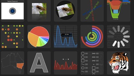
From simple charts to complex maps and infographics, Brian Suda's round-up of the best – and mostly free – tools has everything you need to bring your data to life...

A common question is how to get started with data visualisations. Beyond following blogs, you need to practice – and to practice, you need to understand the tools available. In this article, get introduced to 20 different tools for creating visualisations: from simple charts to complex graphs, maps and infographics. Almost everything here is available for free, and \you may have installed already...


Via Lauren Moss
Randy Rebman's curator insight, January 28, 2013 12:33 PM

This looks like it might be a good source for integrating infographics into the classroom.

Rescooped by pa3geo from visual data
Scoop.it!

All You Need to Know About Infographics: Tips, Tutorials, Guides

All You Need to Know About Infographics: Tips, Tutorials, Guides | omnia mea mecum fero | Scoop.it

Let’s be honest, we don’t like to read big pieces of text. Text-heavy graphs are rather difficult for understanding, especially when dealing with numbers and statistics. That is why illustrations and flowcharts are often used for such kind of information.

An infographic, or a visual representation of study or data, like anything else, can be done right or wrong. How to create a successful infographic? A good idea and a good design.


Stop by the link for more on what defines an infographic, what contributes to its popularity, as well as the various types of infographics and references for tutorials and best practices.


Additional topics covered include:

The major parts of an infographic How to create an infographic Developing ideas & organizing data Research & sources Typography, graphics & color Facts & conclusions Designing & Editing
Via Lauren Moss
HCL's curator insight, April 30, 2014 9:26 PM

Some good tips here...

Rescooped by pa3geo from visual data
Scoop.it!

The 5 Key Ingredients of Great Infographics

The 5 Key Ingredients of Great Infographics | omnia mea mecum fero | Scoop.it
Everyone wants a great infographic. Generic as it sounds, it's overwhelmingly true.

Commissioners — the companies that hire designers or design firms to create infographics — want great results, whether it’s social media sharing, coverage by large websites and media or even achieving specific goal conversion rates. Designers want to work on and ultimately create a great piece that they are proud to include in their portfolio. And end users… well, they just like to look at great things that are beautiful, informative, original and shareable, ideally all at once. So how do you make a great infographic?


Much has been discussed about creating viral infographics and the role that story, data and design play, but viral doesn’t always equal “great” in a more conservative sense: a solid, informative, ethical piece that is beautifully designed and flawlessly executed.

Creating an infographic that is successful in the eyes of the client, design firm and audience is often elusive — but not impossible. At Visual.ly, the process starts out each project trying to do just that, and from the most successful projects (and the experience of going through not-so-successful ones), they extrapolated what are the key ingredients of producing infographics with the desired results.


Read further to learn more about the 5 key elements, including and how they each contribute to successful visualizations:

the idea the data willingness to let go & refine/filter data honesty and humility trust
Via Lauren Moss
No comment yet.
Rescooped by pa3geo from Informatics Technology in Education
Scoop.it!

HOW TO : Create Personal Google Maps with Custom Data, Places & Markers

HOW TO : Create Personal Google Maps with Custom Data, Places & Markers | omnia mea mecum fero | Scoop.it

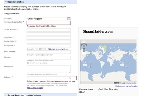
Google Maps is proven to be a very useful and hence popular application which is available on desktops, laptops or even mobile phones. If you are traveling in an unknown area or city, then Google Maps are there to help you for finding your desired destinations. ...


Via Informatics
No comment yet.