
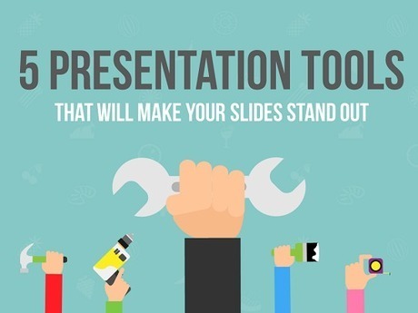

Presentation tools can make designing slides a heck of a lot easier. Here are 5 free tools for you to start using right now.
Via Baiba Svenca, ke hones, Jim Lerman
Get Started for FREE
Sign up with Facebook Sign up with X
I don't have a Facebook or a X account


 Your new post is loading...
 Your new post is loading...
Your new post is loading...
Presentation tools can make designing slides a heck of a lot easier. Here are 5 free tools for you to start using right now. Via Baiba Svenca, ke hones, Jim Lerman 
All of the books, all of the blogs, all of the top Slideshare presentations on slide design make this common plea: simplify. But how simple is too simple? I had this conversation with a non-training... Via Baiba Svenca

Vernon Adrian Emuang's comment,
June 19, 2013 10:29 PM
I really appreciate your scoops! Thank you very much for sharing!

Lisa West's curator insight,
June 21, 2013 6:51 AM
For everyone who does not want their audience to be DOA by DBPP ( death by power point) here is a step by step approach to create professional and effective PPP.
Great Presentations have features that resemble great ads. It's all one big package that hit hard and strong! FREE Download with a tweet: http://goo.gl/X26Ui Via Baiba Svenca, Maria Zappa Kasapidi

Alfredo Corell's curator insight,
April 23, 2013 2:32 PM
Very nice presentation about presentations....
![Serif vs Sans: The Final Battle In Typography [Infographic] | omnia mea mecum fero | Scoop.it](https://img.scoop.it/0kaV-lxNx3WpSw-IUC7JqTl72eJkfbmt4t8yenImKBVvK0kTmF0xjctABnaLJIm9)
Within the typographic communities, people have debated on the issue: Do serifs contribute to the legibility of typefaces, and are sans serif typefaces less legible?
Like many things, these two different fonts have pros and cons. This infographic takes a look at the argument of serif vs sans serif... Via Lauren Moss

ComeStilVuole's curator insight,
March 18, 2013 3:19 AM
Sans o serif? Ecco come usare i font giusti per ogni strumento. 
Best Infographics's comment,
March 18, 2013 2:21 PM
Each font has their own uses, but sometimes it is a personal choice.
A fable about using design to help your audience see your message clearly. And what to avoid. For directors, designers, instructional designers, and presenters. Via Baiba Svenca

24point0's curator insight,
February 19, 2013 4:45 AM
An intersting presentation that's entirely made of 'sketched' images and visuals. 
kathymcdonough's curator insight,
February 25, 2013 4:51 AM
This may plant the seeskills students creating better presentations.
Short talk about presentations given at Startup Dynamo, a workshop held by Startup@Singapore NUS using the Learn Startup Methodology. My segment was on Present Via Baiba Svenca

Alex Grech's curator insight,
October 9, 2013 4:18 PM
It's the first time I've taught undergraduates. I've found myself stripping slides to the core message and trying to find visuals that can communicate that message quickly, simply and yet - resonate. There is nothing as tough as trying to unclutter the mind and focus on what really needs to be said - as opposed to 'making a point' or simply 'showing off'. This presentation is about the art of visuals, clear design, and keeping it 'stupidly simple'. 
Louise Robinson-Lay's curator insight,
January 17, 2014 1:28 AM
While beautiful Powerpoint may seem like an oxymoron this slideshow proves it is possible.
An information graphic in its simplest form is a visual interpretation of data. Though an incredibly useful form of data presentation, infographics have traditionally been an underwhelming sector of the design world. That being said, there are some brilliant designers out there who have turned this form of data visualization into beautiful and creative works of art. In appreciation of those designers who find beauty in data, here is a collection of 40 curated infographic designs that aim to inspire... Via Lauren Moss
Information graphics or “infographics” are graphic visual representations of information, data, or knowledge. Infographics help us absorb facts and figures in the most effective way possible. They come in extremely handy when you need to explain complex information, numbers or data rather quickly and effectively. One cool way to get inspired is to look at some of the best infographics out there. Infographics are an excellent way to add humor or irreverence to tell a great story in short possible way. However, infographics can be pretty hard to design since you have to gather together a lot of information and make it look good. Today we're to sharing the top places to see some great visual graphics and also find inspiration to create your own... Via Lauren Moss
Current resources, websites and mapping tools for creating infographics online... Have you used any of these? If so, which is your favorite? Via Lauren Moss
|

This article will guide you step-by-step how to create the split image effect. Breaking an image into multiple pieces gives a unique visual look to design. Via Baiba Svenca, ke hones, Jim Lerman

Leoncio Lopez-Ocon's curator insight,
April 3, 2016 6:45 AM
Cool! Here's a tutorial that will teach you how to improve your slides visually. Works with PowerPoint 2013. 
Debbie Pop's curator insight,
April 4, 2016 2:50 PM
Cool! Here's a tutorial that will teach you how to improve your slides visually. Works with PowerPoint 2013. 
Ricardo Serrano's curator insight,
April 4, 2016 6:47 PM
Cool! Here's a tutorial that will teach you how to improve your slides visually. Works with PowerPoint 2013.
"Dear Lifehacker, I have been tasked to make a slideshow for an event at work. I don’t want to make a generic PowerPoint with just boring text or pictures. What are some ways I can enhance the slideshow so it looks impressive and knocks the socks off my audience?" Via Baiba Svenca

Elke Watson's comment,
May 19, 2013 5:26 PM
I was an early adopter of Prezi (I think), and am now starting to get a bit tired of the predictable jumping around. It's like cinnamon or something. A wonderful spice but in small doses and not every day! I found that I returned to PPT, using punchy images (thanks Common creative section on Flickr!!) and short / one-word statements. Very powerful

Joaquín Ballester's comment,
May 19, 2013 5:32 PM
I agree with you, Elke. PPT is more customizable and powerful.

Marion Mulder's curator insight,
May 22, 2013 6:00 AM
Oke - if you work in the corporate world there is just no escaping from having to create powerpoints at one point or another. You might as well create amzing one's while your at it. Here are some handy tips, do's & don'ts worth looking at
Want to spice up your next corporate presentation? Take it from us, Make your next presentation Out Of This World! Download this Presentation for a Tweet here: Via Baiba Svenca

Chantal Sim's curator insight,
May 20, 2013 1:18 PM
As I always trying to make my presentation more remarkable than before, I think it is good tips for me and us. These are really nice to learn for your future presentation especially for those of who have presentation for this semester.
So if you are interested in making your presentation look fancy and effective, it will be worthy to see all the slides!
Chantal Sim's comment,
May 20, 2013 1:20 PM
These are so valuable! Thank you for sharing this, appreciate so much that I can re-scoop.it!
March's Slideshare offering is all about visual design. Learn why simplicity takes work, why it's best to pair one idea with one slide, why unity matters, why pictures are superior... Via Baiba Svenca

Dr. Doris Molero's curator insight,
March 9, 2013 8:38 AM
Easy to follow advice...mmmm well, i will try to have my slides ..less crowded..but there's so much to tell.. sighs.. :) 
Alejo Castillo's curator insight,
March 15, 2013 11:52 AM
An excellent summary of visual strategies to follow when designing a presentation. 
Peter Sampson's curator insight,
April 28, 2013 6:41 PM
Slide design but think for articulate objects also
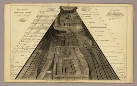
Data visualization is not a new phenomenon. For centuries, artists and historians, educators and scientists have been creating illustrations to better communicate complex information. From Emma Willard’s “Picture of Nations” to Dimitri Mendeleev’s Periodic Table, historical infographics continue to inspire and educate today. Here is a look at some of the most influential and beautiful infographics from the 19th century... Via Lauren Moss
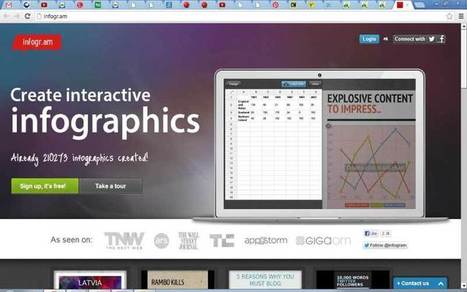
Want to create an attractive infographic but don’t have the budget to hire a professional designer? Then you should try using an infographic-creation tool. If your small business is looking for an eye-catching and easy to comprehend way to teach, inform, and inspire others about its products and services, infographics might be a good solution. Infographics can be more effective and memorable than other ways to present data, making them particularly effective for online audiences. To create an infographic, you should make a list of possible ideas that you want to get across, create the initial draft or skeleton, color scheme it, and research your content from authoritative sites. Then it’s time to select your design platform.
Read about three online tools that can help you create stunning infographics... Via Lauren Moss
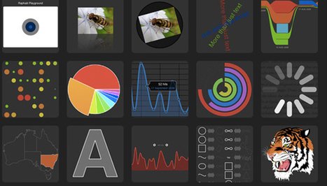
From simple charts to complex maps and infographics, Brian Suda's round-up of the best – and mostly free – tools has everything you need to bring your data to life... A common question is how to get started with data visualisations. Beyond following blogs, you need to practice – and to practice, you need to understand the tools available. In this article, get introduced to 20 different tools for creating visualisations: from simple charts to complex graphs, maps and infographics. Almost everything here is available for free, and \you may have installed already... Via Lauren Moss

Randy Rebman's curator insight,
January 28, 2013 12:33 PM
This looks like it might be a good source for integrating infographics into the classroom.

Information graphics or infographics are graphic visual representations of information, data or knowledge. These graphics present complex information quickly and clearly, and are easy to understand. Infographics are sources of interesting information, when you are in need of some. Reading boring, long, colorless articles isn’t so attractive and interesting than reading and viewing facts and numbers in an illustrated way. Not only an illustrated way, but a very creative, attractive and super-appealing way. All of them have been designed not only to look good, but also to expose the maximum information and data possible. These infographics were made by some very talented designers, with creative minds and superb skills. While there are lots of really interesting and cool infographics on various topics, in this post we have only gathered awesome infographics which are of interest to web designers and developers... Via Lauren Moss
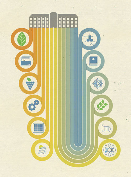
"There's a world of opportunity to re-think and re-design the way we make stuff. 'Re-Thinking Progress' explores how through a change in perspective we can redesign the way our economy works" Via ddrrnt, ABroaderView, Sakis Koukouvis
|


Five great suggestions how you can improve and enhance your presentation slides.
Nice resource! I look forward to adding these tools to the toolbox.
estas herramientas podrían ser de utilidad