omnia mea mecum fero
14.2K views | +0 today
Follow
omnia mea mecum fero
όλα τα δικά μου τα κουβαλάω πάνω μου
Curated by pa3geo
Your new post is loading...
Rescooped by pa3geo from visual data
Scoop.it!

How Google Builds Its Maps—and What It Means for the Future of Everything

How Google Builds Its Maps—and What It Means for the Future of Everything | omnia mea mecum fero | Scoop.it
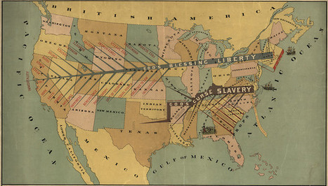
An exclusive look inside Ground Truth, the secretive program to build the world's best accurate maps.


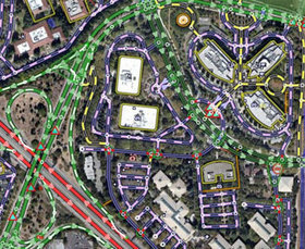
Behind every Google Map, there is a much more complex map that's the key to queries but hidden from view. The deep map contains the logic of places: their no-left-turns and freeway on-ramps, speed limits and traffic conditions. This is the data that Google uses to navigate you from point A to point B.

Last week, Google showed me the internal map and demonstrated how it was built- the first time the company has let anyone see how the project it calls GT, or "Ground Truth," actually works.

Google opened up at a key moment in its evolution. The company began as an online search company, but then the mobile world exploded. Now, where you're searching from has become almost as important as what you're searching for. Google responded by creating an operating system, brand, and ecosystem that has become the only significant rival to Apple's iOS.

And for good reason. If Google's mission is to organize all the world's information, the most important challenge -- far larger than indexing the web -- is to take the world's physical information and make it accessible and useful...


Read the entire article for a fascinating look at how Google utilizes mapping systems, geo data, mobile technology, and visual representation to manage massive amounts of data from varying sources, including one of the most important to the success of Google Maps- human intelligence.


Via Lauren Moss
No comment yet.
Rescooped by pa3geo from visual data
Scoop.it!

11 of the Most Influential Infographics of the 19th-Century...

11 of the Most Influential Infographics of the 19th-Century... | omnia mea mecum fero | Scoop.it
We live in a world steeped in graphic information. From Google Maps and GIS to the proliferation of infographics and animated maps, visual data surrounds us.

While we may think of infographics as a relatively recent development to make sense of the immense amount of data available on the Web, they actually are rooted in the 19th century.

Two major developments led to a breakthrough in infographics: advances in lithography and chromolithography, which made it possible to experiment with different types of visual representations, and the availability of vast amounts of data, including from the American Census as well as natural scientists, who faced heaps of information about the natural world, such as daily readings of wind, rainfall, and temperature spanning decades.

But such data was really only useful to the extent that it could be rendered in visual form. And this is why innovation in cartography and graphic visualization mattered so greatly...


Via Lauren Moss
No comment yet.