The MarTech Digest
563.0K views | +0 today
Follow
Your new post is loading...
Scooped by Marteq
Scoop.it!

Create High-Impact Data Visualizations: Nine Effective Strategies - Occam's Razor

Create High-Impact Data Visualizations: Nine Effective Strategies - Occam's Razor | The MarTech Digest | Scoop.it
In this post I want to inspire you to think differently. I’ve curated sixteen extremely diverse visualization examples to do that. By design none of them from the world of digital analytics, though I’ll stay connected to that world from a how could you use this idea perspective. My primary goal is to expand your horizon so that we can peek over and see new possibilities.

The sixteen examples neatly fall into nine strategies I hope you’ll cultivate in your analytics practice as you create data visualizations:

1: The Simplicity Obsession
2: If Complex, Focus!
3: Venn Diagrams FTW!
4: Interactivity With Insightful End-Points
5: What-if Analysis Models
6: Turbocharging Data Visuals with Storytelling
7: The Magic of 2 x 2 Matrices
8: Close Contextual Clusters
9: Multi-dimensional Related Line Graphs
Marteq's insight:

DEFINITIVE!


RYZZ: It’s a new approach to MarTech for B2B Marketers.


#MarTech #DigitalMarketing

No comment yet.
Scooped by Marteq
Scoop.it!

Download the Guide - An Introduction to Data Visualization - HubSpot

Download the Guide - An Introduction to Data Visualization - HubSpot | The MarTech Digest | Scoop.it
The good news is that you don’t need a PhD in statistics to crack the data visualization code. If your technical skills don’t extend much beyond Microsoft Excel (you’re not alone!), then check out the list of the best data visualization tools we've included as well.
Marteq's insight:

Very under-served function. You want this.


Visualize your Marketing Stack. marketingIO will analyze your marketing technology and deliver a visual of your MarTech Stack. Free. Go here: http://go.marketingio.com/stack_analysis 


#MarTech #DigitalMarketing

No comment yet.
Scooped by Marteq
Scoop.it!

Why Data Visualization Is Key in Content Marketing Analytics - TrenDemon

Why Data Visualization Is Key in Content Marketing Analytics - TrenDemon | The MarTech Digest | Scoop.it
It’s no surprise that visualization plays a major role in how we process and act on information. By some ‘studies’, over 65% of people are visual learners (link). In our work we come across many types of marketers. Some feel more comfortable looking at rows of data and feel right at home with an excel sheet. But, many other marketers aren’t, yet they too need better tools to explore and visualize information in order to come up with new ideas, experiments or insights.

Marteq's insight:

The question is...how? Still trying to figure that out.


Get a FREE Marketing Automation Cheat Sheet. Compliments of marketingIO. Go here.


marketingIO: MarTech for B2B Marketers. Strategy, Software, Services, Support, Staffing.  Go here to submit RFQs. #MarTech #DigitalMarketing

No comment yet.
Scooped by Marteq
Scoop.it!

Train-of-Thought Analytics Can Help Non-Techie Marketers Understand Data - Profs

Train-of-Thought Analytics Can Help Non-Techie Marketers Understand Data - Profs | The MarTech Digest | Scoop.it
Modern train-of-thought analytics facilitate data for use by non-technical people, making datasets easier to access and manipulate and to see results far quicker.

The key to the user-friendliness of these new analytics tools is visualization, which gives context to understanding the data. Those platforms enable marketers to drill deep down into customer data with easy-to-comprehend diagrams, statistics, and other reporting graphics to understand behaviors, segments, trends, and demographics.

This type of data analysis plays well with marketers, who enjoy an iterative approach of asking questions to extract insight. An initial query may not tell you much, but with train-of-thought analytics, the results could spark a second or third question (and more) to really dig down and unearth useful knowledge.
Marteq's insight:

Careful: images are more easily manipulated to draw a certain conclusion.


marketingIO: One Source for All Marketing Technology Challenges. See our solutions.  

No comment yet.
Scooped by Marteq
Scoop.it!

The beauty of data visualization - David McCandless

marketingIO: One Source for All Marketing Technology Challenges. See our solutions

Marteq's insight:

Drop dead gorgeous. We should be jealous.

No comment yet.
Scooped by Marteq
Scoop.it!

How charts and infographics impact engagement - Infogram

How charts and infographics impact engagement - Infogram | The MarTech Digest | Scoop.it

marketingIO: One Source for All Marketing Technology Challenges. See our solutions.

Marteq's insight:

Need more proof than this?

No comment yet.
Scooped by Marteq
Scoop.it!

Adobe gets creative with new data visualization product - VentureBeat

Adobe gets creative with new data visualization product - VentureBeat | The MarTech Digest | Scoop.it

marketingIO bridges the gap between your MarTech and your in-house experience. 

Marteq's insight:

FYI...

No comment yet.
Scooped by Marteq
Scoop.it!

Keeping Score: The ART of ROI (Return on Innovation) Dashboards - Imaginatik

Presented by Luis Solis, President North America, Imaginatik at Chief Innovation Officer Summit, NY Dec. 2-3, 2014


Receive a FREE daily summary of The Marketing Technology Alert

Marteq's insight:

Get through to slide 10+. A different perspective.

No comment yet.
Scooped by Marteq
Scoop.it!

Data Visualization: Your Secret Weapon in Storytelling and Persuasion - ClickZ

Data Visualization: Your Secret Weapon in Storytelling and Persuasion - ClickZ | The MarTech Digest | Scoop.it
Combining data - which can be dry - with real creativity - which isn't something humans, even creative ones, can simply turn on and off - can be challenging. Yet we live in a stream-powered mobile world that is increasingly visual, inspiring demands from media to achieve equal parts style and substance for news. This explains why unique and truly compelling visualizations are an underused, yet devastatingly effective tactic. They are equal parts rare and in demand. They beg to be shared. They are a catalyst for conversation, awareness, and action.
Your marketing arm would be remiss not to have a designer on-hand or partner capable of creative and attractive visualizations as part of a larger content mix. Your analytics team is not doing their job if they sit on your digital analytics and BI data without thinking of how to use it to create persuasive internal and external visualizations. Such content attracts links, traffic, and media reactions - all essential for success in a world where no one has a monopoly on attention.


↓↓↓↓↓↓↓↓↓↓↓↓↓↓↓↓↓↓↓↓↓↓↓↓↓↓↓

Receive a FREE daily summary

of The Marketing Technology Alert HERE

↑↑↑↑↑↑↑↑↑↑↑↑↑↑↑↑↑↑↑↑↑↑↑↑↑↑↑


Marteq's insight:

Probably one of the most underlooked facets of the marketer: how data is presented. It's a quick win if you can figure it out.

No comment yet.
Scooped by Marteq
Scoop.it!

To Go from Big Data to Big Insight, Start with a Visual - HBR | #TheMarketingAutomationAlert

To Go from Big Data to Big Insight, Start with a Visual - HBR | #TheMarketingAutomationAlert | The MarTech Digest | Scoop.it
Lessons on making data useful from inside The New York Times.


Condensed...


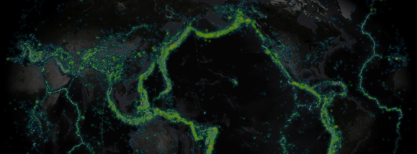
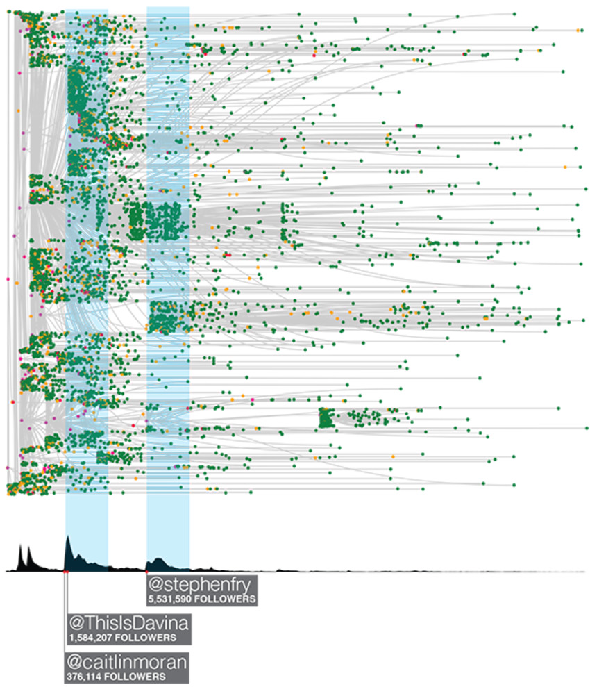
We are documenting every tweet, retweet, and click on every shortened URL from Twitter and Facebook that points back to New York Times content, and then combining that with the browsing logs of what those users do when they land at the Times. This project is a relative of the widely noted Cascade project. Think of it as Cascade 2.0.


We're doing this to understand and predict when an online cascade or conversation will result in a tidal wave of content consumption on the Times, and also when it won't. More importantly we are interested in how the word-of-mouth conversation drives readership, subscriptions, and ad revenue; how the Times can improve their own participation in the conversation to drive engagement; how we can identify truly influential readers who themselves drive engagement; and how the Times can then engage these influential users in a way that complements the users' own needs and interests. Do it, and we can turn that statistical analysis, as you'll see below, into elegant, artistic real time data streams.


Handling the streams, archiving the sessions and storing and manipulating the information are in themselves herculean tasks. But the even bigger challenge is transforming beautiful, big data into actionable, meaningful, decision-relevant knowledge. We've found that visualization is one of the most important guideposts in this search for knowledge, essential to understanding where we should look and what we should look for in our statistical analysis.


Still, the visuals cannot tell the whole story. We see some clear correlations here, but complex conditional dependencies and temporal and network autocorrelation make it necessary to build more sophisticated causal statistical models that will generate true, reliable insights about word-of-mouth influence.

Marteq's insight:

In the forthcoming era of Big Data, is Data Visualization the first step? We've always collected, collated and analyzed the data, then created graphics to explain. Are graphics now the first step? Is this a way to use both sides of the brain to gain a greater understanding of what the data is telling us?


And can data lead to the creation of art?


  • See the article at from blogs.hbr.org
  • Receive a daily summary of The Marketing Automation Alert directly to your inbox. Subscribe here (your privacy is protected).
  • If you like this scoop, PLEASE share by using the links below.
  • iNeoMarketing drives more revenue and opportunities for B2B companies using marketing technologies. Contact us
No comment yet.
Scooped by Marteq
Scoop.it!

Five Tips for Painting a Clearer Marketing Ops Picture With Data Visualization - Profs | #TheMarketingAutomationAlert

Five Tips for Painting a Clearer Marketing Ops Picture With Data Visualization - Profs | #TheMarketingAutomationAlert | The MarTech Digest | Scoop.it

Summary...


Experts have written about how to portray data effectively, by using simple and informed graphs to reveal the story behind the data. This article focuses on how to apply data visualization techniques in marketing operations to make a real impact.


Five categories of data visualization as it relates to marketing:

  • Data Quality Assessments
  • Lead Lifecycle Management
  • Marketing Channel Performance Reporting
  • Campaign Planning and Budgeting
  • Marketing Return on Investment (ROI)


Marteq's insight:

Obviously this does not cover the full range of data visualization options, but this article gives you a tremendous view (so to speak) of the rationale behind certain types of graphs/charts. Strongly encourage the quick read.


  • See the article at www.marketingprofs.com
  • Receive a daily summary of The Marketing Automation Alert directly to your inbox. Subscribe here (your privacy is protected).
  • If you like this scoop, PLEASE share by using the links below.
  • iNeoMarketing drives more revenue and opportunities for B2B companies using marketing technologies. Contact us
No comment yet.