


 Your new post is loading...


2012 might be the year which we reached 'peak infographic'.
You can’t have an issue or a piece of data without putting it into a picture so it’s easier for people to understand. While this has mostly resulted in a glut of ugly graphics that don’t actually do anything with data (and you’ll see some of these below), it’s still an incredibly simple way to get information to you fast. And this year, some of our most compelling content has appeared in the format.
These are some of our favorites.
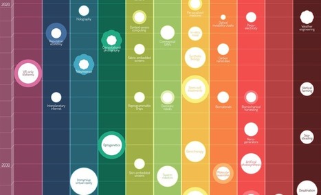
Via Lauren Moss


A curated infographic gallery from FastCompany...
A voir ... rapidement