


In my last post, “Common Assessments” vs “Common Understandings”, I was reminded of how powerful comments are on a blog, and why blogging is a hugely powerful tool for not only sharing your learnin…
Via Linda Foote, Jim Lerman
Get Started for FREE
Sign up with Facebook Sign up with X
I don't have a Facebook or a X account


 Your new post is loading...
 Your new post is loading...
Your new post is loading...
In my last post, “Common Assessments” vs “Common Understandings”, I was reminded of how powerful comments are on a blog, and why blogging is a hugely powerful tool for not only sharing your learnin… Via Linda Foote, Jim Lerman 
No comment yet.
Sign up to comment
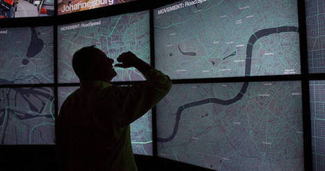
This giant installation and a website you can play with at home lets you compare the worlds urban centers side by side. We live in a world of easily accessible maps; however, our map knowledge is limited by the fact that no two cities collect data the same way. Maps often aren’t drawn to the same scale, and until now, there hasn’t been a way to compare data on things like income, cost of living, water distribution, and power grids. It’s a problem that has bugged Richard Saul Wurman, the creator of the TED conference (as well as an architect and graphic designer), for decades. Wurman recently teamed up with Jon Kamen of Radical Media and Esri president Jack Dangermond to create an ambitious solution: the Urban Observatory, an immersive exhibit featuring standardized comparative data on over 16 cities. Zoom in on one city map and other cities will simultaneously zoom in at the same scale, making it possible to compare data on traffic density, vegetation, residential land use, and so on.
Find more details and information at the article link... Via Lauren Moss
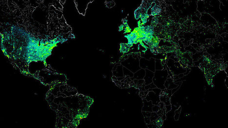
It wasn’t malicious. The file itself was the size of a small JPEG. It was given the absolute lowest priority. And it was set to self-destruct if anything went wrong. But this small file allowed one single hacker to measure the Internet activity of nearly half a million connected devices around the world, then share the results with everyone. How was this even possible? The "hacker" barely hacked anything. In reality, they gained access to all these systems because each had the default "root" set as a password. With this access in hand, they ran several tests focusing on Internet structure and activity. And what they created from all this data is a spectacular map that captures a day in the life of the Internet (and all of its users). Via Lauren Moss

Nacho Vega's curator insight,
May 11, 2013 12:18 PM
Creative power: hacking at the end of the world!
Using "root" as universal key :))
Humankind has been telling complex stories through simple visuals long before you saw your first infographic at Mashable. History is humbling, let's go back in
|
The second installment of The Best American Infographics 2014 (public library) has an introduction by master-statistician Nate Silver and fifty-eight examples of stellar information design shedding light on such diverse topics as the history of space exploration, the sleep habits of famous writers, the geography of where gay people stay in the closet, the comparative shapes and sizes of major baseball parks, and the social network of jazz musicians in the 1920s. Silver, the author of The Signal and the Noise, considers the two factors that make an infographic compelling — providing a window into its creator’s mind and telling a story that “couldn’t be told in any other way. Via Lauren Moss

"ChronoZoom is an open source community project dedicated to visualizing the history of everything to bridge the gap between the humanities and sciences using the story of Big History to easily understand all this information. This project has been funded and supported by Microsoft Research Connections in collaboration with University California at Berkeley and Moscow State University. You can browse through history on ChronoZoom to find data in the form of articles, images, video, sound, and other multimedia. ChronoZoom links a wealth of information from five major regimes that unifies all historical knowledge collectively known as Big History." An overwhelming amount of information in one location...this will take time to explore! Via Beth Dichter, Smithstorian
By Robert Korsara
"Presentation and communication of data have so far played a minor role in visualization research, with most work focused on exploration and analysis. We propose that presentation, in particular using elements from storytelling, is the next logical step and should be a research focus of at least equal importance as each of the other two. Stories package information into a structure that is easily remembered, which is important in many collaborative scenarios when an analyst is not the same person as the one who makes decisions, or simply needs to share information with peers. Data visualization lends itself well to being a communication medium for storytelling, in particular when the story also contains a lot of data. We review the literature on storytelling and presentation and outline the research area. "
|


