


 Your new post is loading...

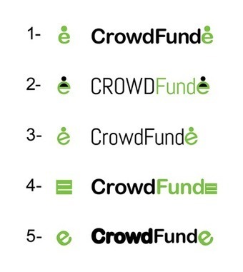

Creating CrowdFunde's new logo includes our rough drafts along with a short description of why the graphic design ended up where it did.
As I share in this post about the process of creating a logo any graphical communication should lead, follow or get out of the way (lol). In this case WTE.net's designer Rachelle Leath suggested something I didn't see - she made Funde green.
That may seem like a small thing, but it isn't. I've been working on this logo for months and felt like I had it close. I needed another pair of eyes, a pro graphic designer to supplement my amateur efforts (lol).l
Once I saw Funde i green my immediate reaction was, "That tells a better story". Every element needs to tell a story especially a logo. Sometimes I have the logo creation story all worked out. Not this time.
This time I had a good design, but I missed Rachelle's idea to emphasize CROWD and Funde. This emphasis helps tell CrowdFunde's brand story. The positioning of crowdsourcing and content marketing FUNDED by crowds is easier to SEE now. This new logo begins to tell that story right off.
When you create a hook like Funde in green the minute you explain it your visitors will have a V8 moment. They will smack their head and your story and graphic will feel easy, understandable and fun.
Great job by Rachelle and WTE team helping to create a new CrowdFunde logo. Now our job, as the marketing team, is to craft a brand story consistent with the new logo. I like to write a short story ABOUT the logo. Why?
A good logo prompts curiosity, so answer the unstated but prevalent question of why we crafted the logo the way we did provides another brand positioning and storytelling opportunity.


