Public Relations & Social Marketing Insight
443.4K views | +0 today
Follow
Public Relations & Social Marketing Insight
Social marketing, PR insight & thought leadership - from The PR Coach
Curated by Jeff Domansky
Your new post is loading...
Scooped by Jeff Domansky
Scoop.it!

List Beats Grid: Linear Feeds Perform Two to Three Times Better Than Grids

List Beats Grid: Linear Feeds Perform Two to Three Times Better Than Grids | Public Relations & Social Marketing Insight | Scoop.it

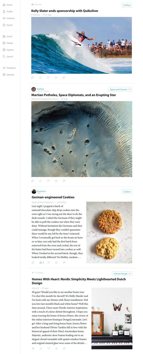
Many content-centric products have been moving to a magazine or card style layout, popularized by apps like Flipboard and Pinterest. Both Flipboard and Pinterest are beautifully designed products, but our studies indicate multi-item-per-row grid layouts deliver inferior results to single-item-per-row list layouts for our particular design problem.


These relative results may be unique to us, but we nevertheless publish them here in case they may be relevant to others considering the tradeoffs involved in list vs. grid designs....

Jeff Domansky's insight:

Good argument for moving away from grid layout back to lists according to usability studies by Prismatic.

No comment yet.
Scooped by Jeff Domansky
Scoop.it!

How to Nail Down the Perfect Website Navigation

How to Nail Down the Perfect Website Navigation | Public Relations & Social Marketing Insight | Scoop.it

Learn how to decide what should be in your website navigation, and where, with a scientific and objective approach.It takes up just a few pixels, but your main navigation is arguably the most essential and ever-present aspect of your website. What to include as part of your main navigation can be a hotly contested topic inside your organization, and it could mean the difference between a website conversion and a bounce.


The good news is, when making navigation decisions, there are a lot of tools at your disposal to help you make the right call. What should be included in it?...

Jeff Domansky's insight:

Useful guide to better website experience for your visitors.

No comment yet.
Scooped by Jeff Domansky
Scoop.it!

CRO: How to Convert Visitors from Your About Page - Dukeo

CRO: How to Convert Visitors from Your About Page - Dukeo | Public Relations & Social Marketing Insight | Scoop.it

Many bloggers only set up an About page as an afterthought. Someone said, “Hey! You need an About page” so they create one and add a few lines about their blog, their reason for blogging and what they like to do when they’re not blogging. But if you understand the mindset of the visitor who looks for your About page you’ll see it deserves much more attention.


Unless you’re sharing that specific link, very few of your visitors will land on your About page when they come to your blog. Most will either land on an individual post or your homepage. After reading your post, and maybe checking out a few more, your visitor might be so impressed that he decides to check out your About page. So it’s important to understand that visitors who go to your About page are already sold on your blog, otherwise they wouldn’t take the time to try to learn more about you – they’d just leave your blog.... 

Jeff Domansky's insight:

All about getting the most from your About page...

No comment yet.
Scooped by Jeff Domansky
Scoop.it!

Why Usability & Usefulness Are Cool Again | Rohit Barghava

Why Usability & Usefulness Are Cool Again | Rohit Barghava | Public Relations & Social Marketing Insight | Scoop.it

...Jakob Nielsen was a household name in web development teams – and "Information Architect" and "Usability Expert" were considered careers for the future. Then one day usability started to fade into the background. It became more of an afterthought. When is the last time you saw any job with "usability" in the title on any sort of list of jobs for the future?


The irony is that usability never became less important – it was just that marketing people moved on to promoting sexier things … like social media and focused on buzzwords like "engagement" and creating "conversations." The after effect of this focus is still evident all around us:


United Airlines has a website that is a towering monument to what happens when no one listens to the usability experts. Tasks are impossible to complete without too many clicks, the interface is completely non-intuitive, and your logged in profile is inconveniently forgotten before any transaction....


[Rethink & a social media reminder - JD]

No comment yet.
Scooped by Jeff Domansky
Scoop.it!

How Typography Affects ConversionsConversions | Quick Sprout

How Typography Affects ConversionsConversions  | Quick Sprout | Public Relations & Social Marketing Insight | Scoop.it

When you think about conversion optimization, what comes to mind? Testing colors, call-to-action buttons, headlines, and other elements including text, right?


Although those elements do affect conversions, what about other design aspects such as typography?


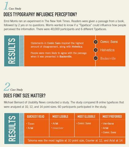
I know what you are thinking. How the heck does typography affect conversions? Well, certain font types will affect people’s decisions in different ways. For example, if you are trying to get your users to agree with a passage, they are more likely to do so if you use the font type Baskerville....

Jeff Domansky's insight:

Typography affects conversion? Who knew?

Scooped by Jeff Domansky
Scoop.it!

6 'About Us' Pages That Are Probably Better Than Yours

6 'About Us' Pages That Are Probably Better Than Yours | Public Relations & Social Marketing Insight | Scoop.it

If your 'About' page ain't too nifty, check out these examples and fix it up in a jiffy. When you’re building a website, it’s tempting to get distracted by all the bells and whistles of the design process and forget all about creating compelling content. But having awesome content on your website is crucial to making inbound marketing work for your business.


So how do you balance your remarkable content creation with your website design needs? Why, with your 'About Us' page, of course! For a remarkable 'About Us' page, all you need to do is figure out your company's unique identity, and then share it with the world....

Jeff Domansky's insight:

This post is all about your About page and how to get about getting better About pages. Kidding aside, seriously good tips..

Laura Brown's comment, May 17, 2013 11:11 AM
I've put time into my About pages. They may not be fancy with HTML code but I think they're pretty good.
Jeff Domansky's comment, May 17, 2013 4:43 PM
Hey Laura thanks for the Scoop. To me the most important thing is that your About page reflects your uniqueness.
Scooped by Jeff Domansky
Scoop.it!

20 excellent contact pages | Webdesigner Depot

20 excellent contact pages | Webdesigner Depot | Public Relations & Social Marketing Insight | Scoop.it

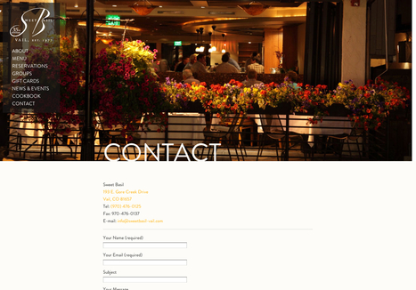
...For some, this is that last page on the site map where you just throw a bunch of information. You can leave it up to the person to decide how they want to contact you and what they want to contact you about. For others, this is the last attempt to get your potential customer to give you their business. The contact page is much more important than many give it credit. Many basic websites just throw some numbers and e-mails up and move along. But in most cases, this is the page your customer sees before they decide they want you on their project. Or before they decide they want to visit you to purchase your product. It’s extremely important to make sure your contact page delivers in the best way possible. It can be a tricky thing to handle, so today, we’ve gathered 20 sites with great contact pages and forms to give you a bit of a creative boost....

Jeff Domansky's insight:

Fresh thinking on Contact Page design and purpose.

KADRI Nassim's curator insight, November 18, 2016 4:16 AM

Fresh thinking on Contact Page design and purpose.