


 Your new post is loading...


The stripped-down, minimal approach to page design has its place -- but most of that time, that place isn't for news stories.
... For a prime recent example of the disconnect, check out NYT public editor Margaret Sullivan’s recent post on trend stories in general, and that monocle trend story in particular:
Media watchers received the story like a Christmas present, tearing off the wrapping to get at the goods. The fun began on Twitter, after the story went online but well before its print publication. Dustin Gillard tweeted: “NYTimes does a trend piece on monocles. It is about as good/bad as it sounds.” (No one ever said the Internet was good at nuance; the wags ignored that the short piece was tucked inside the Styles section in its “Noted” column, treating it instead as if it were front-page screaming-headline news.)
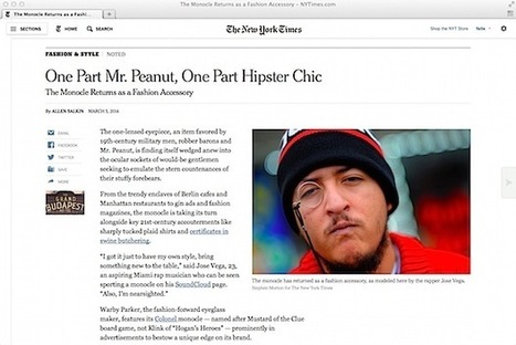
But here’s the thing: on the internet (which, Sullivan admits, was for a long time the only place where you could read the story), the story wasn’t “tucked” anywhere. Instead, it looks like this...


Even the grey lady, The New York Times, is vulnerable to poor journalistic judgement. What a goofy story!