 Your new post is loading...
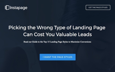
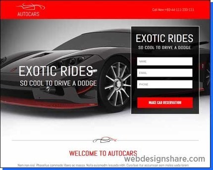
How do you convince your visitors to take the plunge on your website? There are so many elements that a top-notch landing page needs, and making those elements the "best" they can be often depends on what your landing page goals are. Take form length, for example. It's just one of the many components you need to optimize, but best practices will tell you that both short and long forms perform well -- it all depends on whether you want to generate a lot of (potentially) lower quality form submissions, or a smaller number of higher quality submissions. So if you're looking to up your landing page game, it's helpful to know what goes into a great landing page and see a few examples of these nuanced elements in action. Surprisingly, when I started doing research into the latter, I realized there are hardly any sites out there with examples of modern, impressive landing pages that are more than just a sign-up form on a homepage. So we decided to compile a list of landing pages we love ourselves....
There is no perfect landing page design, but there are proven design best practices. In our latest Landing Page Design Best Practices guide, we help you answer all of those questions and many more. With this guide, you’ll learn: - Why landing pages should be focused on a single goal and best practices to convert visitors into leads and customers - How to use Cialdini’s principles of influence and other psychological techniques to your advantage - Specific tips on how to design each landing page element to achieve your conversion goals - Why the visitor’s post-click experience is just as important as the pre-click experience and how to optimize each component....
Since the 1960s much has changed. What hasn’t changed is: people use their emotions as much as their reasoning when buying, it’s still well-known and valid. We even know how particular emotions influence buyers! According to Geoffrey James, the sales expert, all buying decisions are driven by greed, fear, altruism, envy, pride, and shame. Emotional appeal in advertising is certainly a real thing, and there are plenty of emotional advertising examples to draw inspiration from (see Proctor and Gamble’s “Thank You Mom” Olympics commercial). But in today’s post, I’m going to show how to use the following six emotions on your landing page to encourage people to buy from you....
According to HubSpot, 65% of survey respondents say that generating leads is their top challenge and even more (74%) say that converting leads is their top priority.
If you’re reading this, you likely know that landing pages are the best asset in your digital marketing arsenal to generate leads and sales. Every stage of the marketing funnel can utilize landing pages, but one type of landing page helps qualify leads for sale unlike any other: a demo landing page.
Demo landing pages are typically included in the decision stage of the buyer’s journey, at the bottom of the marketing funnel. In the decision stage prospects already know they have a problem, they’ve evaluated all of their options, and are now deciding who to purchase from.
Lead capture forms tend to be longer on these pages because companies want to know more about the prospect to ensure they are qualified for the sales process. With this in mind, let’s take a look at 10 demo landing page examples to see what works well and what could be improved....
Are you looking for the best and proven solution to build a professional web presence for your business or personal project? Ask any marketing specialist and he will tell you that a well-built landing page is exactly what you need to make people talk about you. But how to build a landing page that will convert accidental visitors into loyal customers? How to generate new leads for your business? How to design a powerful landing page? Let’s cover all of these aspects in one blog post. A landing page is a place where the online story of your business begins. A landing page is the first spot that the users come across when looking for some general information about your business. This is the simplest and the most effective way of engaging the audience and inviting them for a productive dialogue. Depending on the way a landing page is designed, we can judge the potential success that a business standing behind it will attain. The more user-friendly a landing page is designed, the higher chances of triggering the users’ curiosity you have. It’s not a rocket science to build a professional landing page. Let’s consider the most effective tips on how to get started right and appeal to a wider audience....
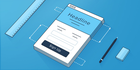
Putting together an A+ landing page can be tricky.
There are so many elements that a top-notch landing page needs, and making those elements the "best" they can be often depends on what your landing page goals are.
Take form length, for example. It's just one of the many components you need to optimize, but best practices will tell you that both short and long forms perform well -- it all depends on whether you want to generate a lot of (potentially) lower quality form submissions, or a smaller number of higher quality submissions.
Download our free guide to landing pages here to learn how to design landing pages that convert.
So if you're looking to up your landing page game, it's helpful to know what goes into a great landing page and see a few examples of these nuanced elements in action. Surprisingly, when I started doing research into the latter, I realized there are hardly any sites out there with examples of modern, impressive landing pages that are more than just a sign-up form on a homepage. So we decided to compile a list of landing pages we love ourselves....
A 26% lift may not seem impressive to some, but from an annual perspective, that one change grew revenue well into six figures. If you know anything about me, you know I’m obsessed with split testing. I kept testing, kept tweaking, and kept optimizing my contact page. With every test, I learned some new lessons. Here’s my big takeaway: Getting people to contact you is valuable. Making it easy for them to contact you is even better. Why? Because these are warm leads. Anything you do to move qualified leads into your funnel is a smart move. How do you turn your boring ol’ contact page into a massive lead magnet? Let me give you the perspective-setting intro, then we’ll dive into some tricks....
To put this another way, for every $92 of advertising revenue spent, only $1 is being invested into CRO and A/B testing efforts - you know, the part that actually turns your ad dollars into converting leads.
Shocked? We were, too.
Why would anyone throw money down the drain like that? We’re guessing it is probably happening out of ignorance, but if you want more conversions, you can’t afford to ignore landing page trends, best practices, and A/B testing.
This is why we decided to take on a colossal task. We’ve chosen 100 landing page examples and critiqued them on their optimization efforts to show you exactly what works and what doesn’t when it comes to CRO.
We’ll start with the landing page example showcase, showing you a mug shot of every landing page. Then, we will discuss what page elements help the conversion process and which elements are a disgrace to landing page optimization....
If you want to capture more targeted leads, then your landing page has to convey your message well. But, the truth is that most landing pages don’t convert, which is why most people complain about low conversion rates. You can change the story by following 6 steps to create high-converting landing pages....
I've scoured the web for the strategies that have performed best in numerous tests and case studies.
In this article, I’ll show you 14 data-driven techniques to optimize the conversion rates of your landing pages (and how you can implement them).
First, take a look at this infographic on the landing page design best practices to get an idea of what I'm talking about....
Pablo Picasso once said: “Good artists copy; great artists steal.”
There are plenty of lead generation tips on the web to help you create the perfect lead generation landing page. There's even lead generation landing page templates to help you speed up the process. But, how do you know which elements are appropriate for your page and conversion goal?
Today we’re going to help you heed Picasso's advice by critiquing 30 lead generation landing pages from which you can steal great ideas, and eliminate bad ones. But, before we jump in, let's define the term...
There’s no shortage of lead capture page examples on the Internet. There is, however, a lack of lead capture pages that are optimized to do what they were created to do (capture leads!).
What most marketers forget when creating lead capture pages is that just slapping a form on a page doesn’t make it a lead capture page. To make it a viable lead capture page, there are necessary elements that you must include converting visitors into leads.
So, what are these elements that help jumpstart your revenue cycle? We’ve hand-picked four lead capture page examples to show you how an optimized lead capture pages should look....
In this article, we’re going to take a look at how you can use a landing page to generate customers.
We’ll take a look at what makes a landing page work effectively. But, we’ll also discuss what constitutes a high converting sales funnel.
By the end of this post, you’ll be able to take what you’ve learned and use it to improve the revenues of your own business.
|
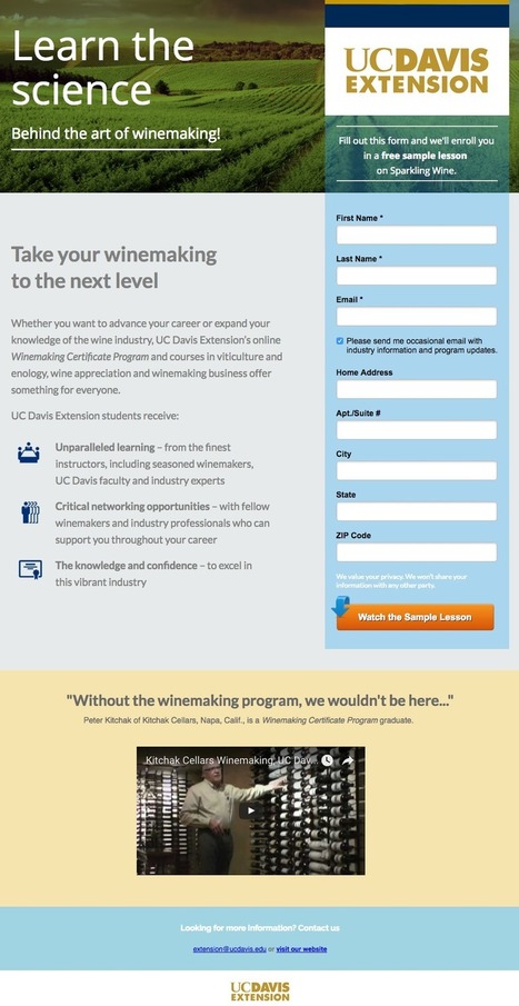
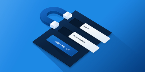
One of the most commonly asked questions for digital marketers is: how can I grow my email list? When so much of a marketing campaign’s success hinges on your ability to capture a prospect’s email and nurture them to sale, how can you get more potential customers into the sales funnel? Simply asking people for their email address won’t provide stellar results. Understandably so. Why should they willingly give up personal information without receiving anything in return? Instead, marketers are increasingly turning to lead magnets as part of their inbound and content marketing strategy. What is a lead magnet? A lead magnet is a valuable offer that you provide to your prospects in exchange for contact information such as name and email. The best way to promote that offer is with a landing page. Therefore, a lead magnet landing page encourages a reciprocal relationship between a company and prospect. They provide their personal information in exchange for what is behind the form. There are plenty of lead magnet ideas to draw inspiration from on the web, and it’s important to note they do not have to be a content download (PDF file or otherwise). We’ve compiled 15 lead magnet examples that demonstrate the various ways marketers use gated offers to maximize leads and drive sales....
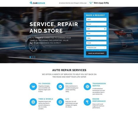
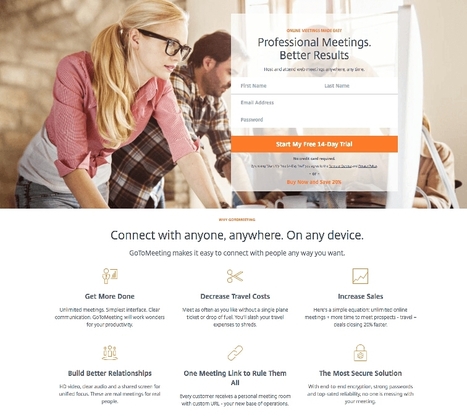
When car shoppers visit a dealership, they aren’t necessarily looking to buy right away. A car salesperson must nurture the relationship, answer their questions, offer a test drive, and relieve their doubts before a purchase is made. Marketers take their online prospects through a similar journey as they move from the awareness stage to the decision stage. In the decision stage of the buyer’s journey, prospects already know they have a problem, have evaluated their options, and are testing out who they should purchase from. Marketers know this well, as an estimated 93% of web-based companies and startups offer a free trial at the bottom of their marketing funnel. That percentage is overwhelming because a free trial offer is the best way for prospects to experience the product and sell themselves on using it. Now let’s examine how businesses are using free trial landing pages to convert prospects....
My video landing page is the highest converting page I’ve ever had, bar none. Ever since I started using that video on the homepage, my conversions took a noticeable upturn, and haven’t slowed a bit!In this article, I’m going to show you some of the principles that I’ve learned as I’ve split test my videos, tweaked my home page, and watched the conversions pour in. And, just to up the ante, consider how much time and money you’re wasting with a low-converting landing page....
Landing Page Inspiration — December 2016.
A successful landing page is a combination of many different factors. Colors, copywriting, layout, and the quality of your traffic all play a role in how well your landing page converts. You can, and should, implement proven copywriting tactics, psychological principles, and other well-known techniques to boost your chances of convincing visitors to take action. There are also a few lesser-known persuasive elements worth adding to your landing page. They’re powerful, and they’re hiding in a place that few people think to look: Social media. The magic of social listeningSocial listening is all about using social media to learn more about your audience. You’re “listening” to the conversations going on about your brand and industry on social media, and turning them into actionable steps that improve your marketing efforts....
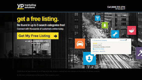
Optimizely recognizes that landing pages are perfect for establishing a great first impression and are an essential component of their overall marketing strategy. The company uses landing pages to target product, marketing, and brand managers — offering an array of assets for their audience’s information....
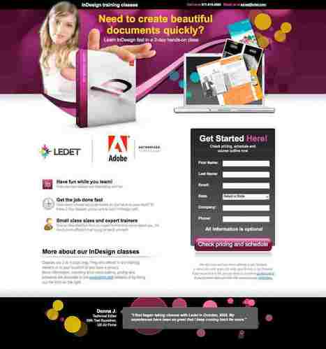
For ten years in a row, marketers report that email has produced a higher return on investment than any other channel. Today, influencers like Neil Patel and industry leaders like HubSpot combine emails with landing pages to deliver a one-two punch that gets prospects converting like no other medium. An email landing page is a standalone web page that uses persuasive elements like testimonials, contact forms, and benefit-oriented copy, to convince visitors to convert on an offer. They’re reached after a prospect clicks on a link within an email. Let’s take a look at how 20 pros create successful ones....
When you create landing pages, sometimes you’re forced to make some tough calls — deciding on the type of headline, all the way down to the colors on the page, and CTA button copy.
Every single decision has a significant impact on your conversion rate. Of course, this puts added pressure on you to get all the elements perfect before you publish the page.
The data you collect with A/B testing puts a lot of the CRO questions to bed, but the thing with testing is that it’s not an immediate solution. You can’t rely on A/B testing data as soon as you publish your page.
This is where CRO best practices come into play.
We’re going to make a case for both types of pages and argue why one should take precedence over the other. Then, we’ll give you a list of factors that will help you decide the length of your pages once and for all.
Let the debate begin....
Putting together an A+ landing page can be tricky. There are so many elements that a top-notch landing page needs, and making those elements the "best" they can be often depends on what your landing page goals are. Take form length, for example. It's just one of the many components you need to optimize, but best practices will tell you that both short and long forms perform well -- it all depends on whether you want to generate a lot of (potentially) lower quality form submissions, or a smaller number of higher quality submissions. So if you're looking to up your landing page game, it's helpful to know what goes into a great landing page and see a few examples of these nuanced elements in action. Surprisingly, when I started doing research into the latter, I realized there are hardly any sites out there with examples of modern, impressive landing pages that are more than just a sign-up form on a homepage. So we decided to compile a list of landing pages we love ourselves. Big, big caveat here: I don't have access to any of the stats for these pages, so I can't tell you how well they convert visitors, leads, and customers. Still, these examples have some of the best combinations of those nuanced landing page elements I've ever seen. Obviously, if you feel inspired to try any of these tactics on your own site, the only way to know whether they'll work for you for sure is by testing them out for yourself....
You asked and we answered! Learn the top 15 most FAQ to Instapage customer service, answered by Head of Customer Support, Marius Laza.
Want to increase conversion? Duh. Want a tedious and complex lesson on CRO (conversion rate optimization) or would you prefer to know the most simple little conversion secret in the digiverse? Sheeshe, Barry, you ask some silly questions (he writes in a strange third person voice shift). Okay, my friend, let’s stroll down Uncomplicated Avenue today. If you want to increase the conversion rate of your web pages, tell your reader what to do next. Loudly. Proudly. Clearly....
On your landing page, those muscles, organs, and electrical signals are replaced by buttons, visuals, copy, and code. They work together to perform one incredibly difficult function: convince the most powerful supercomputer known to man, a.k.a. the human brain, to take action.
Whether it’s to buy, subscribe, or download, when a landing page is “anatomically correct,” it can move its visitors to click a CTA button. Different shapes and colors scream “look here” and “press me,” while headlines capture attention and testimonials build trust.
The anatomy of a landing page isn’t as complex as our own, but to the untrained eye, it’s still difficult to understand. Today we’re going to break it down to help you piece together the puzzle that is a persuasive landing page.
|


Get inspired by these 16 brilliant landing page design examples from HubSpot..