Public Relations & Social Marketing Insight
443.4K views | +2 today
Follow
Public Relations & Social Marketing Insight
Social marketing, PR insight & thought leadership - from The PR Coach
Curated by Jeff Domansky
Your new post is loading...
Scooped by Jeff Domansky
Scoop.it!

Infographic Design Best Practices - Make Info Beautiful

Infographic Design Best Practices - Make Info Beautiful | Public Relations & Social Marketing Insight | Scoop.it

We are hardwired to be visual. Science has proven vision is the most powerful of all our sensory systems for cognition. 90% of all input in our brains is visual. People remember 60% of what they see, but only 40% of what they read.


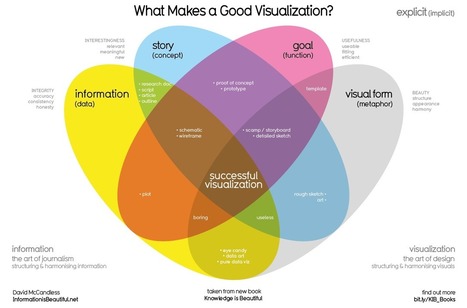
What’s different nowadays is the shift from functional charts and graphs to more beautiful, interactive infographics. Boring designs increasingly fail to engage our audience; people crave for more art-like visuals. For the vast majority of non-designers out there, the challenge is to strive for a balance between beauty and functionality.


In our quest to learn how to make sense of all the information out there, we asked 25 experts for their best advice on how to tell visually compelling data-driven stories. We hope these experts’ tips will help you communicate data-driven information in an engaging way....

Jeff Domansky's insight:

25 industry experts share the best ways to visualize boring information into beautiful designs such as data visualizations, infographics, and more.

No comment yet.
Scooped by Jeff Domansky
Scoop.it!

Review of 20 best big data visualization tools

Review of 20 best big data visualization tools | Public Relations & Social Marketing Insight | Scoop.it

Whether you’re looking to wow your audience at your next presentation or you are a developer looking for a practical way to visualize large sets of data, there are amazing tools out there for both parties. So many that it’s hard to find the right tool for your project.

Want to know the best part?

We made everything easy for you and prepared a series of reviews that cover all the features of the best data visualization tools out there. And we divided our reviews in two sections: data visualization tools for presentations and data visualization tools for developers.

Here are reviews of our 20 best tools for Big Data visualization....

Jeff Domansky's insight:

Valuable review and comparison of 20 best big data visualization tools. Got data, need pictures? Recommended reading. 9/10

No comment yet.