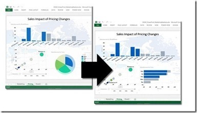
In this new world of exploding data volumes, the ability to make sense of all this data and effectively communicate insights from it is a highly valued skillset. Communicating trustworthy insights includes choosing the appropriate data visualizations to tell a story or make a key point. That may seem trivial at first, but in fact, it is quite powerful. In some fields such as research, healthcare or military, the use of data and visualizations has specific guidelines since misinterpretations could impact human lives.
Most of the time getting data visualizations right is not a life and death matter, but it is important. There are several highly-regarded thought leaders with excellent reading material on this topic, including Stephen Few and Edward Tufte. If you have not read any of their books and you are in an analytics/business intelligence profession, consider this a “must do” before you build another report or dashboard.
In the meantime, read the article at the link for more details, a few of the most common mistakes and some best practices to keep in mind...
Via Lauren Moss


 Your new post is loading...


