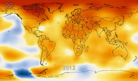
An amazing 13-second NASA animation depicting how the globe has warmed during the period of 1950 to 2012.
From our friends at NASA comes this amazing 13-second animation that depicts how temperatures around the globe have warmed since 1950. You’ll note an acceleration of the temperature trend in the late 1970s as greenhouse gas emissions from energy production increased worldwide and clean air laws reduced emissions of pollutants that had a cooling effect on the climate, and thus were masking some of the global warming signal.
The data come from NASA's Goddard Institute for Space Studies in New York (GISS), which monitors global surface temperatures. As NASA notes, “All 10 of the warmest years in the GISS analysis have occurred since 1998, continuing a trend of temperatures well above the mid-20th century average.
Via
Lauren Moss


 Your new post is loading...


Es un grafic molt atractiu. Interessant per muntar treballs de grup, investigants païssos concrets