


 Your new post is loading...

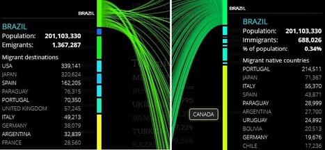

Peoplemovin shows the flows of migrants as of 2010 through the use of open data (see Data Sources). The data are presented as a slopegraph that shows the connections between countries. The chart is split in two columns, the emigration countries on the left and the destination countries on the right. The thickness of the lines connecting the countries represents the amount of immigrated people.
Via Lauren Moss


Es un grafic molt atractiu. Interessant per muntar treballs de grup, investigants païssos concrets