

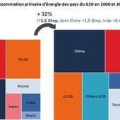

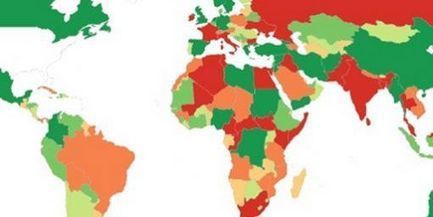
Décryptage. Quel pays tire la consommation mondiale d'énergie ? La planète se mobilise-t-elle vraiment pour lutter contre les émissions de CO2 ? Où en est le prix du gaz ?...
Get Started for FREE
Sign up with Facebook Sign up with X
I don't have a Facebook or a X account


 Your new post is loading...
 Your new post is loading...
Your new post is loading...
Décryptage. Quel pays tire la consommation mondiale d'énergie ? La planète se mobilise-t-elle vraiment pour lutter contre les émissions de CO2 ? Où en est le prix du gaz ?... 
No comment yet.
Sign up to comment
I've searched wide and far for maps that can reveal and surprise and inform in ways that the daily headlines might not.
Maps seemed to be everywhere in 2013, a trend I like to think we encouraged along with August's 40 maps that explain the world. Maps can be a remarkably powerful tool for understanding the world and how it works, but they show only what you ask them to. You might consider this, then, a collection of maps meant to inspire your inner map nerd. I've searched far and wide for maps that can reveal and surprise and inform in ways that the daily headlines might not, with a careful eye for sourcing and detail. I've included a link for more information on just about every one. Enjoy. Via Sigalon, Sémio PUB, association concert urbain
Christophe CESETTI's insight:
• Pearltree "Géographie"

Terheck's curator insight,
January 26, 2014 5:58 AM
Une sélection de 40 cartes qui permettent de mieux comprendre notre monde. 
Jessica Rieman's curator insight,
February 11, 2014 2:30 PM
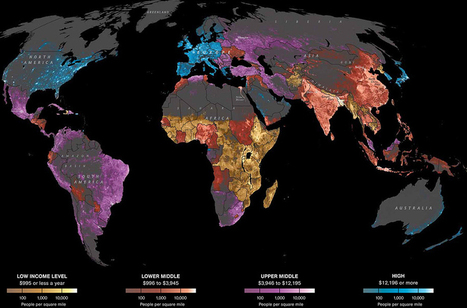
When looking at this map there area few things that stick out to me and not just the colors. Fistly what I founf interesting was that South America in relation to where we live is quite different. For example, The US economic status is High Class at $12195 or more for most of the East and West Coast and then it is dull in the middle. These facts compared to South America where they are mostly upper middle class at around $3946-12185 and a portion of them are the lower middle class which rings in at around $886-3945. 
Jake Red Dorman's curator insight,
November 13, 2014 2:39 PM
On map 33, it shows the religious borders map of the different religions that are occupying certain areas of the Middle East. The area of Baghdad and east is mostly Shiite Islam and west of Baghdad is Sunni Islam. What I found to be most interesting is that even though Jerusalem is surrounded by many different religions they still celebrate Judaism. They are religiously protected by its borders. There is some sign of Sunni Islam being practices within their borders but it is mostly dominated by Judaism.
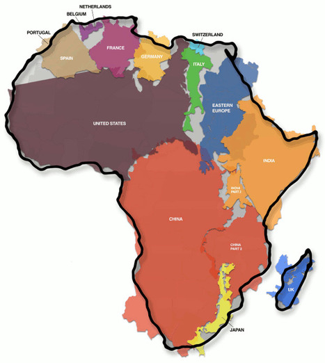
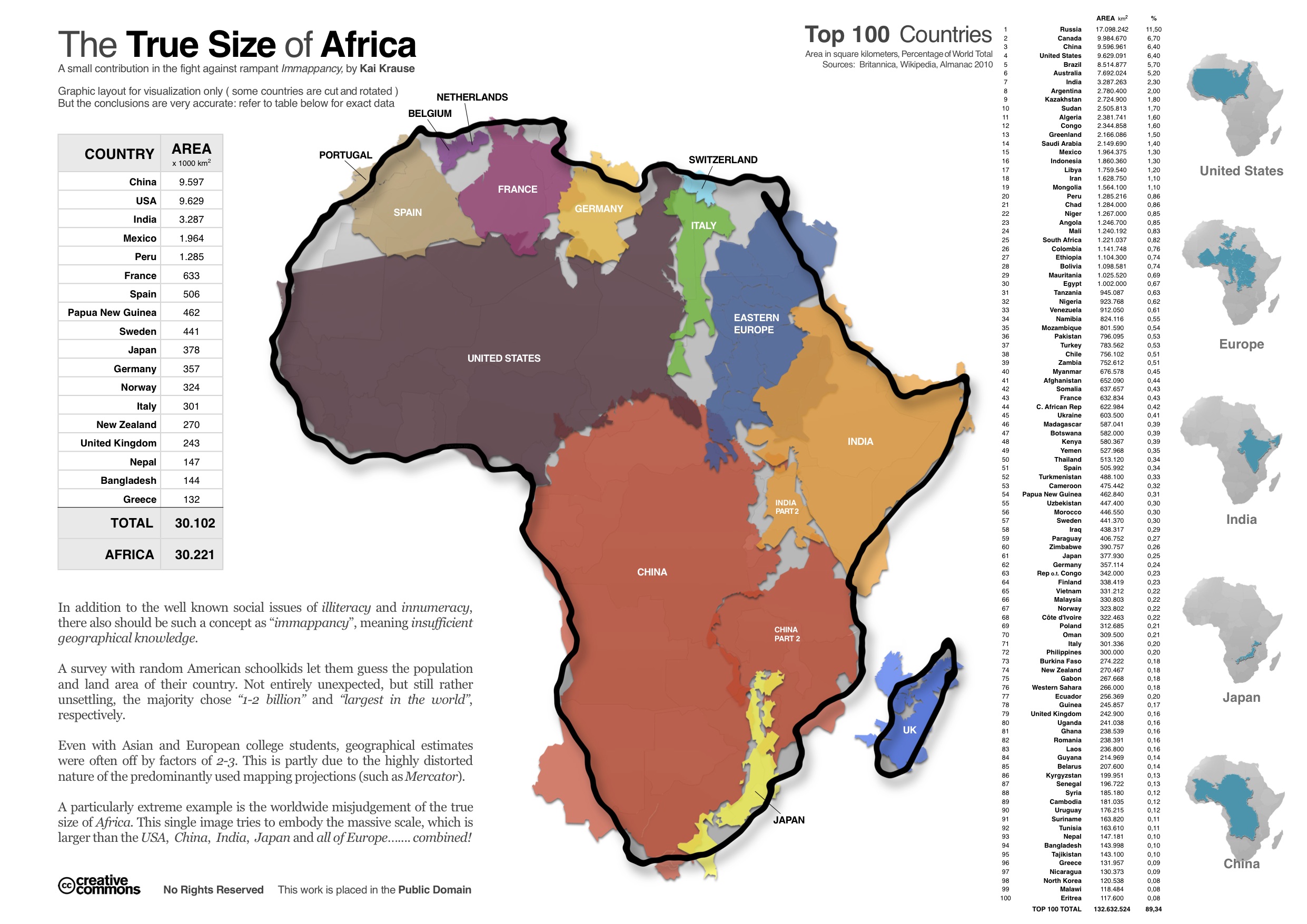
People are often not aware of how large Africa continent really is. The image is an accurate look at Africa relative to some major countries

Jean-Baptiste Brochier's comment,
May 17, 2013 3:50 AM
merci ! j'ai repartagé cela sur http://www.scoop.it/t/bourgeons A bientôt
|
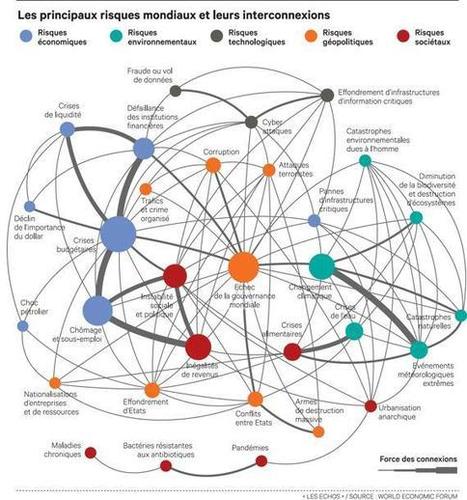
La carte de ces interconnexions fait apparaître un danger central : l'échec des instances de gouvernance mondiale à traiter les défis qui se présentent à l'humanité. La crise de 2009, l'explosion des dettes, le ralentissement des pays émergents ont accéléré la tendance des pays à se replier sur eux-mêmes et la défiance à l'égard des institutions internationales. Via Solange Hémery, michel verstrepen
Christophe CESETTI's insight:
Pearltree "Crise systémique & chaos économique" http://pear.ly/Zkt5 avec notamment cette carte sur l'interconnexion des dettes http://pear.ly/gJGwi

Stephane Bilodeau's curator insight,
January 21, 2014 9:45 PM
Si l'étude se penche sur cinq catégories de risques (économique, environnemental, technologique, sociétal et géopolitique), les sujets liés à l'économie et au climat arrivent cette année largement en tête des préoccupations. Les crises financières, le niveau élevé de chômage et de sous-emploi et l'accroissement des inégalités de revenus sont vus comme ayant à la fois un fort impact et une forte probabilité de se réaliser au cours de la prochaine décennie, tout comme les catastrophes dues au changement climatique et les crises liées à l'eau. 
Bethlehem Hickman's curator insight,
January 22, 2014 9:04 PM
Crise de l'eau et changement climatique figurent parmi les 5 risques les plus préoccupants au même rang que le chomage une raison d'esperer.
Le magazine américain «Foreign Policy», spécialisé en politique étrangère, publie une sorte de classement des pays à risques pour l’année 2014. Ce classement, basé sur une compilation des informations en circulation dans le monde, donne des résultats surprenants. Ainsi, la France se retrouve dans les pays à risques, comme l’Irak ou l’Ukraine…
Christophe CESETTI's insight:
Pearltree "indcateurs de gouvernance" http://pear.ly/SWBz
|


