
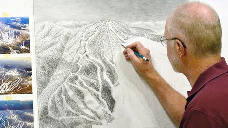
"The ski trail map at your local mountain was probably painted by James Niehues. Now you can see his life's work in one beautiful book."
Get Started for FREE
Sign up with Facebook Sign up with X
I don't have a Facebook or a X account


 Your new post is loading...
 Your new post is loading...
Your new post is loading...
"The ski trail map at your local mountain was probably painted by James Niehues. Now you can see his life's work in one beautiful book." 
No comment yet.
Sign up to comment
From
vimeo

"LIVING IN THE AGE OF AIRPLANES is a story about how the airplane has changed the world. Filmed in 18 countries across all 7 continents, it renews our appreciation for one of the most extraordinary and awe-inspiring aspects of the modern world." airplanesmovie.com

Adrian Bahan (MNPS)'s curator insight,
March 14, 2016 8:04 PM
I was absolutely delighted to see this film on the big screen...it was as visually stunning as any film I'd ever seen. I and my young children were mesmerized. So much of the modern world that we take for granted is absolutely revolutionary. This is a great teacher's guide to teaching with this film. Tags: transportation, globalization, diffusion, industry, economic, National Geographic, video, visualization. |
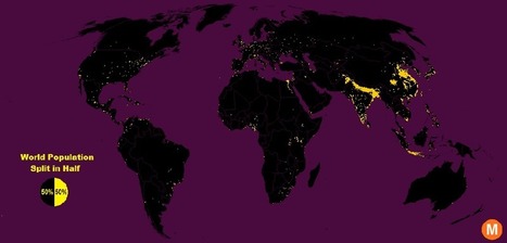
"Data viz extraordinaire Max Galka created this map using NASA’s gridded population data, which counts the global population within each nine-square-mile patch of Earth, instead of within each each district, state, or country border. Out of the 28 million total cells, the ones with a population over 8,000 are colored in yellow."
Tags: population, density, mapping, visualization.

Brian Weekley's curator insight,
July 27, 2016 10:47 AM
Great simple map of world population. Scroll down and look at the U.S. It reflects the global trend. This also has political implications, as evidenced by voting patterns in the 2012 presidential election. Elections are dependent upon votes, which come from people, which are primarily clustered in cities. Election campaigns would use this data to plan their schedules as to where to focus their campaigning efforts. For the folks in Wyoming, they rarely see candidates other than during the primaries. And these world populationclusters have been relatively consistent historically, particularly in south and east Asia. Northern India has serious carrying capacity challenges. Notice the clusters along the Nile- evidence of arable land.
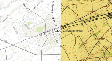
"This cool new historic mapping app from the folks at esri and the U.S. Geological Survey is worth exploring. What it does is take 100 years of USGS maps and lets you overlay them for just about any location in the nation. That allows users to see how a city – say Harrisburg – developed between 1895 and today. The library behind the project includes more than 178,000 maps dating from 1884 to 2006."

PIRatE Lab's curator insight,
August 13, 2014 12:25 PM
For more ESRI maps that let you explore urban environmental change, the 'spyglass' feature gives these gorgeous vintage maps a modern facelift (but not available for as many places). The cities that are in this set of interactive maps are: Chicago (1868)Denver (1879) Los Angeles (1880)Washington D.C.(1851)New York City (1836)San Francisco (1859) |


