Your new post is loading...

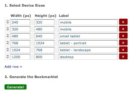

Robin Good: "This simple bookmarklet allows you to you view any webpage in multiple screen sizes, simulating the screen display size of different devices."
Free to use.
Try it now: http://www.benjaminkeen.com/misc/bricss/ ;
Via Robin Good, Zakariyya Spain, Mike Ellsworth