


 Your new post is loading...

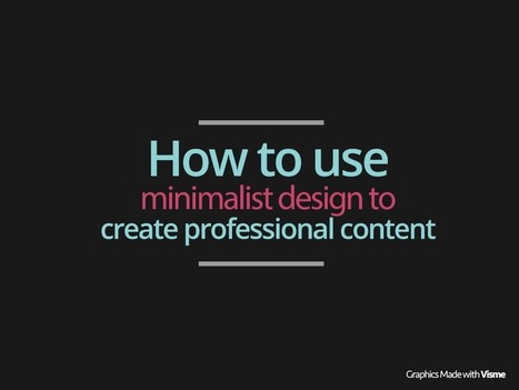

Sometimes less is more. Learn these simple tricks to take advantage the minimalist design trends in graphic design to create more professional presentations.
Aside from aesthetics, the beauty of design is that it helps the presenter to clarify messages and communicate more effectively with the viewing audience. That is why presentations and infographics are highly effective means of communication (at least when created and presented properly).
One of the trending styles is called minimalism; it is an artistic movement that uses only minimal and basic elements. Think of your iPhone’s clean and crisp interface and its flat use of icons and shapes.
In this article we’re going to show you how you can improve your communication skills through minimalist design which will help you create better Presentations, infographics and other forms of rich content.
By extension in pretty much everyday language, minimalism is associated with everything that has been reduced to essentials and presents no accessories; no clutter, no depth, no bells and whistles. Just the necessities.
The intention of minimalism is to generate meaning from the minimum. This requires simplifying the design, using pure colors and simple flat elements. The “Less is More” statement definitely holds true here.
Read more at http://blog.visme.co/how-to-use-minimalist-design-to-create-professional-content/#RRcE16bhwIgxVTbs.99
Via Baiba Svenca, Catherine Pascal

![10 Tips To Build A Responsive Website [Infographic] | Machines Pensantes | Scoop.it](https://img.scoop.it/eRraDMqmkZcM4QW_DTYFZDl72eJkfbmt4t8yenImKBVvK0kTmF0xjctABnaLJIm9)


I really prefer minimalist design. This short post gives some simple tips on how to achieve this.
Poses a refreshing contrast to what is very *busy* in most digital media. The tips presented are consistent with brain research on how we take in information visually.