


Un dessin vaut mieux que de long discours. Le refrain est connu. Le développement de l'usage des infographies dans la presse , dans les médias, dans l'édition ces dernières années est une tendance lourde.
Via Karen Bastien
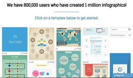
Get Started for FREE
Sign up with Facebook Sign up with X
I don't have a Facebook or a X account


 Your new post is loading...
 Your new post is loading...
Your new post is loading...
Un dessin vaut mieux que de long discours. Le refrain est connu. Le développement de l'usage des infographies dans la presse , dans les médias, dans l'édition ces dernières années est une tendance lourde. Via Karen Bastien 

PBS is exploring the hidden patterns and rhythms that make America work. They are taking this data and visualizing it in a series being called, America Revealed... Via Lauren Moss

If you ever get tired of boring, flat charts in a presentation, then you may want to look at them in 3D and 4D. A new application, DataAppeal, could make the lives of researchers, students, developers, governments, and business representatives easier; and their data more understandable. DataAppeal is web-based application, off of GoogleMaps, that allows the user to map and complete geographic analysis using data, and visualize it in 3D and 4D models. It allows people to represent data in a new way that makes it easier to understand and actually see... Via Lauren Moss
|

With the rampant usage of the internet these days, most people get information using it for it is the easiest way to acquire one.
Infographics, visual representations of information, data or knowledge are an important tool in teaching, in business, in giving inspiration and in presenting information. It is one of the most strongest ways to communicate with complex data.
However, the effectiveness of an infographics greatly relies on how it is designed. Hence, to aid designers, here is a list of what not to do to create a successful infographic or visualization... Via Lauren Moss
Can anyone be a data journalist? Simon Rogers on what we can learn from a 1977 diagram...
Now is the time to examine this - in May 2010, we published this piece on how reporters would soon be flooded with a "tsunami of data". Two years on and data journalism is part of the fabric of what we, and many other news organisations do.
What is it? I would say data journalism is such a wide range now of styles - from visualisation to long form articles. The key thing they have in common is that they're based on numbers and statistics - and that they should aim to get a 'story' from that data. The ultimate display of that story, be it words or graphics, is irrelevant, I think - it's more about the process... Via Lauren Moss
|


Pour mieux mémoriser, mieux comprendre des informations, notamment statistiques ou géographiques rien de mieux qu’un diagramme, une cartographie ou un schéma explicatif. Rien de mieux qu’une bonne infographie.
Pour mieux mémoriser, mieux comprendre des informations, notamment statistiques ou géographiques rien de mieux qu’un diagramme, une cartographie ou un schéma explicatif. Rien de mieux qu’une bonne infographie.
Pour mieux mémoriser, mieux comprendre des informations, notamment statistiques ou géographiques rien de mieux qu’un diagramme, une cartographie ou un schéma explicatif. Rien de mieux qu’une bonne infographie.