I’ve never been a fan of color theory. I think it’s because I’ve always been a bit hopeless at it.
I’d love to be able to sit there, color wheel in hand, and pick out complementary, split-complementary and triad color schemes, impressing all of my friends, family and clients in the process.
But the theory has always eluded me, and, truthfully, I’ve never found it useful when trying to use color in my projects.
Somewhat ironically, I’ve been finding that the better I get at choosing and using color, the better I become in the theory behind it.
Of course, that doesn’t really help when you’re just starting out, does it?
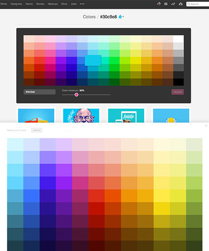
That’s why, in this article, you won’t see a single color wheel. Instead I’m going to show you a simple color workflow that you can use in your next web project.
Read more on smashingmagazine.com blog ...


 Your new post is loading...