Learning Claris FileMaker
317.3K views | +9 today
Follow
Learning Claris FileMaker
Give life to your data with an easy to use database ... I'll share cool FileMaker stuff for you, avoiding the programming part of it as much as I can.                        #WorkplaceInnovationPlatform #Claris
Your new post is loading...
Scooped by Didier Daglinckx
Scoop.it!

Data visualization | FileMaker tip

Data visualization | FileMaker tip | Learning Claris FileMaker | Scoop.it

Data visualization


Data visualization depicts information in graphical form.
Contents


Data visualization is a form of communication that portrays dense and complex information in graphical form.

The resulting visuals are designed to make it easy to compare data and use it to tell a story – both of which can help users in decision making.


...

No comment yet.
Scooped by Didier Daglinckx
Scoop.it!

Storytelling with Data Visualization

Storytelling with Data Visualization | Learning Claris FileMaker | Scoop.it

I (the author) had the pleasure of attending a Guardian Masterclass in London — one specifically about Data Visualization for journalists, designers and marketers.

Presented by both an editorial director and an art director, it covered both the story and the graphic design aspects, and the core theme of the course addressed a simple question – does your data tell a story and can you visualize it?


No comment yet.
Scooped by Didier Daglinckx
Scoop.it!

39 studies about human perception in 30 minutes | Medium - FileMaker tip

39 studies about human perception in 30 minutes | Medium - FileMaker tip | Learning Claris FileMaker | Scoop.it
39 studies about human perception in 30 minutes
These are my speaker notes from a talk I gave at OpenVis in April 2016.

Originally this talk was supposed to be called “Everything we know about how humans perceive graphics,” which is… at a minimum, pretty pretentious. I scaled back a bit.


Clearly I have learned everything there is to know about how humans perceive data graphics in preparation for this talk. Literally everything.

But I couldn’t possibly fit it all into 30 minutes. So for your sake, let’s just refer to this talk as “39 studies on human perception in 30 minutes.”

No comment yet.
Scooped by Didier Daglinckx
Scoop.it!

Data Visualizations: A Beginner’s Guide to Finding Stories In Numbers | FileMaker tool

Data Visualizations: A Beginner’s Guide to Finding Stories In Numbers | FileMaker tool | Learning Claris FileMaker | Scoop.it
A guide to using the techniques of data mining and data journalism to create compelling, original content in the form of data visualizations.
No comment yet.
Scooped by Didier Daglinckx
Scoop.it!

How to Make Your Data Pretty? Utilize These Data Visualization Tools | FileMaker Inspiration

How to Make Your Data Pretty? Utilize These Data Visualization Tools | FileMaker Inspiration | Learning Claris FileMaker | Scoop.it
Tired of showcasing the same old boring tables to your management? A spice of colors and layout brings life to data representation. If you need to understand million rows of data and you are short on…
No comment yet.
Scooped by Didier Daglinckx
Scoop.it!

The Importance of Visualizing Data Part 1 | Filemaker tip

The Importance of Visualizing Data Part 1 | Filemaker tip | Learning Claris FileMaker | Scoop.it

As software consultants, part of our role in serving our clients is as ambassadors (advisors, if you will) in the realm of information technology.


Our clients are experts in their fields, with a lot of knowledge that they bring to the table when working with us.


They trust us to build custom software to leverage their expertise and enable their interests by working with their data and bringing it to life.


Read more on Soliant consulting blog ...

No comment yet.
Scooped by Didier Daglinckx
Scoop.it!

4 Tips for Mastering Tableau | FileMaker tip

4 Tips for Mastering Tableau | FileMaker tip | Learning Claris FileMaker | Scoop.it
People who are just getting started with Tableau often reach out to me, asking for advice on how to improve their skills.


As I find myself giving them the same list of things to do, I thought it would be good to write it out in long form.


So, in this blog, I’ll share with you my 4 tips for mastering Tableau: Train, Practice, Engage, Teach


Read more on the blog

No comment yet.
Scooped by Didier Daglinckx
Scoop.it!

24 Data Viz Sites to Improve Your Next Data Design Project | FileMaker data visualisation

24 Data Viz Sites to Improve Your Next Data Design Project | FileMaker data visualisation | Learning Claris FileMaker | Scoop.it

24 Data Viz Sites to Improve Your Next Data Design Project
Examples, resources and inspiration in data visualization

Numbers have an important story to tell.

They rely on you to give them a clear and convincing voice.
―Stephen Few

No comment yet.
Scooped by Didier Daglinckx
Scoop.it!

Heat Maps in FileMaker

Heat Maps in FileMaker | Learning Claris FileMaker | Scoop.it

FileMaker is a powerful tool for data visualization, with many tools to display the story that the numbers tell.

What many may not realize is that the vector-based SVG button icons can be utilized for some very flexible custom charting.

Let’s explore how we can use them to quickly construct a choropleth map, more commonly called a heat map.


Read more and see the video, download the file on the post ...

No comment yet.
Scooped by Didier Daglinckx
Scoop.it!

The 37 best tools for data visualization | FileMaker tools

The 37 best tools for data visualization | FileMaker tools | Learning Claris FileMaker | Scoop.it
Creating charts and info graphics can be time-consuming. But these tools make it easier.

It’s often said that data is the new world currency, and the web is the exchange bureau through which it’s traded.


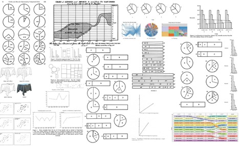
As consumers, we’re positively swimming in data; it’s everywhere from labels on food packaging design to World Health Organisation reports.

As a result, for the designer it’s becoming increasingly difficult to present data in a way that stands out from the mass of competing data streams.


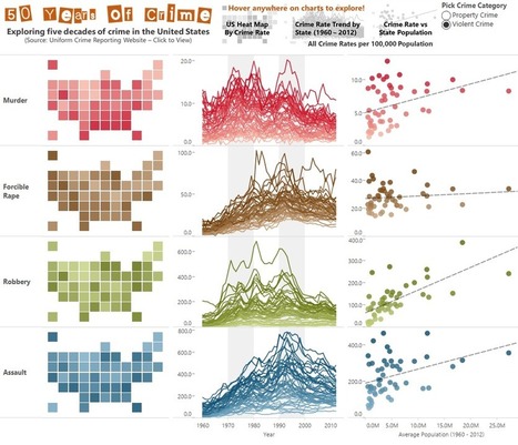
One of the best ways to get your message across is to use a visualization to quickly draw attention to the key messages, and by presenting data visually it’s also possible to uncover surprising patterns and observations that wouldn’t be apparent from looking at stats alone.


...


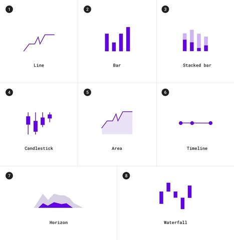
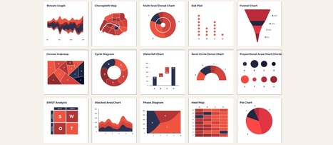
Explore the different possibilities on analyticsweek.com post ...

Didier Daglinckx's insight:

FileMaker offers graphics you can use quite easily but if you want/need to go further a combination of FileMaker and one of the tools describe here can be pretty awesome.

James J. Goldsmith's curator insight, March 24, 2015 9:42 AM

Some useful tools for making data understandable in your presentations. 

Scooped by Didier Daglinckx
Scoop.it!

The Data Visualization Catalogue | inspiration for Filemaker solutions

The Data Visualization Catalogue | inspiration for Filemaker solutions | Learning Claris FileMaker | Scoop.it
If you've ever struggled with what visualization to create to best show the data you have, The Data Visualization Catalogue might provide just the help you
No comment yet.