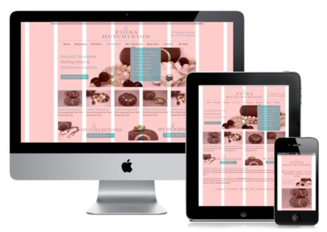
Responsive Design (RWD) is a key trend in creating effective online customer experiences driven by the need to cost-effectively build sites across desktop, tablet, phablet and smartphone.
I featured it at #13 in the digital marketing techniques that would be important in my 2014 digital marketing trends post and Smart Insights readers voted investment in mobile as the second trend with the most commercial potential for 2014.
To help marketers to create effective experiences we have featured many articles discussing best practice, examples and implementation for responsive design on Smart Insights through 2012 and 2013 which I thought it might be helpful to collect together here:
An Introduction to Responsive Website Design for MarketersPlanning your RWDCase Study on Oxfam in Ireland on RWDRWD vs Adaptive DesignParallax web design examplesGoogle’s changing recommendations on SEO for mobile
I hope there will be more discussion in 2014 about adaptive designs too since there are limitations of simple “one-size fits all” RWD implementations in terms of speed, experience and conversion that can be overcome through an adaptive design based on tailoring for specific device types. So I’m hoping to publish more articles on this – do let me know if you have strong thoughts on the best way to implement adaptive so we can move away from the simplistic Responsive = 100% good type thinking.
Collecting these resources together for anyone planning a site redesign project was prompted by this useful and stylish infographic from Splio that gives useful tips on how to implement responsive design. I hope that’s helpful too!


 Your new post is loading...

![6 Best Practices of Responsive Web Design [Infographic] | Information Technology & Social Media News | Scoop.it](https://img.scoop.it/GEiP8AlElwKVA2cIR8IpFDl72eJkfbmt4t8yenImKBVvK0kTmF0xjctABnaLJIm9)


![Ten practical tips to implement Responsive Design [Infographic] - Smart Insights Digital Marketing Advice | Information Technology & Social Media News | Scoop.it](https://img.scoop.it/9HIHs448cf0PKWd93Jd9Czl72eJkfbmt4t8yenImKBVvK0kTmF0xjctABnaLJIm9)


Interessante infografica che mostra le dimensioni ideali degli oggetti web e delle immagini quando si progetta un template resposive.
Responsive designs are the window into the future of web portability to drive higher per user engagement by embedding the concept of Probability Scores. An aggregate of Content Scores & Engagement Scores are debated prior to finalizing which sections gets a higher Probability Score that will eventually determine content position in the responsive design layout. Probability Scores aims at achieving better per user click through rate owing to its full width auto adaptive content display interface that adjust the landing page content based on the device.
Earlier websites used to feed different URLs for different devices. For example m.sitename.com or mobile.sitename.com indicated that the URL is for mobile or smart devices. But now things have changed thanks for responsive design attributes that determines the device that is trying to access the site URL before optimizing the content layout to adjust automatically with the device interface. This way the same URL is serving any device that is trying to access the website which again is compliance for search engine algorithm.
Responsive design has the advantage to every inch of the device or browser interface to maximize the user’s engagement intent possibility. Compelling visual storytelling theme powered by catchy headlines or titles richly feed with an interesting content copy furthermore elevates user interest to engage. This nature in elevating intent & urge to get involved have statistically indicated the favourability of lead generation & conversion rates from responsive designs.
Mobile devices will overtake PC user worldwide citing encouraging statistics to enthuse responsive design for websites, emails & landing pages. Responsive design layouts devised with #ProbabilityScores are based on the overall marketing objectives & branding goals. An implosive content marketing strategy with a creative team of visual storytellers delivers inspiring results and therefore the greater goodness is in the adoption of Responsive Site Design.
#ProbabilityScores <> #ContentScores <> #ContentEngagement
Visit the blogs4bytes Responsive Content Design HomepageCheck out the Responsive Content Scores for the blogs4bytes Homepagehttp://sonicrituals.brinkster.net/ps/probabilityscores.png
Responsive Design, Parallax Campaigns, Hashtag Marketing, SEO & SMO all blend into one to serve a hot cup of result driven digital marketing performance with #blogs4bytes // Follow the conversation.