


 Your new post is loading...

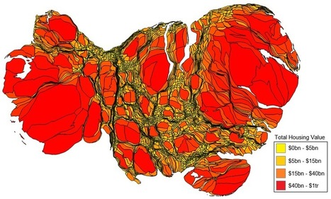

Cartograms are fun tools for swapping out land area for some other variable. For certain figures, especially data that swing wildly at one of the end of the spectrum or another, cartograms are ideal.
This cartogram, which compares property values between counties across the continental United States, looks like bad news from a gastroenterologist. What this in fact shows is that just a handful of counties account for the vast majority of property values in the U.S. The distortion is so severe that it doesn’t look like a map of the U.S. at all...
Via Lauren Moss


