

Most people who need to create an exciting presentation are not design experts. Fortunately, there are a number of really neat tools and websites that can assist you in creating a captivating, professional look for your slides.
Via Baiba Svenca
Get Started for FREE
Sign up with Facebook Sign up with X
I don't have a Facebook or a X account


 Your new post is loading...
 Your new post is loading...
Your new post is loading...
Most people who need to create an exciting presentation are not design experts. Fortunately, there are a number of really neat tools and websites that can assist you in creating a captivating, professional look for your slides. Via Baiba Svenca 
The emphasis on infographics in content marketing is at an all-time high, and the idea of displaying information graphically to convey complex data is not new. Edward Tufte, the American statistician and noted pioneer in the field of data visualization, references in his book- The Visual Display of Quantitative Information- a diagram created in 1869 by Charles Joseph Minard which shows Napoleon’s march to Moscow in the War of 1812. Tufte considers this diagram as perhaps the best statistical graphic ever drawn, and it’s still in use as a teaching aide today. With the flood of attention on infographics, it’s important for marketers to quickly adapt their content strategies. One of the most effective guides I’ve seen so far was published by Brafton. This guide does a great job of explaining the need for good design, ways to approach content and design, and most importantly to marketers, ways to measure effectiveness. Via Lauren Moss
|
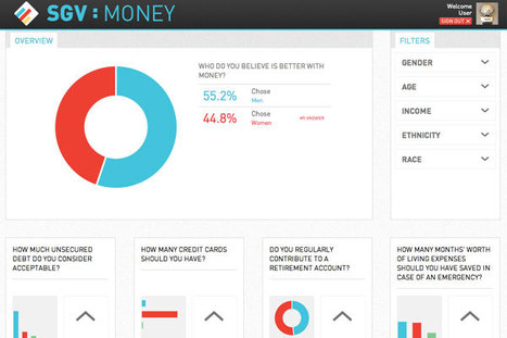
The idea of a Socially Generative Visualization originated out of a section of the design handbook INFOGRAPHICS. Via Lauren Moss
|


The article shares some helpful ideas about the importance of color in your design, making screenshots to illustrate a point, using an attractive font, constructing mind maps for organizing your story.
Extremely important, especially now that we have websites where you're expected to upload your slide show so it can be examined in perpetuity! Great tips for eBook authors as well.