Information and digital literacy in education via the digital path
77.9K views | +0 today
Information and digital literacy in education via the digital path
Literacy in a digital education world and peripheral issues.
Your new post is loading...

Popular Tags

Current selected tag: 'visualisation'. Clear
Rescooped by Elizabeth E Charles from Personalized Professional Development
Scoop.it!

How a science search engine is visualizing the discovery process - Storybench

How a science search engine is visualizing the discovery process - Storybench | Information and digital literacy in education via the digital path | Scoop.it

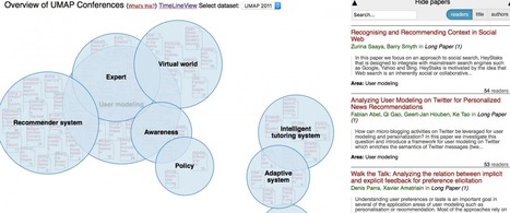
Scientists and journalists share similar skills and challenges in digital storytelling, especially when it comes to researching an unfamiliar field. Current tools for searching information from the academic world in particular can be difficult and time-consuming. PubMed and Google Scholar, for example, present searches linearly—a long list of things to sift through.


Via Andreas Christodoulou, Mark E. Deschaine, PhD
Scooped by Elizabeth E Charles
Scoop.it!

Storytelling with Data: Data Visualization Best Practice (part 1)

Storytelling with Data: Data Visualization Best Practice (part 1) | Information and digital literacy in education via the digital path | Scoop.it
Part one in a two-part series on the best guidelines for data visualization for business intelligence and analytics
No comment yet.
Rescooped by Elizabeth E Charles from Digital Delights
Scoop.it!

From MOOCs to Learning Analytics: Scratching the surface of the 'visual'| elearn Magazine

From MOOCs to Learning Analytics: Scratching the surface of the 'visual'| elearn Magazine | Information and digital literacy in education via the digital path | Scoop.it
The visualization of big MOOC data enables us to see trends in student behaviors and activities around the globe, but what is it that we are not seeing?

Via Ana Cristina Pratas
Alex Enkerli's curator insight, November 24, 2014 8:32 AM

Learning data: from learner behaviours to a diversity of perspectives and appropriation.

Matt Woodruff's curator insight, November 24, 2014 1:19 PM

Intelligent questioning of just some of the challenges in interpretation of the underlying meaning or 'truth' of data

Scooped by Elizabeth E Charles
Scoop.it!

Online Learning and Linked Data - Lessons Learned and Best Practices | EUCLID

Online Learning and Linked Data - Lessons Learned and Best Practices | EUCLID | Information and digital literacy in education via the digital path | Scoop.it

Linked Data has established itself as the de facto means for the publication of structured data over the Web, enjoying amazing growth in terms of the number of organizations committing to use its core principles for exposing and interlinking Big Data for seamless exchange, integration, and reuse. The European project EUCLID is developing a comprehensive educational curriculum, supported by multimodal learning materials and highly visible eLearning distribution channels, tailored to the real needs of data practitioners. The EUCLID curriculum focuses on techniques and software to integrate, query, and visualize Linked Data, as core areas in which practitioners state to require most assistance.

No comment yet.
Scooped by Elizabeth E Charles
Scoop.it!

Visme: Bring Visuals to Life

Visme: Bring Visuals to Life | Information and digital literacy in education via the digital path | Scoop.it
Looking for a cool way to add some pizzazz to infographics and presentations? Visme could be the answer. Here`s an in-depth review of this marketing tool.
No comment yet.
Scooped by Elizabeth E Charles
Scoop.it!

A Must Have Rubric for Infographic Use in The Classroom ~ Educational Technology and Mobile Learning

A Must Have Rubric for Infographic Use in The Classroom ~ Educational Technology and Mobile Learning | Information and digital literacy in education via the digital path | Scoop.it

So you're planning to make infographics part of teaching toolbox! Educational infographics section both here and on our  Pinterest board has hundreds of meticulously selected graphics to use with your students in the classroom. I am pretty sure you will find some good ones for your class.

However, to effectively integrate infographics in your teaching you need much more than just curated lists of educational graphics, you will need to develop your own skill at judging the relevance of graphics you come across online. In other words, you need a rubric of the things you have to highlight when selecting such learning materials for your class. Thankfully, Kathy Schrock has created this wonderful chart featuring the most important elements to consider when opting for infographics. Kathy has also another great page on infographics which I highly recommend for you.

No comment yet.
Scooped by Elizabeth E Charles
Scoop.it!

[Presentation] Dabbling with Data Visualisation

[Presentation] Dabbling with Data Visualisation | Information and digital literacy in education via the digital path | Scoop.it
In this presentation I will demonstrate simple techniques for generating data visualisations: using tools (including MS Excel and Google Spreadsheets), drawing packages (including Illustrator and ...
No comment yet.
Suggested by April Alen Abion
Scoop.it!

Technical Data Made Simple with Visme

Technical Data Made Simple with Visme | Information and digital literacy in education via the digital path | Scoop.it
A review of the steps you should follow to visualize technical information so that it is easy to understand and engaging for non-technical audiences.
No comment yet.
Rescooped by Elizabeth E Charles from Digital Literacies information sources
Scoop.it!

Visualisation tools for all tastes

Visualisation tools for all tastes | Information and digital literacy in education via the digital path | Scoop.it

Description


Via Fiona Harvey
Fiona Harvey's curator insight, February 22, 2015 5:01 AM
Collection of tools for all tastes and needs
Scooped by Elizabeth E Charles
Scoop.it!

A Periodic Table To Help You Choose The Best Type Of Visualization - Edudemic

A Periodic Table To Help You Choose The Best Type Of Visualization - Edudemic | Information and digital literacy in education via the digital path | Scoop.it
People love visuals. Visuals have been shown to help us learn more quickly and to retain more information than text alone. We’re more easily able to understand the world around us when we have visual components to aid us. The same goes for the classroom. If you present your students with a block of text …
No comment yet.
Scooped by Elizabeth E Charles
Scoop.it!

11 Essential Ingredients Every Blog Post Needs - [Infographics and Data Visualization] Cool Infographics

11 Essential Ingredients Every Blog Post Needs - [Infographics and Data Visualization] Cool Infographics | Information and digital literacy in education via the digital path | Scoop.it
If every blog followed the 11 Essential Ingredients Every Blog Post Needs in this infographic, ...
Maria Richards's curator insight, May 1, 2014 7:34 AM

Infographic explanation of blogging!

Scooped by Elizabeth E Charles
Scoop.it!

Top Visualizations of Bloom's Taxonomies ~ Educational Technology and Mobile Learning

Top Visualizations of Bloom's Taxonomies ~ Educational Technology and Mobile Learning | Information and digital literacy in education via the digital path | Scoop.it


Today while I was sifting through my Twitter feed I came across this  great slideshare entitled "Creative Visualizations of Bloom’s Taxonomies!" shared by Dawsonite. This presentation is created by Zaid Alsagoff, e-learning manager at the International Medical University (IMU).

No comment yet.
Scooped by Elizabeth E Charles
Scoop.it!

Creating Classroom Infographics Using these 2 Awesome Google Docs templates ~ Educational Technology and Mobile Learning

Creating Classroom Infographics Using these 2 Awesome Google Docs templates ~ Educational Technology and Mobile Learning | Information and digital literacy in education via the digital path | Scoop.it
No comment yet.