information analyst
43.8K views | +2 today
Follow
information analyst
km, ged / edms, workflow, collaboratif
Your new post is loading...
Rescooped by michel verstrepen from visual data
Scoop.it!

Solving Wicked Problems: Using Systems Thinking in Design

Solving Wicked Problems: Using Systems Thinking in Design | information analyst | Scoop.it

My classmates and I are in the Design for Social Innovation program because we identified problems in our communities, companies, or cultures and are keen to figure them out. But before talking about any solution or outcome, one must first frame the problem—by thoughtfully examining the system it’s part of to understand where and how to get involved.

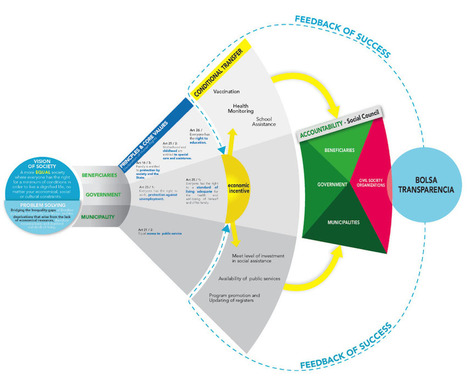
 Learning to use systems thinking, a holistic approach to problem solving that emphasizes contextual understanding, has helped me with team management, project planning, creative work, and even relationships. And for wicked problems like healthcare that confront business, nature, and society, it’s proving to be imperative.So, where to even begin? “We have to invent boundaries for clarity and sanity,” advises systems thinking pioneer Donella Meadows. Sometimes a simple infographic works to tell the story. Designing visual maps and models helps us immediately find connections and describe relationships. Creating models helps in seeing the big picture and one's place within it.


Via Lauren Moss
Martin (Marty) Smith's comment, January 28, 2013 7:14 PM
I think "design" and "programming" are rushing at each other at light speed. Web pages will be made from branching if,then,else algorithms soon. Can't just drip paint on a canvas, so design's function will be making those algorithms make visual sense.
Gordon Shupe's curator insight, February 8, 2013 6:38 AM

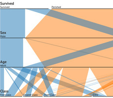
Info graphics don't really include digital photography, generally, but they are a fascinating way of displaying understanding, telling a story, and implying solutions.

Rescooped by michel verstrepen from Online ecosystems - Écosystèmes Web
Scoop.it!

Data-driven journalism and data visualization

Data-driven journalism anddata visualization by Jojo Malig on Prezi. Great visual presentation this...

Data journalism is not just graphics and visualizations; it's about telling the story in the best way possible.


Via Lauren Moss, Karen Bastien, Xiradakis Alexandre
Angelica's curator insight, October 13, 2015 10:55 AM

As a student, I thought that this Prezi presentation had structured an informative lecture about the functionality of Data Journalism for students. In addition, The presentation contains a video that helps students to understand and analyzed this topic.

Rescooped by michel verstrepen from visual data
Scoop.it!

Visualizing Connections In Data & Analyzing Information

Visualizing Connections In Data & Analyzing Information | information analyst | Scoop.it

For many data visualization projects, information comes from a source that has already done some aggregation. This is both a blessing and a curse. Aggregation definitely simplifies the analysis and visualization process, but it can also greatly reduce the visualization and analysis options. This is because aggregation often destroys connections in data. For this reason, it's critical to have an in-depth and thorough knowledge and understanding of the information from aggregated information. There are several different visualization techniques that open up once we have the original data, such as Euler diagrams and parallel sets.


The extra information that can be obtained from visualizations is important to gaining a full understanding of the data, and it can lead to a much more interesting story, as well as far better visualizations and more accurate connections and links within those visualizations.

So, when gathering data about something, remember to dig deeper into it, as there are many important connections that happen within data that can provide knowledge beyond just a simple average or total.


To learn more about the value of these connections, sourcing accurate data, and how it is transformed into useful graphics, read the complete article and check out the case study used to convey the main points outlined above...


Via Lauren Moss
kurakura's comment, November 15, 2012 5:17 AM
the last graph on that page is really useful for understanding the data?
Rescooped by michel verstrepen from visual data
Scoop.it!

The Most Important Piece of an Infographic

The Most Important Piece of an Infographic | information analyst | Scoop.it

A solid idea is the essential foundation of a great infographic. While this may sound obvious, it is the most common mistake made by companies developing infographics today, leading to a slew of poorly thought-out visual disasters.

I aim to spotlight a few of these pitfalls, to help you first recognize what you are trying to do, then identify the types of ideas that will help you achieve it.


Via Lauren Moss
No comment yet.